
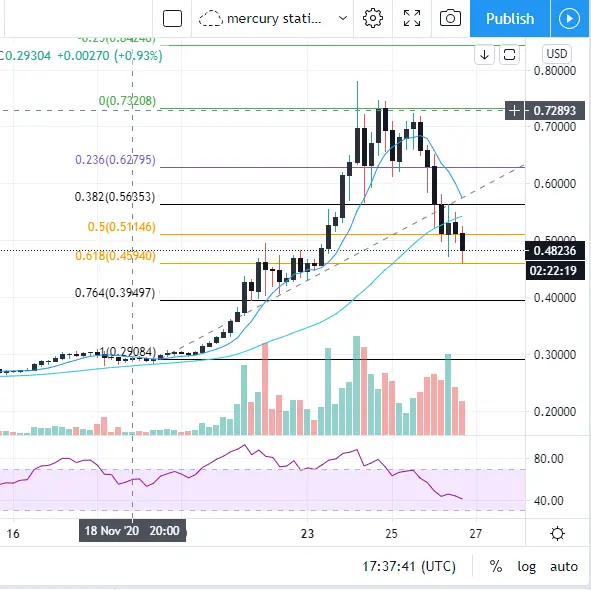
Many traders around here probably know the Fibonacci levels, but I just wanted to share a picture of how perfectly the levels are met in the 4 hours timeframe of XRP.
The zone between the two orange lines is where I usually would buy an asset which is in an Uptrend. (in this case of XRP I would wait for confirmation).
It is so beautiful.
I have not changed my mind on my HODL coins and I am not shilling any coins, because I am pretty optimistic on the long term.
You can check other old posts like this one if you are looking for that: My top 3 affordable coins for long holding
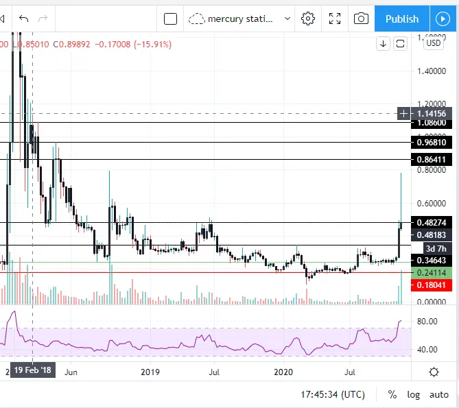
And just for fun I am sharing these weekly levels, which were drawn a long time ago (meaning that in an uptrend and downtrend, prices will tend to remain at those levels. Again just beautiful.
Most importantly, do your research, and in my opinion, dont miss out the opportunity of this year.
I am not going to tell you anymore that this is no financial advise, cuz anyway the ones who want quick money will lose and those who are smart will be patient.






