
For my first post in this blog I want to look at the big kahuna, the one that almost everyone has heard of by now - Bitcoin - and analyze some of the decisions made in the design. Let's start with color scheme.
Color
Orange and Gray. Which color says “money” to you? If you're American or deal heavily in USD, then the answer is most likely “green”. So why not a green circle instead of orange? The designer revealed that they had been inspired by Mastercard and Visa, stating a hatred for the financial giant but admitting to the power of consumer perception. So let's look at Mastercard real quick.
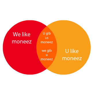
In fact, Mastercard's bright, red and yellow circles demand the eye's attention almost selfishly. The Mastercard Venn Diagram seems to say, “WE want to be rich (red circle), YOU want to be rich (yellow circle), so we'll give you money if you give us money and we can be rich together (orange middle).” In the world of sales and ads red can be a very powerful color to separate you from your money, and yellow very easily communicates fun and happiness, so orange creates a sense of trustworthy buying. “Buy this now (red)! It'll make you happy (yellow)! Just put it on your credit card (orange)”! Keeping with the metaphor, it would then seem as though Bitcoin has merged its red and yellow entities into a single orange circle of its own trustworthy buying power.
Next, the gray word mark. I like the gray word mark, but why not black? Black and white have the highest possible contrast and therefore the best chance of visibility. But on-screen this contrast can become hard on the eyes and many web designs have started to adopt a dark gray for their text. And seeing as how Bitcoin is a digital currency and will be utilized on screens for the foreseeable future, a neutral gray text would make sense. Excellent forward thinking!
Type
It's interesting to note the slab-serif bhat within the coin emblem. The closest font I could find to match this bhat was Microsoft Sans Serif. It's not an exact match, but its close. There may be some modifications happening, too. The use of a slab-serif here is important in cementing a sense of foundational staying power, as though we're looking at a cornerstone upon which a grand idea will be constructed into existence. Tilting the emblem was a choice made some 8+ months later when the word mark was added to the designed.

The font used for the word mark is straight from the Ubuntu family. The razor crisp edges of this sans-serif type have a clean and modern presentation. In my opinion, pairing the lower case sans-serif word mark with the upper case serif bhat emblem speaks of a certain adolescent maturity, as if to say “I've been around for a long time but now I'm ready to grow up”. Using bold type re-emphasizes staying power and foundation. Italicizing the brand name gives it incredible speed and movement, a decision that could have (arguably) influenced Bitcoin's meteoric rise. O.K. Maybe it's a bit of a reach, but I will argue that any and all good design has a much greater (and sometimes imperceptible and un-quantifiable) influence on us than most people realize.
Well, now that the big one is out of the way I think the next design I look at will be a modern one with a gradient. I absolutely LOVE that gradients are back!
-fizzlstout


