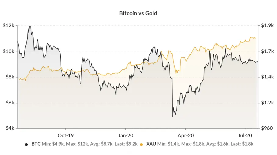
These comparison charts are very interesting, they allow us to see which of the two assets is the stronger these last months. Here for the blow, we are obliged to give reason to Peter Schiff on these last months. It is true that on the beginning of the creation of the Btc, this one has progressed more but we must not forget the Gold which has much more history, it is slower, because it is old active, heavier.
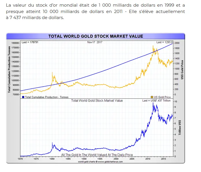
The stock market value in 2011 was at $ 10,000 billion.
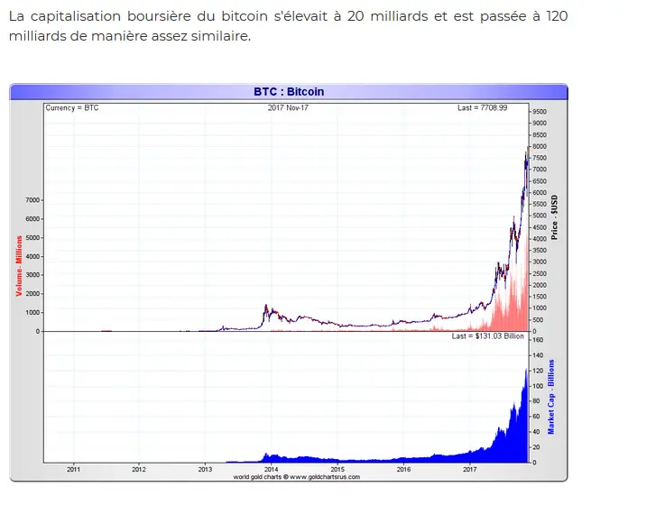
Btc is much more dynamic because it is a tech.
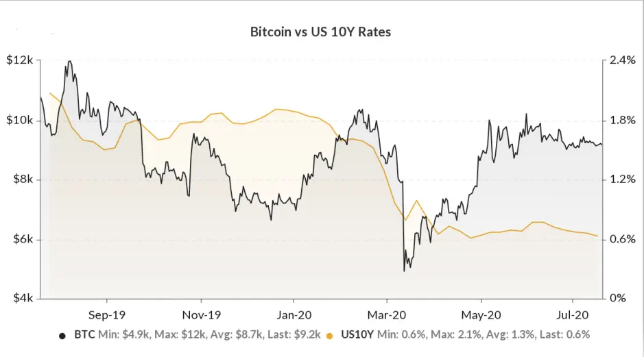
There, the Btc chart is advancing more than the U.S. 10-year rates, it is more attractive now to hold Btc than the U.S. 10-year interest rates.
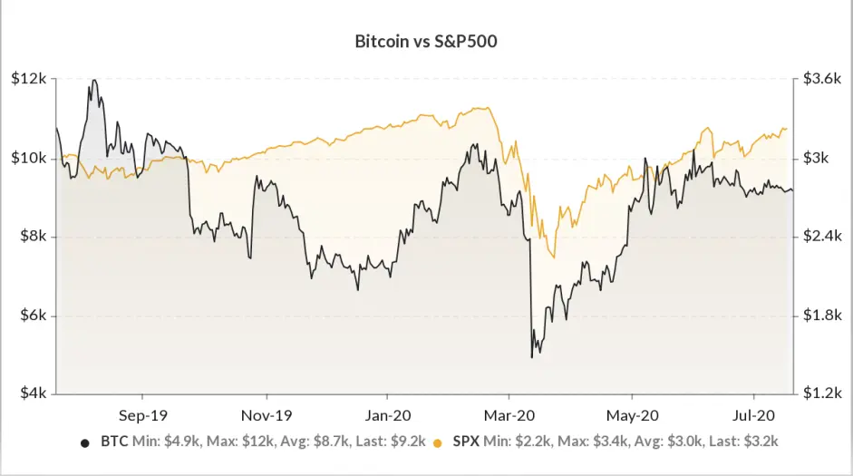
This chart is very interesting, because we have the impression to see a correlation between Btc and the S&P 500. Btc behaves a bit like an index, it does not have several tokens in its value (like the S&P with stocks) but has a dominance on the coin market cap, which currently corresponds to 63.7%
 .
.
*
In the DEFI, Compound lost ground on SNX, Kyber network is almost invisible as well as Uniswap and Dharma ect ...
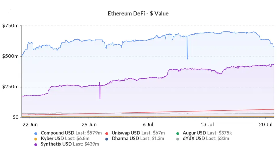
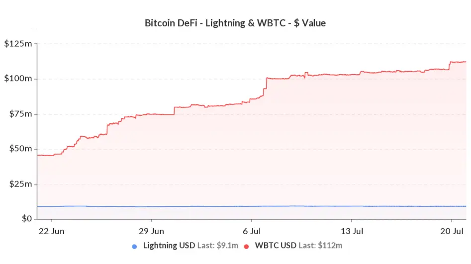
On this graph we also see the value of Btc integrated into the DeFI with WBTC and Lightning USD which corresponds to the horizontal blue line, and again on this graph they have not integrated the SBtc of SNX or other protocols.