The global precious metals landscape is undergoing a massive shift as top financial authorities dramatically ramp up their bullion reserves. Recent market data highlights that official net purchases jumped significantly, driving renewed momentum into physical bullion demand while broader macroeconomic uncertainty continues to unfold. At the same time, chart structures show that market participants are closely monitoring critical areas where hidden stop losses and resting orders tend to cluster.
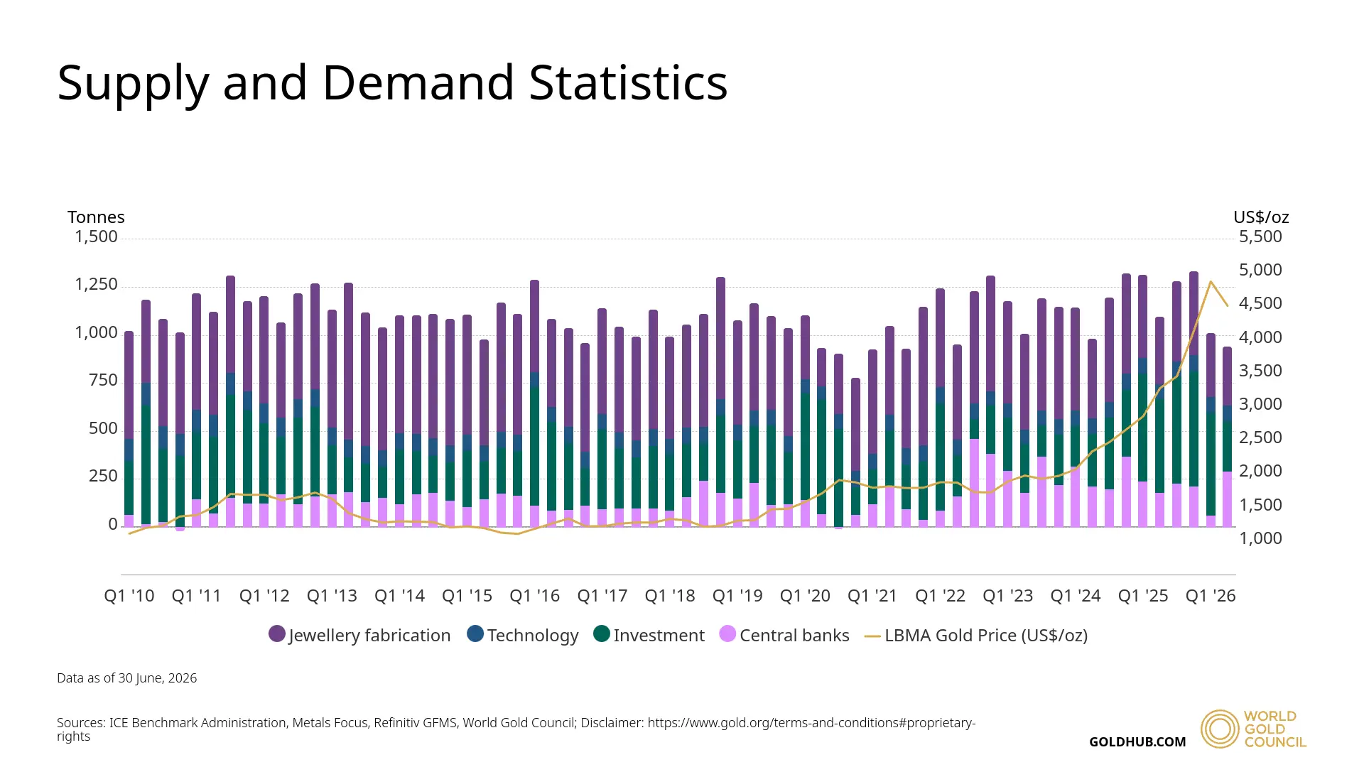
When examining the underlying mechanics of this market, looking strictly at raw physical flows tells only half the story. Historical records from major market institutions show that consistent consumption across jewelry fabrication, industrial tech applications, and institutional vaults creates a baseline that prevents sharp structural collapses.
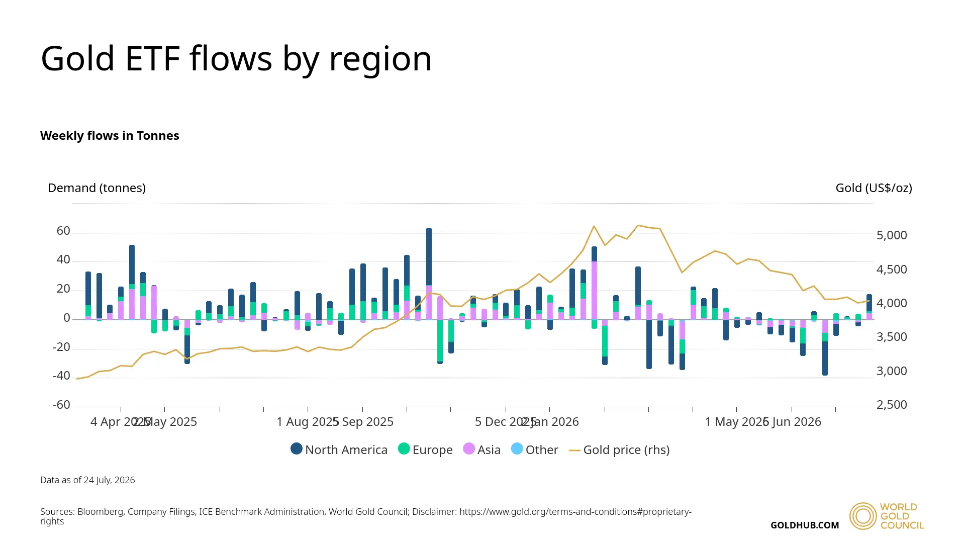
Beyond physical manufacturing, fund managers and institutional players channel significant capital through exchange traded products. Regional data tracking reveals distinct shifts in capital allocation, with Asian markets displaying particularly high levels of activity compared to other global jurisdictions.
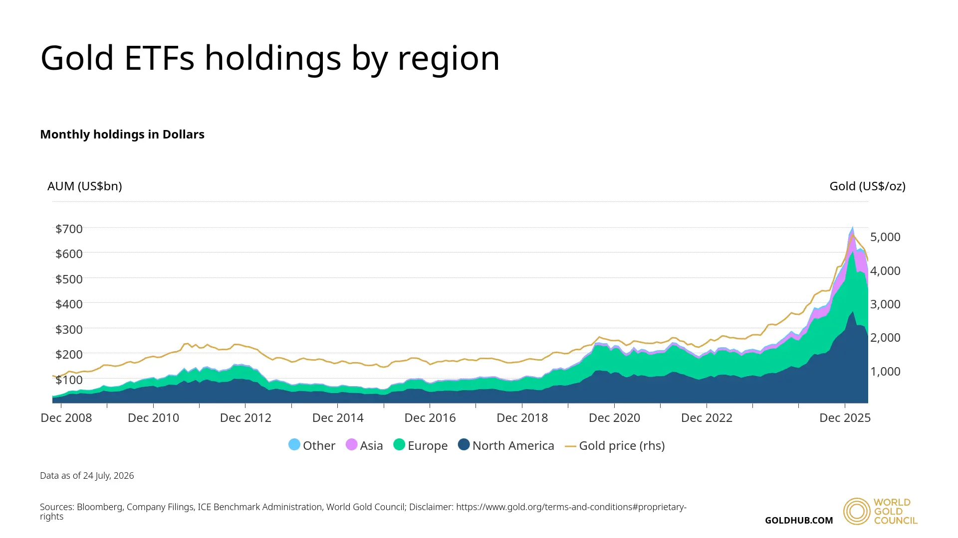
Accumulation trends inside these pooled investment vehicles keep growing steadily, mirroring the broader upward trajectory of bullion prices over recent cycles. As total assets under management expand, it becomes clear that large portfolios increasingly rely on this asset class as a defensive hedge.
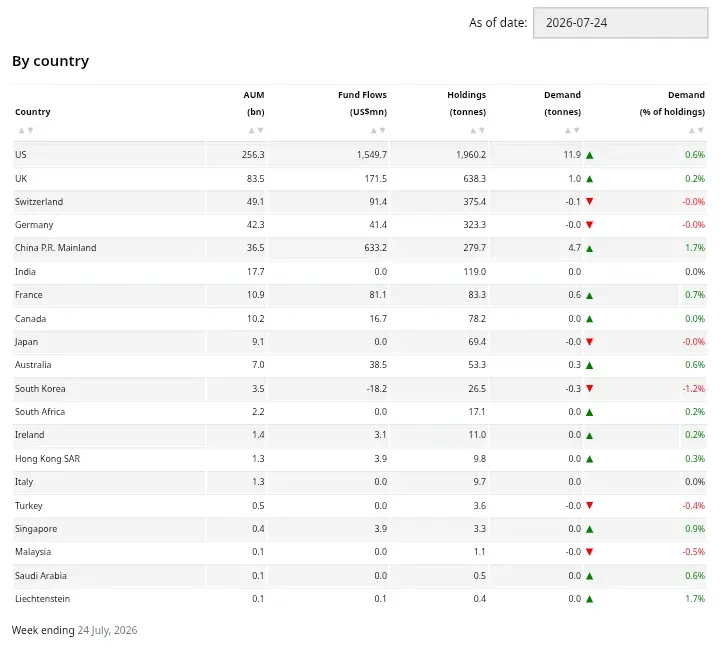
A closer look at regional ownership breakdowns shows that major Western economies continue to control the lion's share of total registered holdings. This distribution confirms that mature financial systems still view bullion as a fundamental cornerstone for long term reserve diversification.
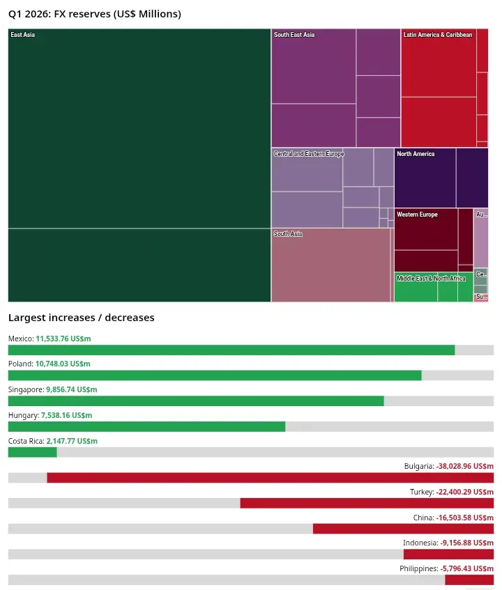
Aside from traditional investment funds, recent central bank maneuvers have drastically altered global liquidity distribution. Official reports from emerging economies and monetary authorities highlight substantial shifts in foreign exchange reserves, with several nations aggressively expanding their metal stockpiles.
From a charting perspective, examining price action on the mid term timeframe reveals an intriguing setup. Price behavior often retests specific retracement levels to find equilibrium before attempting any aggressive directional expansion.
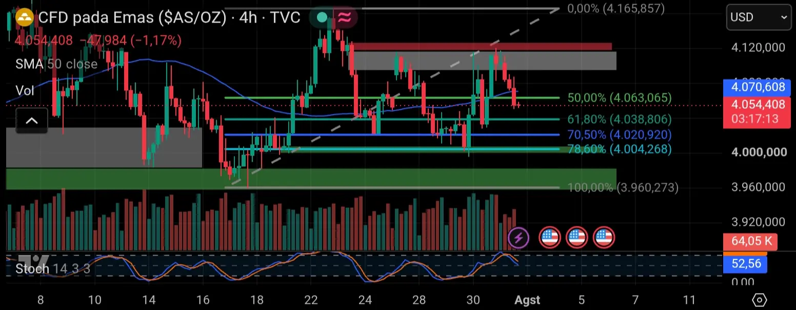
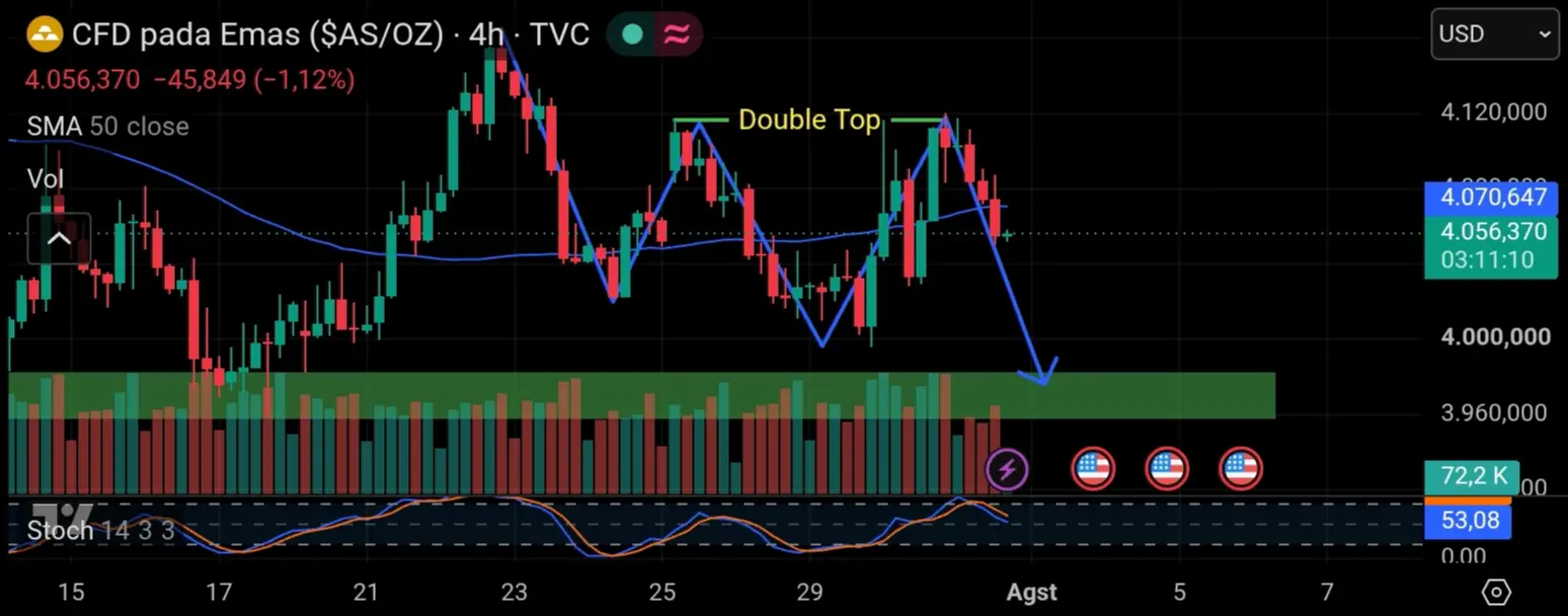
However, the real action is building around well defined horizontal boundaries. The repeated appearance of parallel swing peaks creates a classic double top formation, which naturally acts as a magnet for trapped market participants. In professional trading frameworks, these visible barriers function as prime liquidity pools waiting to be cleared.
My Opinion
Analyzing the blend of macro data regarding aggressive central bank accumulation and current price action technical structures, I see that the equal highs formed on the chart are not actually strong resistance areas. That area is a deliberately maintained liquidity pool. Large institutions (Smart Money) heavily need the liquidity from retail traders' stop loss orders stacked above that level to facilitate their large scale entry orders. Therefore, the probability of a sudden price spike (Liquidity Sweep) to wipe out that area is very high before the market potentially undergoes an actual structural correction. Under conditions like this, understanding institutional liquidity narratives is far more crucial than simply following conventional technical patterns.
Click here to read my authentic and original analysis
Source
⛔Disclaimer - This analysis is for educational purposes and reflects personal opinion only, not financial advice. Always practice risk management and use stop losses (SL) according to your own risk tolerance.
Keep trading and stay profitable📊💪