
How The Death Cross & Golden Cross Can EXPLODE Your Portfolio (if used the right way)
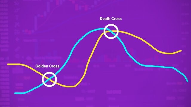
Death Cross
Death cross is one of those terms that is very popular when it comes to technical analysis. A death cross basically forms on a particular cryptocurrency chart when the shorter-term moving average like the 50 simple average crosses below the longer-term moving average like the 200 simple moving average. When the death cross forms on a particular cryptocurrency chart, it can be an indication that the market is about to go bearish and that the sellers are about to take control and push the market into a potential downtrend.
A combination of the 50 simple moving average and 200 moving average has proven to be very effective when it comes to identifying death crosses. 50 periods moving average is very common because it shows the average closing prices in the past 50 periods, which makes it more sensitive to recent price movements. The 200 period moving average is also very common because it shows the average closing prices in the past 200 periods with a smoother line and is less sensitive to recent price movements.
Golden Cross
A Golden cross basically forms on a particular cryptocurrency chart when the shorter-term moving average like the 50 simple average crosses above the longer-term moving average like the 200 simple moving average. When the Golden cross forms on a particular cryptocurrency chart, it can be an indication that the market is about to go bullish and that the buyers are about to take control and push the market into a potential uptrend.
The combination of the 50 simple moving average and 200 moving average is also a very effective way of identifying golden crosses. The 50 period moving average shows the average closing prices in the past 50 periods and is more sensitive to recent price movements. The 200 periods moving average on the other hand, shows the average closing prices in the past 200 periods and are less sensitive to recent price movements.
What is the Significance of Death Cross and Golden Cross in Trade?
Death Cross
The significance of death cross in trade is that it is often seen as a bearish signal because it is a pattern on a chart that can indicate the potential downtrend coming. It is a pattern that appears when the shorter-term moving average like the 50 simple average crosses below the longer-term moving average like the 200 simple moving average. What this means is that the recent average price is lower than the longer-term average price.
A death cross helps to signal traders that there could be a major sell-off coming and that sellers are about to take control of the market. Death cross can also help traders identify trends in the market, whether the market is about to be bearish and enter a downtrend. It can also help cryptocurrency traders identify potential exit points.
Golden Cross
The significance of the golden cross in trade is that it is often seen as a bullish signal because it is a pattern on a chart that can indicate the potential uptrend coming. It is a pattern that appears when the shorter-term moving average like the 50 simple average crosses above the longer-term moving average like the 200 simple moving average.
What this means is that the recent average price is higher than the long term average price. A golden cross helps to signal traders that there could be major buy pressure coming and that buyers are about to take control of the market and drive the price up. The golden cross can also help traders identify whether the market is about to be bullish and enter an uptrend. It can also help cryptocurrency traders identify potential entry points.
Death Cross and Golden Cross Formations on a Chart
Death Cross

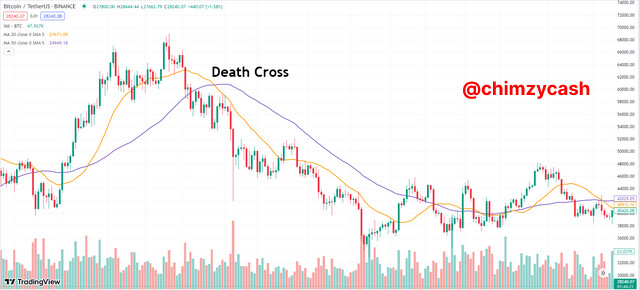
The death cross was formed on the ETH/USDT chart. On the chart using the daily timeframe, I placed the 50-day simple moving average and the 200-day simple moving average. We can see that the 50-day MA has crossed below the 200-day MA. This is because the 50 day moving average shows the average closing prices in the past 50 days which is why it is more sensitive to recent price movements, and the 200-day moving average shows the average closing prices in the past 200 days, it has a smoother line and less sensitive to recent price movements.
On the chart, we can see the different factors that are taken into consideration to see the death cross on a chart. The lead-up, the death cross formation and the continuation of the downward momentum. During the lead-up, there was a rapid fall in the price of ETH/USDT. The uptrend which has been going on for a period of time began to lose momentum. This was the first early sign. After the uptrend lost its momentum, the death cross was formed.
We can see that the 50-day moving average line (blue line) finally crossed below the 200-day moving average line (red line). The formation of the death cross was a strong signal about a potential downtrend incoming. After the 50-day moving average crossed below the 200-day moving average and the death cross was formed, the price action continued lower which eventually led to the downtrend. This showed that the sellers have taken control of the market. After the downtrend was confirmed, the price continued to be lower than the 50-day moving average for a period of time in the downtrend.
Golden Cross
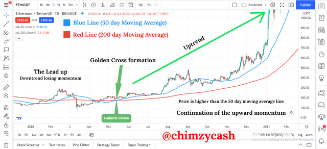
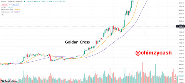
The golden cross was also formed on the ETH/USDT chart. On the chart using the daily timeframe, I placed the 50-day simple moving average and the 200-day simple moving average. We can see that the 50-day MA has crossed above the 200-day MA. This is because the 50 day moving average shows the average closing prices in the past 50 days which is why it is more sensitive to recent price movements, and the 200-day moving average shows the average closing prices in the past 200 days, it has a smoother line and less sensitive to recent price movements.
On the chart, we can see the different factors that are taken into consideration to see the golden cross on a chart. The lead-up, the death cross formation and the continuation of the upward momentum. During the lead-up phase, there was a consolidation and the downtrend which have been going on for a period of time began to lose its momentum. This was the first early sign.
After the downtrend lost its momentum, the golden cross was formed. We can see that the 50-day moving average line (blue line) finally crossed above the 200-day moving average line (red line). The formation of the golden cross was a strong signal about a potential uptrend incoming. After the 50-day moving average crossed above the 200-day moving average and the golden cross was formed, the price action continued higher which eventually led to the uptrend. This showed that the buyers have taken control of the market. After the uptrend was confirmed, the price continued to be higher than the 50-day moving average for a period of time in the uptrend.


