
The chart and associated data here is courtesy of Glassnode, which does an excellent job providing useful information to the community and ecosystem. What you are looking at, in a nutshell, is an assessment of how much supply of BTC is readily available for sale relative to the total available supply of Bitcoin.
The data and graph depicted is showing the ratio of illiquid supply versus the overall supply essentially. As this ratio rises, that means there is more of the supply "locked up" if you will. It doesn't mean these coins can't be sold literally just that they are off exchanges, etc. from the standpoint of having them at the ready to hit the market.
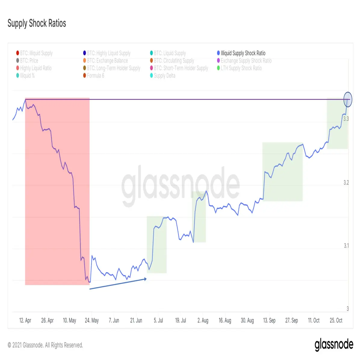
As you can see the ratio plummeted in April and May, which coincided with a brisk selloff in BTC. This makes sense. More supply of coin became liquid (in a general sense becoming more readily available for sale) as the price tanked. Now, we see the supply becoming much tighter as the price has been rallying very aggressively the last several weeks.
No way to predict where this ratio is heading, but safe to say at the moment investors and HODLers are clinging tightly to their stack of sats. Where does it go from here and what happens to price?
Tezos and OneOf and Grammy Awards






