
[Originally published on Sep 21st on the official Zano blog. Apologies for the delay in cross-posting!]
Hello all! Today we announce the migration of the official Zano blog from medium.com to blog.zano.org. We believe this new, more flexible platform will let us further improve the frequency and quality of our communications as the project and community continue to grow. Posts will still be mirrored here on Pubilsh0x and on Medium.
New logo and branding
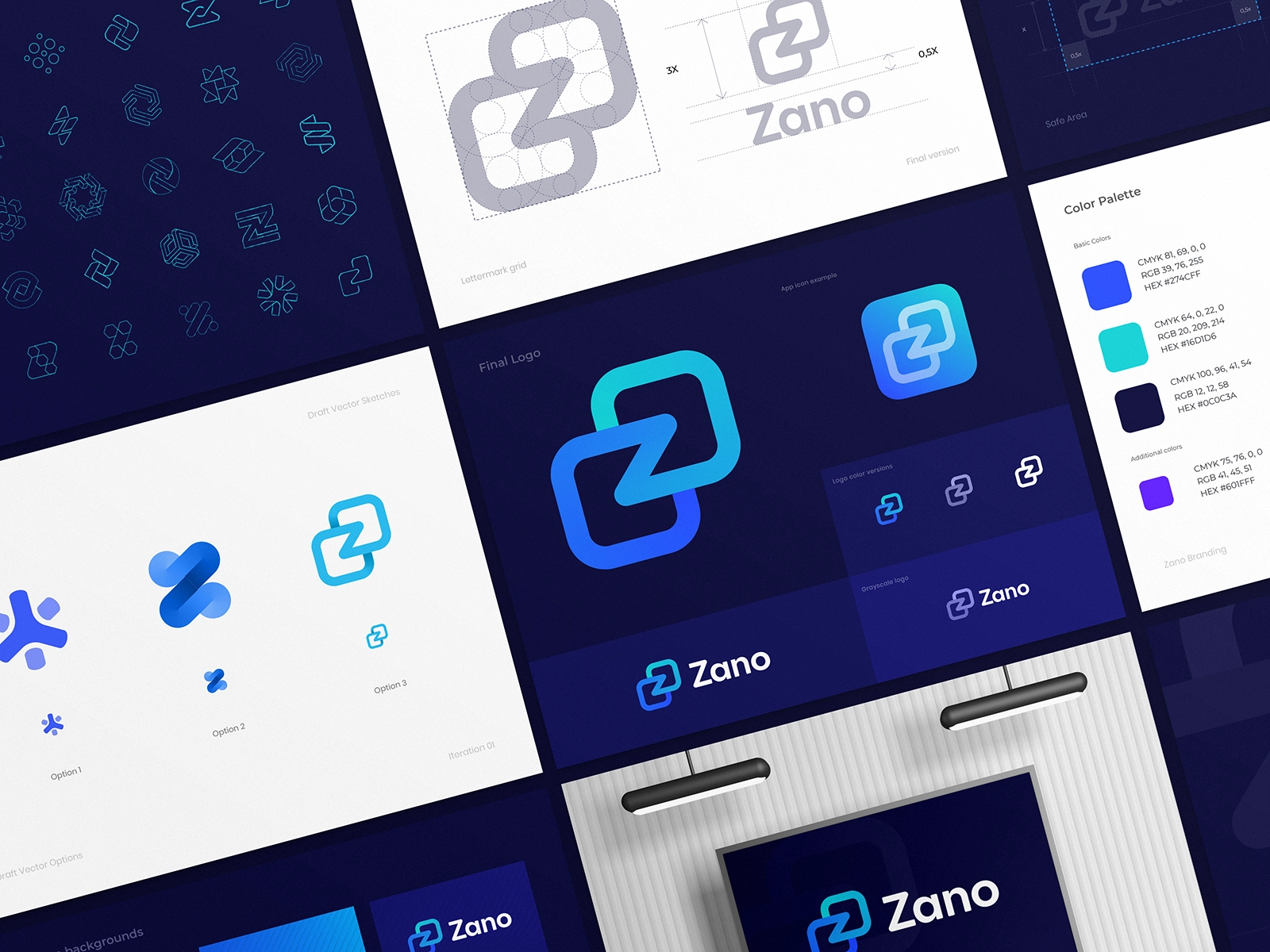
First impressions are crucial. A logo, as the primary visual representation of a project, often constitutes the first point of contact with a newcomer. A great logo can be enough to draw in the casual observer. It’s a visual distillation of the project’s essence that accompanies it everywhere it goes. A symbol of identity, which in our case will be seen on wallets, websites and even adorning the new Zano office’s walls.
So when choosing a new logo for Zano, we tried to show it the same level of care and attention that we show to changes to the code. After all, our hope is that it will eventually be seen by millions.

The designer we chose for the task was Dmitry Lepisov (https://dribbble.com/lepisov), one of the most highly-rated designers on Dribbble, whose portfolio we’d been extremely impressed by.
Upon selecting our favorite from the initial sketches, Dmitry took us on a weeks-long exploration of colors, fonts, letter weights, cases and spacings… producing variant after variant in search of a design with impact, balance and cohesion. It was a fascinating process to witness and a pleasure to work with someone so meticulous and dedicated to their craft. We hope this will be the first of many collaborations with Dmitry.
We’re thrilled with the final results and we hope you are too. Dmitry’s delivered a beautiful, modern, professional and unique logo that we believe will represent us perfectly as we enter the next leg of our journey. He also provided us with an alternative purple version which will be used to represent all versions of Wrapped Zano (wZANO).

Our social platforms will be updated shortly, while over the next month or so you’ll see the new branding applied to the desktop and mobile wallets and to zano.org, giving the project a more consistent and cohesive visual identity. We’ll also be making the brand guidelines and logo files available soon so that you can use them on your own websites and in your own designs.
We’d love to know what you think of the new design. Give us your thoughts and feedback in the comments or in our Zano Discord/Telegram/Reddit groups.


