
Hello once again out there in the world of all things Crypto!
My name is Trevor here to share with you Ethereum's Monthly Historical Data Chart!
This was inspired by the creation of my monthly chart for Bitcoin's Historical Data which you can read right here on Publish0x too.
Here is the link to that article in case you're wondering. 😉
https://www.publish0x.com/trevor-balthrop/bitcoins-historical-monthly-chart-september-1st-2021-xxyzmgq
Now if you're not familiar with this type of chart there is no need to worry!
Although overwhelming at first, this chart shows an amazing backseat perspective on potential price trends.
But first, before I explain I must share with you the chart.
BEHOLD! 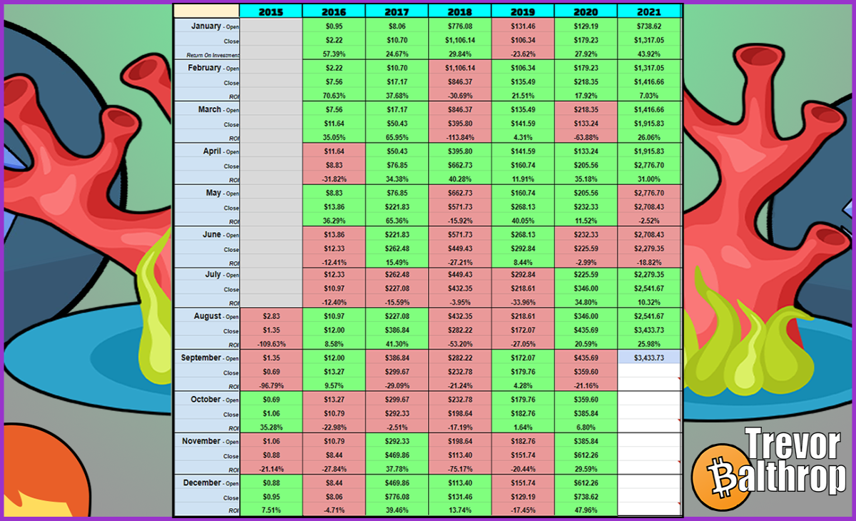
I update and post this chart on the 1st day of every month after closing.
By entering both the open and close every month we can determine better points of entry (and exits!) when investing in Ethereum or Bitcoin.
If a month closes above the price it opened at, the return is positive and the box is colored green.
If a month closes below the price it opened, that means the price went negative and the box is colored red.
The numbers entered in on the 1st of every month are taken from official data supplied by CoinMarketCap/CoinGecko.
What makes this chart different from others is the fact that it doesn't use traditional graphs to monitor the price.
Instead, it uses raw numbers only with a helpful color-coded system to help visualize where things stand.
So if you're tired of looking at the same crud all the time make sure to check back every month for some additional market insight! 
There are many benefits to following this chart but as always I must say, this is not official professional financial advice so do please be careful when making your own decisions investing in cryptocurrency.
With that out of the way, I would like to point out one of the greatest benefits of this chart.
Which is!
Lowering your stress levels!!!
Looking at this chart will humble you with what to expect in the immediate short-term without making things too complicated.
So whether you are day-trading or just revisiting your portfolio every few months or so.
The Historical Data Chart is the ultimate cheat sheet to help point you in the right direction. 
For example!
Do you see 3 or 4 green months in a row?
Well, maybe it's time to start taking profit because it can't stay green forever!
Seeing red before a major upgrade or halving?
Might want to start accumulating and get ready for a green month or two to happen during a giant bear market!
There is no easier way to see those things than by looking at this chart.
Combine this with more knowledge and you are on your way to swimming with the whales my friends!
I really hope this helps others so I am dedicated to updating every month no matter what!
Thanks so much for stopping by to check things out and if you like my stuff I hope to see you back again!
That's all for today and I hope everyone has yet another BEAUTIFUL day in Crypto!
This is Trevor's signature 🦰
and article!
Check out the website
at
www.TrevorBalthrop.com


