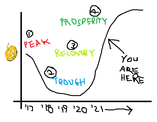
This morning while drinking my morning coffee (no milk, no sugar), I came across a post on Torum that discussed the "Rainbow Chart" for Bitcoin. This chart reminds me of the classic market cycle chart.
You've got your:
- Peak
- Trough
- Recovery
- Prosperity
We are currently between the "recovery" and "prosperity" phases. I've drawn a useful chart and attached it below, because for some reason the original Wall Street Cheat Sheet version of this chart is impossible to find. Let me know in the comments if you can figure out why going to www.wallstcheatsheet.com redirects to a celebrity news site. I'll tip you some Doge.
Okay, moving on to the rainbow chart.
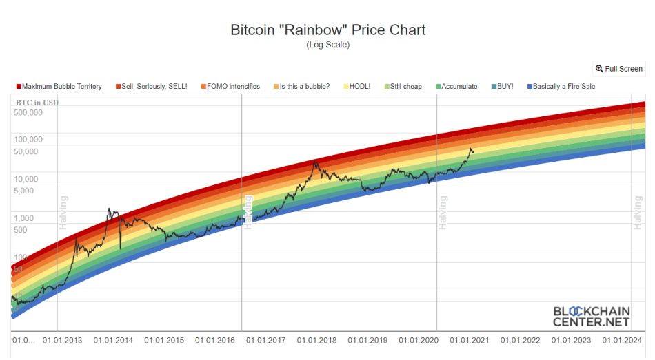
What I like about this chart is the information density, its simplicity, and its beauty. Thank you to Uber Holger, the inventor of this chart. In his own words:
The Rainbow Chart is not investment advice! Past performance is not an indication of future results. The Rainbow Chart is meant to be be a fun way of looking at long term price movements, disregarding the daily volatility “noise”. The color bands follow a logarithmic regression (introduced by Bitcointalk User trolololo in 2014), but are otherwise completely arbitrary and without any scientific basis. In other words: It will only be correct until one day it isn’t anymore.
You can see that at the current moment we are in the "HODL!" phase, which I can certainly get behind. Check out back in January/February 2014, we were literally "off the chart.
The above chart is a combination of the below two carts:
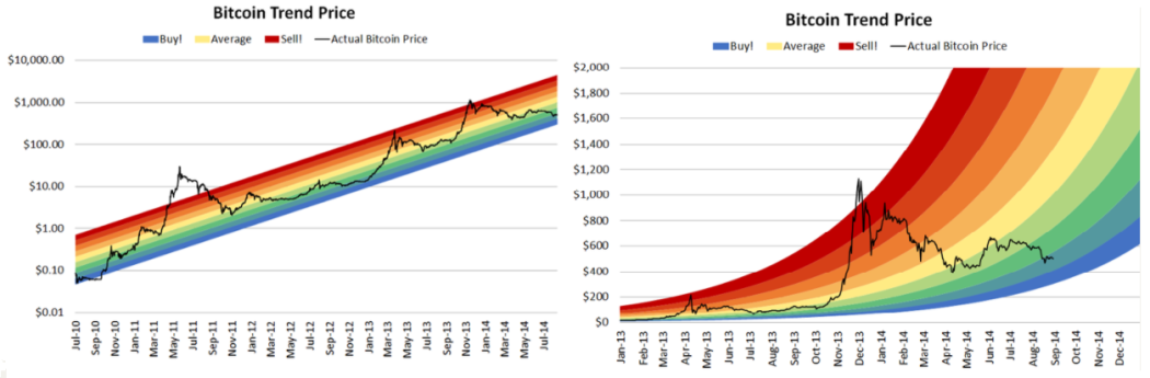
Pretty neat right?
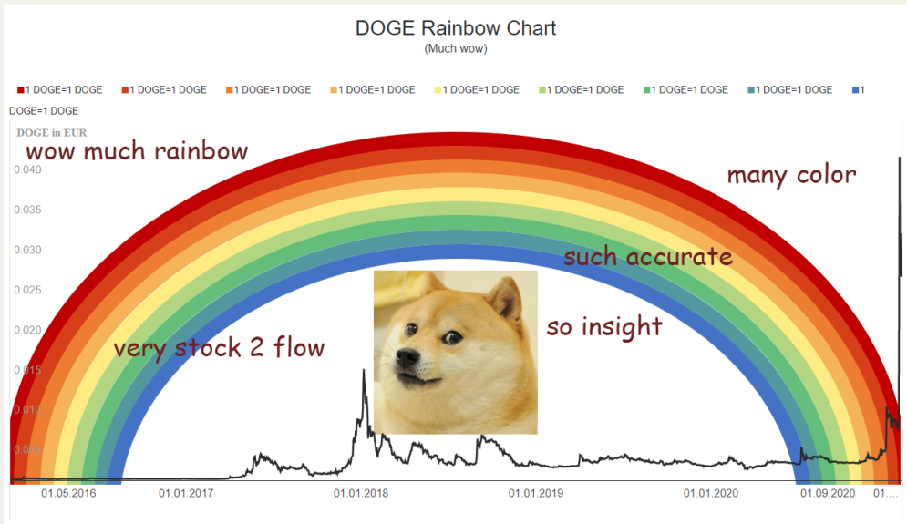
Anyways, I leave everyone with this last chart, the most important of them all. A smol rendition on the bitcoin rainbow chart, but for DOGE, also by Uber Holger:
Until next time, stay strong my friends.