![[LEARN TA] Price reading, an important source of information](https://www.publish0x.com/img/15237.webp?action=resize&ar=1&enc=webp&inv=0&ori=1&st=1&up=1&w=1140&signature=f840c20b65839add75d81bbb6bd26358abd7cfcc0ee20028ac7dfc41a3a2c8d0)
Today I decided to bring a didactic post because I found the graphic of XEM and RCN in their current movements quite informative, I enjoy doing this kind of post, I hope you enjoy your reading and learn something new in the process :)
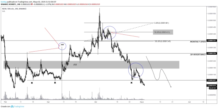
In the image above we have the graph of XEM seen from the temporality of 4H, the first thing to explain is the area of the first blue circle where I have written an HH, at that point we notice a higher height compared to the previous I have indicated through the red arrows, when we have that drawing by the candles means that the trend is on track and we will have new heights later, we can also see the area marked by a gray rectangle, this area is known as ITZ (Important trading zone), the area that encloses the rectangle is bounded by a specific area during the previous bearish trend, this area is important because if the candles manage to break that area, we would have an important signal to buy.
In the graph above we see that when the candles broke the ITZ point, a throwback was made towards the support, tests it correctly and begins to rise again, during the movement we see how the minimums formed by the wicks of the candles are higher every time, this for us will represent that the trend continues with force.
After following its course, XEM has reached a zone that has prevented it from passing and begins a strong retreat until it hits the support zone, after this happens the price consolidates the support and undertakes a new bullish movement that ends up forming a lower high, the price repeats the movement and creates another lower high, when we begin to observe this movement, we must interpret it as red lights of alarm, because it is very possible that the tendency has come to its end, and this preparing a strong movement of correction, something that must complement this observation are the minimum formed by the wicks of the candles during this movement, these are becoming more and more in parallel one of another, sign that it is losing force on the part of the bulls in its movement to the rise.
A technique I use to determine if I should already leave my long positions (if that were not enough!). :)) is to place a fibonacci with 0, 50, 100, levels 0 and 100 mark the high and low zone of a range, while level 50 indicates the key point that will tell us if the chances of selling are greater than those of following the upward trend, in the chart above and at the top of the trend, I have indicated within a blue circle the time when the candles test the level 50 fibonacci without being able to close from above what causes a strong downward movement that breaks the range zone, after making this move, the price makes a pullback towards the bottom of the fibonacci range that ends up confirming to the most disbelievers that the trend is now bearish, these pullbacks are important because they provide us almost a second chance to get out of a bad decision within the market.
After confirming that the price will continue to fall, the candles undertake another strong downward movement that end up closing below the ITZ point indicated by the gray rectangle, this is the strongest signal that the trend has changed downward, we return to perform a pullback into that area, test the now resistance and the price begins to fall again, in the chart I have also marked a strong support where previously the price had taken bullish momentum, many traders might think that once the price reaches that support the price will begin to rise or failing that enter a range, however, experience has told me that once the bearish movement breaks the ITZ point before the support, the price will continue to fall beyond the support to form a new LL in relation to the first LL formed before starting the bullish movement explained above.
I have tried to narrate the XEM movement as best as possible, now I would like to compare it with the movement made by RCN today 2/05/2019.
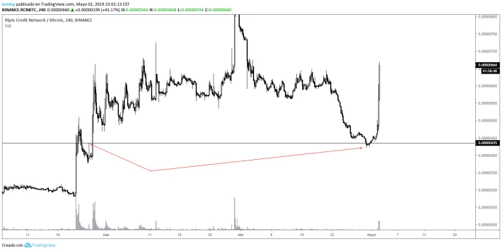
In the image above I have pointed with the first red arrow the high formed by the candles within the range prior to the bullish movement, this high indicates the ITZ point of the current movement, once the price begins to correct, the candles should reach that area, perform a successful test and find demand that ends up starting a new upward movement, compared to what happened with XEM, this currency has respected the support which has caused the purchase volume to increase and there is that strong bullish movement that we see in the chart. I found it interesting to make this comparison so that the explanation made with XEM could be better understood.
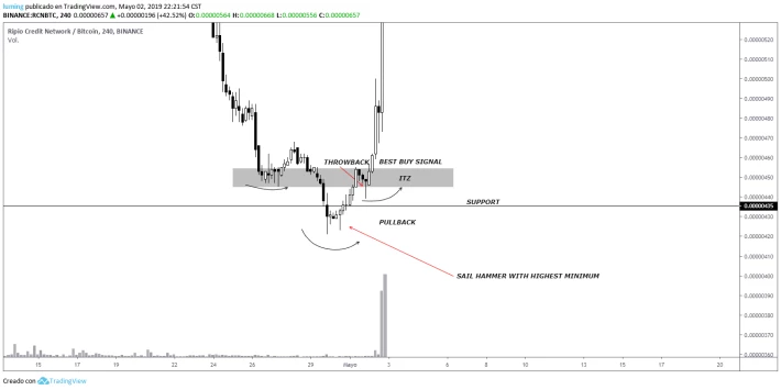
Now let's take a closer look at what signals RCN gave us to determine if it was time to buy. In the image above I have commented the most important thing to explain.
The first thing we can observe is that before reaching the support, the price takes a break after its bearish path, the price during several candles consolidates forming for us an ITZ point that will serve as a reference later, after the consolidation the price makes a pullback that would not be more than a trap for bulls, because after a brief upward movement the price finds resistance that ends up pushing the price down, reaching the support the price stops, but the next candle of 4H manages to close below the support, before taking a hasty decision we must wait for confirmation, the first thing we must analyze is the candle that has broken the support, the candle has formed a lower wick longer than the maximum formed by the upper wick, this can be interpreted as there was more volume of purchase than sale, this data in principle already gives us an indication that the price despite having broken an important support could have recovery. The next 3 candles begin to consolidate above the minimum previously formed, and then produces a bull hammer candle that reconfirms the intention of traders with this currency, the next bull candle manage to close above the support, recovering it, then the candles manage to hold the position and then "the train leaves the station", the price begins to rise until it meets with a resistance that causes a throwback to occur, here it is important to point out that after my experience it has always been a strong buy signal that the movement before the throwback finds resistance at a lower level than the previous HL where the ITZ point was generated, and at the same time that after the throwback is generated, the sails close above the area delimited by the ITZ point, as we see in the image above, this has happened perfectly, giving the best buy signal what ends up producing that strong bullish movement.
The above does not mean that RCN will continue to rise, however if you entered after the recovery of the support, you took a strong gain, RCN could start to fall from here to form a new LL, or failing that, form an LH within a range that gives us a signal to continue the bullish trend, all these data will continue to provide the same price action. :)