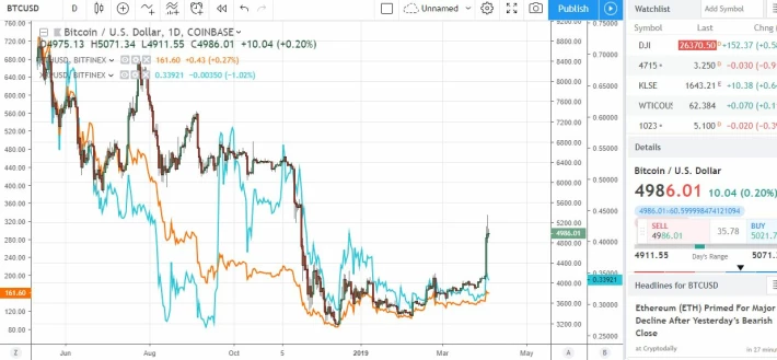
Img courtesy: Screenshot from my account in Tradingview
Analysis of the Chart : I've been always a chartist. I analyse stocks. When you chart alot, there is this automatical visualization of charts. I wanted to check if there was a huge correlation between the Cryptos. To proof this, I used Bitcoin/USD chart then I added some other charts to compare. I took the cryptos with the biggest market capitalization. The Blue line is the XRP line of the prices of XRP from June 2018 till the present date. The orange line here is the price changes of Ethereum. The advantages of using such comparisons is to have a benchmark with BTC and to find out which Cryptos would have performed better in comparison with Bitcoins. My analysis from the charts shown above is to find the correlation between the different cryptos. This was used to show whether the rise in BTC would cause a rally of other cryptos. The condition for this is for those cryptos that are in the top 30 in terms of their sizes in Market Capitalization. Referring to the chart above, it can be seen that, there is indeed a corelation between the different cryptos. All the cryptos move in the same direction. When BTC falls in prices, every other crypto falls. Ether moved closely with BTC.
If you love to read charts, you can create your own at tradingview.com
Luueetang






