
With today's growing internet world, more and more websites are popping up filled to the brim with data and information - sometimes more than we can handle (at least at a first glance).
Do we (as site-owners or web developers) ever consider how our design principles impact the lives of the average end-user?
In the following article I will take on a few usability approaches by the horns and clear up some common sense expectations for web (and mobile) design. The inspiration for this article comes from a little fantastic book called Don't Make Me Think - by Steve Krug.
Before I press on, I would like to point out that this article contains summarized information from the book as understood by myself - perhaps not everyone may agree with all the ideas which are portrayed in the article (or in the book) - it may be opinionated (by the author) but it has its place in usability tutolage.
If you disagree with any points or have any counter-arguements, I would love to hear them in the comments section. :)
This book contains a plethora of information to help us improve our design principles in order to create the most user-friendly interface possible for our websites.
I have summarized and simplified some of the chapters in this book which I found to be of great importance and interest, and even though I will not delve into every single section of the book itself - I would like to point out some of the chapters which I used as a reference and basic guide for this article.
- Chapter 1: Don't Make Me Think (Introduction)
- Chapter 2: How we really use the Web
- Chapter 3: Design Web Pages for scanning, not reading
- Chapter 4: Why users like mindless choices
- Chapter 5: Omit needless words
- Chapter 10: Usability as a common courtesy
And now... On with the show!
Don't make me think
"A person of average (or even below average) ability and experience needs to be able to first figure out how to use something in order to accomplish something, without it being more trouble than it’s worth."
The above is known as Krug's First Law of Usability - yes the author made this rule-of-thumb up and its named after him as a result, as well as a couple more laws - to be defined later on.
This law more or less makes complete sense; if something is too much trouble, why do it? In the context or browsing the web, if a web site is too troublesome to navigate or understand, what's to stop a user from simply leaving and looking for another (better) web site?
So how do we illustrate this principle in a graphical manner?
Let's take the perspective from an end-user who happens to stumble upon a website where they wish to get to a certain piece of information, in this case they wish to see which jobs are available at a company's website.
Use case #1:
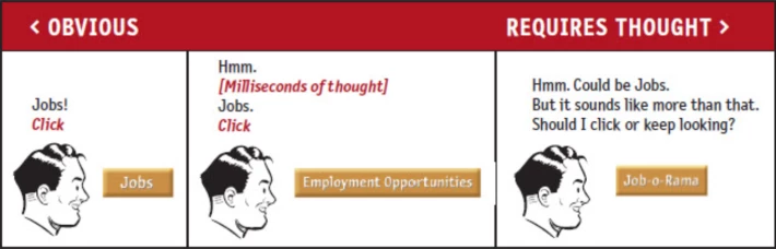
- A button named Jobs
- Short and sweet, this is what I want, so I click it.
- A button named Employment Opportunities
- Hmmm, this also means Jobs I guess, lets try it (milliseconds of thought wasted)
- A button named Job-o-Rama
- Hmmm, could mean "Jobs" - but maybe its something else or something more. Should I click or keep looking? (milliseconds of thought wasted)
This use case illustrates the power of simply choosing the right word/s which will convey (in the fastest way possible) the correct meaning of a button.
In programmatical terms this can be compared to the KISS principle: Keep it Simple Stupid!
Use case #2:
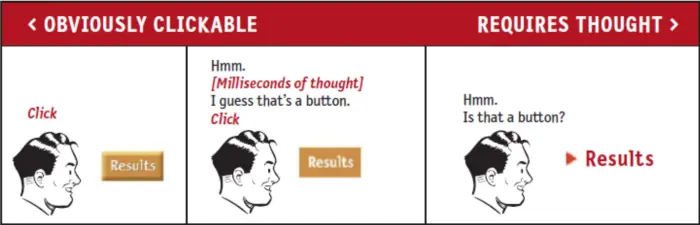
- A beveled rectangular block with text inside
- Obviously a button and clickable (almost all standard buttons look similar to this)
- Just a rectangle with text
- Hmmm, is this a button? I guess it might be...
- Just text with an icon
- Hmmm, is this a button? I guess it might be...
Here we can see how much of an impact the design of an element can have on the thought process of an end-user. Most of us know what a button "should" look like and this is what we expect to see when we are looking for something to click on in order to reach a certain section of a web site.
The point we are trying to get across with these use cases is that it is always easier to present data on a web site which requires as little thought as possible. Yes this does more or less portray humans as lazy - but with good reason. We cherish time, and many of the things we do, we rush to do. (Time is money isn't it?) - Browsing the internet is no exception.
Not everything can always be self-evident.
If not, settle for self-explanatory
How we really use the Web
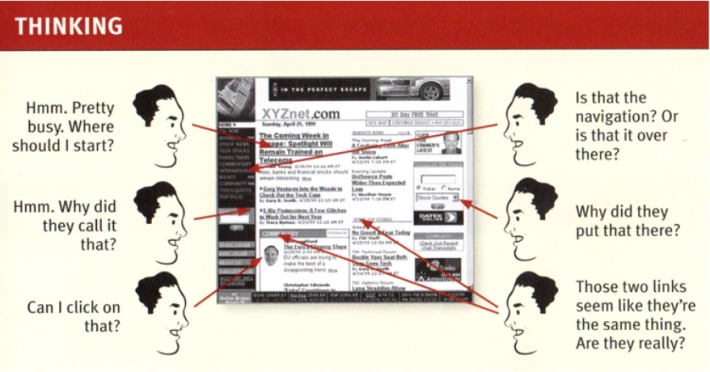
Reading is something most of us learn to do at a very young age, and our brains get accustomed to processing data from the pages of a book (just like the pages of a web site) - our very eyes are trained to spot key words in each line of an article quicker and quicker as we practice our reading over the years. Muscle-memory could be a great comparisson here to point out, but let's not, and say we did.
Anyway, quick-reading is also known as "scanning" by some experts - and the following is therefore no surprise.
FACT OF LIFE #1:
We don't read pages. We scan them.
WHY?
- We're usually in a hurry.
- We know we don't need to read everything.
- We're simply good at it (insert muscle-memory comparison here)
FACT OF LIFE #2:
We don't make optimal choices. We satisfice.
WHY?
- We're usually in a hurry.
- There's not much of a penalty for guessing wrong.
- Weighing options may not improve our chances.
- Guessing is more fun.
FACT OF LIFE #3:
We don't figure out how things work. We muddle through.
WHY?
- It's not important to us.
- If we find something that works, we stick to it.
So what have we learned with the above arguements and examples?
The answer is our very next chapter title. Therefore...
Design pages for scanning, not reading
In order to explain this further, lets step into a few examples on how we can actually achieve this.
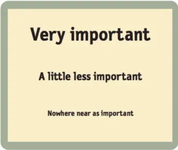
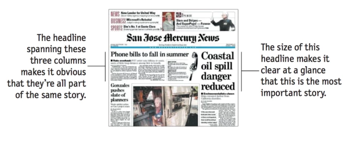
- Create a clear visual hierarchy on each page.
The more important something is, the more prominent it should be.
- Take advantage of conventions.
Use the norms as your guide.
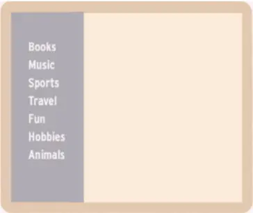
- Break pages up into clearly defined areas.
Things that are related logically should also be related visually.
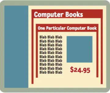
Things are “nested” visually to show what is part of what.
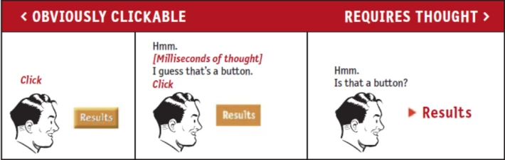
- Make obvious what's clickable.
Is this text a button?
- Minimize noise.
I need to see what fits where and what is part of what.
Why users like mindless choices
"It doesn’t matter how many times I have to click, as long as each click is a mindless, unambiguous choice."
Zombie-mode might have just been activated but we have just listed Krug's Second Law of Usability which I can attempt to dumb down a little further.
Users don’t mind a lot of clicks as long as each click is painless and they have continued confidence that they’re on the right track - following the “scent of information”.
Omit needless words
Going hand-in-hand with getting rid of "noise" brings us directly to Krug's Third Law of Usability which states:
"Get rid of half the words on each page, then get rid of half of what’s left."
- It reduces the noise level of the page.
- It makes the useful content more prominent.
- It makes the pages shorter, allowing users to see more of each page at a glance without scrolling.
In other words:
HAPPY TALK MUST DIE.
INSTRUCTIONS MUST DIE.
Come on, so much theory, give me another practical example to understand what you are talking about...
Okay let's say I have a website with some instruction text and a button.
Firstly, imagine my text is as follows:
The following questionnaire form is designed to provide us with some information that will help us to improve the site and make it more relevant to your needs. Please fill it out and then click on the submit button.
This should be replaced by something way quicker to scan through and understand while still getting the main point across.
Provide feedback to help us help you!
Usability is a common courtesy
With everything that's said and done, let us recap on some of our reasoning as to why usability is so important for web sites just as it is in the real world. Each and every person expects to find what they are looking for with as little effort as possible, especially in cases where the customer is paying for something from a company or service provider for instance.
In the context of browsing web sites specifically, how much effort do you think a user will invest into trying to navigate through mangled and garbled pages of text and images, with no clear indication of where they need to go in order to find what they want, until finally failing and simply navigating away from the website altogether?
This "effort" will likely vary from person to person, but lets take an awesome example of an average supermarket visitor trying to find and buy something by illustrating the decision-making process on a data diagram.
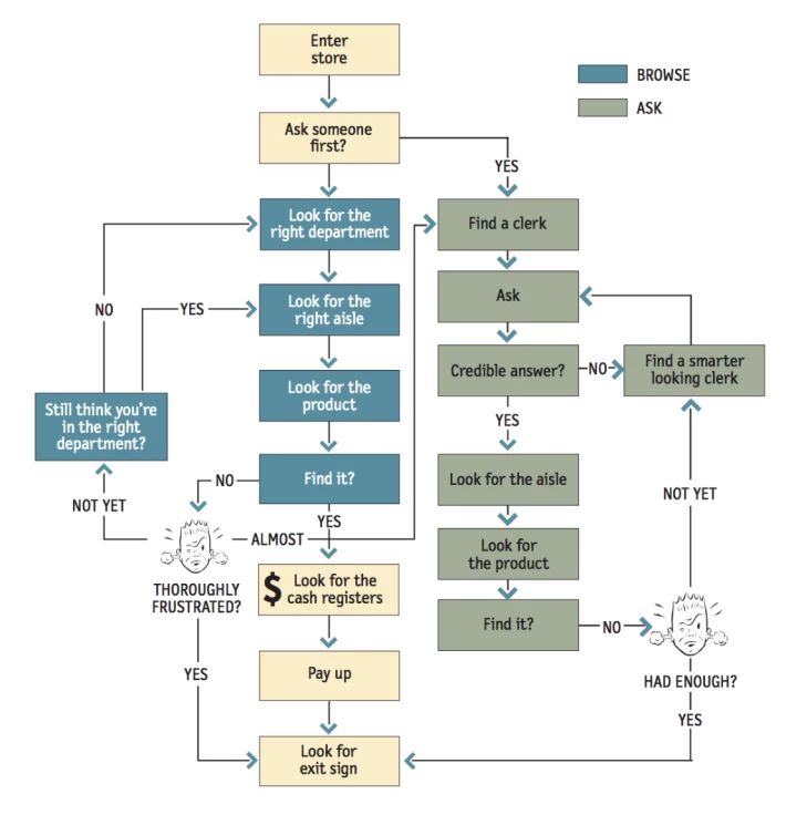
Quite a simple example and it sure makes quite a lot of sense. This is quite similar to a user's behaviour on the internet when in search for something. It is not that far-fetched at all when you give it some thought.
So what should we do in order to keep our users clicking on our site (even after failing) and ensuring that they dont give up and navigate away?
- Know the main things that people want to do on your site and make them obvious and easy to get to.
- Find out what most users want and show them what they want to know.
- Save them steps wherever you can.
- Put yourself in their shoes - and put some effort into it.
- Know what questions users are likely to ask, and answer them (FAQ page?).
- Make it easy to recover from errors and misclicks.
That brings us to the end of this article. If you have any questions and/or suggestions please feel free to leave a comment below.
Resources: Usability lessons from "Don't make me think" book by Steve Krug.






