Today we will take a short look at CSS Grid Layouts, what they are all about, what their purpose is and how to implement them.
Surely most developers have heard of (and used) bootstrap in the past in order to create responsive layouts, which can be customized for different viewports and devices via media queries. This has been a massive step towards an innovative and somewhat immersive web environment - and it was great at the start, until users began overcomplicating things...
Layout implementations such as Bootstrap and Masonry have assisted in building consistent layouts for displaying data on websites in a neat and tidy fashion, and this was made possible thanks to standard CSS properties such as defining element positioning.
position:absolute;
These layout solutions worked great, up until the point where users wanted to shuffle sections of their page around depending on the viewport size or type of device used. In essence and for example, users wanted to place elements in the center of a page on a desktop viewport and somewhere at the top on mobile. Even though this was possible, shuffling numerous elements in this manner created a lot of style code (which could be simplified) and visual bugs where layers were not rendering consistently across different browsers became commonplace.
This is why the CSS Grid System came along to resolve all of these diagnosed complications, by offering a grid-based layout system, using rows and columns, and theoretically making it easier to build web pages - without having to play around with element floating or positioning.
The new grid system was almost instantly adopted as a great replacement for the previous layout implementations and quickly became supported in all modern browsers - simply due to how awesome and popular it is.
So what exactly is this CSS Grid layout and how does it work?
Grid Elements and CSS Properties
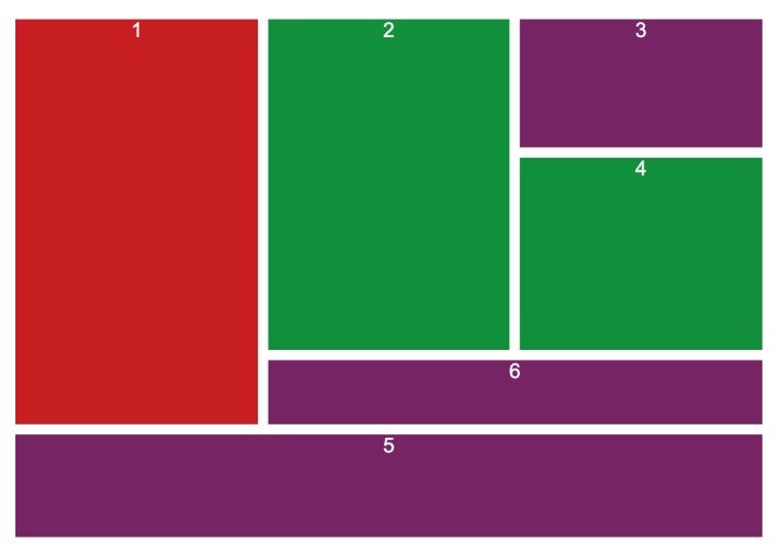
The grid system itself does not deviate too much from the norm where child elements are placed within a parent element and styled accordingly using the display property but using options: grid or inline-grid.
Doing this made every direct child element automatically become a grid item, and content would be rendered within rows and columns inside the parent which acted like a control container for its children.
Alignment of content within the grid system and specifically the grid-items was achieved using (the then) newly added style properties such as:
ALIGN => for rows ( align-item/s || align-content = vertically align items or whole grid )
JUSTIFY => for columns ( justify-item/s || justify-content = horizontally align items or whole grid )
Fractional and Mixed Units
Additionally, to help with grid-item dimensions, placement and sizing, a new flexible unit was also introduced for CSS Grid Layout. This unit was named the Fractional unit (fr). It denoted a fractional part of the available space present on the element where it is applied.
The great thing about these newly added units is that they were completely interchangeable with the already existing units such as pixels and percentages. How this works is that the fr unit values would be divided between the space which is left over after it is used up by the other typed unit values.
Here is a little code snippet with fractional units being used alongside other unit types.

Grid Layout Examples
So after explaining the grid layout system, surely some of you wish to see this all in action in order to better understand the system with real world examples. Well do not fret, I have prepared some lovely working code snippets for you to take a look at and play around with.
Feel free to use them in any of your projects and site-creation endeavours. :)
Isotope Example: https://jsfiddle.net/geostima/pwu5rdn3/
Profile Card Example: https://jsfiddle.net/geostima/whnqp0c3/

Simple Overlay Example: https://jsfiddle.net/geostima/b7qjnr6w/

Closing Notes
- Shorthands are more convenient to use, after an initial mindset is gained.
- In code examples we also covered the object-fit CSS property.
- In code examples we also used the repeat() CSS function.
Resources:
The following resources were used in constructing this article and can be checked for additional information about any of the presented topics.
W3Schools: https://www.w3schools.com/css/css_grid.asp
Complete Grid Guide: https://css-tricks.com/snippets/css/complete-guide-grid/
FR Units: https://alligator.io/css/css-grid-layout-fr-unit
CSS Repeat: https://developer.mozilla.org/en-US/docs/Web/CSS/repeat
Grid Polyfill: https://github.com/FremyCompany/css-grid-polyfill

