
Decentraland's MANA emblem is simple in its design but complex in its communication, and it's screaming for attention. There's a lot happening in there, so down the rabbit hole we go!
Color
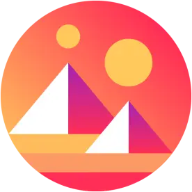
Decentraland decided to double down on the nostalgia factor with the gradient trend (see my Solana post) and have gone full Lisa Frank.

Two gradients make use of three colors: golden yellow, red, and purple. The background utilizes a red to yellow gradient, and we know from Bitcoin's design that the combination of these two colors can have an effect on our spending. But these colors are taken a step further and are being used as a background element: a sunset on an alien world. By blending these sometimes aggressive and exciting colors together into a soothing sunset they strengthen our emotional connection to the brand, because a sunset says "This day was awesome"!
The second gradient is used in the pyramids, transitioning from red to purple. Purple communicates luxury and nobility, and placing the white “hot spot” opposite the rich gradient is intentional, as I'll point out next.
Layout
O.K. First, if you don't know what Decentraland is I'll give you the nutshell – it's baby Roblox with crypto. Yes, I know. It's an oversimplification, but this isn't a comprehensive guide. Anyway, it's important to know that you use MANA to purchase virtual “land plots”, and that you can generate income with these plots.
The pyramid - a symbol of status, power, energy, legacy, and stability – painted with rich colors and an eye catching hotspot is a very blatant statement: hot commodity. At the very least, they want us to adopt a “landrush” mentality. In an image, the brightest spot commands the greatest amount of attention, and they want your attention on these pyramids.
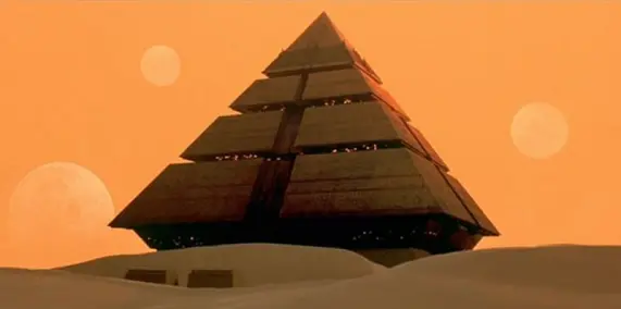
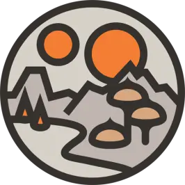
I like the use of the double suns. When we look at the old MANA emblem there is a surreal world being described, but too much is happening. The double suns are still there, but we also see tents and mushroom trees... maybe? Reducing this imagery down to double suns is enough to let us know we're looking at a surreal world. But the double suns have a double meaning.
If the pyramids represent land and we can earn crypto from that land, then the gold suns take on the symbolism of coins. Notice how the big pyramid gets a small coin, and the small pyramid gets a large coin? They want us to know that earning power is not tied to plot size.
We won't look at the typeface because there really isn't any to critique. I found a lack of uniform typefaces with a simple search and even Decentraland's own website refrains from using any special font to make their name stand out, choosing to use only the emblem in their nav. The decision to use only an image may reveal an interesting concept: they don't want us to think of Decentraland as a "place" we go to, but rather as an experience we are always connected to. By removing any accompanying text this emblem becomes a portal to a pocket dimension.
The design is pleasantly unique. A lot is happening, but now we know what and why. With a simple, geometric design and deep rooted symbolism Decentraland makes a good first impression. If you're interested in how some of the design decisions were made, you can read Decentraland's blog post here.
-fizzlstout






