
Not gonna lie, I almost bought Solana based purely on it's emblem design. But I did the responsible thing and went to their website to learn more, and almost bought based solely on their web design. Wow, talk about influencing our buying habits! (See my Bitcoin post.) Let's dive in!
Color
Minty spring green and magenta. Individually, the pastel green tends to be a soothing color while magenta likes to be shocking and exciting. Interesting side note: magenta doesn't exist as light but, rather, is a color constructed by our brains!

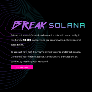
Tying mint and magenta together with a gradient gives this logo a cool, nostalgic, retro-punk vibe. It feels like I'm about to play a new kind of video game. They are clearly jumping on a popular design trend, however. Gradients have dominated the world of UI/UX for a couple of years, and it looks as though gradients aren't going anywhere for a while. That said, I am interested to see how long it will be if and when Solana rebrands itself... again. But for now, I believe they have successfully hooked their target demographic.
Shape
I absolutely love this. Their old emblem was squares arranged in a “S”. This new “S” keeps the idea of blocks, and adds a new motion dynamic: an accordion. The alternating parallelograms work to create an accordion-like folding movement. We're being told this is something that can be condensed or expanded as needed. What a clever way to communicate “scaleable”, a word Solana prominently displays and repeats throughout their website!

One very noticeable difference from other crypto emblems is the lack of a containing circle, a shape pioneered by Bitcoin. It's not uncommon, but in Solana's case I think this may be an attempt to move away from the idea that it is a “currency” in the traditional sense. By removing the “coin frame” we perceive it as an icon more than an emblem, and in the computer age we're conditioned to connect icons with apps and digital tools. One last thing to note here is that most, if not all, exchanges force coin emblems into round frames much the same way social media platforms do. There's no escaping that. So even though you may see a faint frame (or a magenta circle?! WTF Kraken? LOL), understand that the original intention of the design is meant to be sans coin.

Type
Using all caps fits the brand when considering the messages that the colors and shapes communicate. The typeface is reminiscent of 80's era tech that displayed block-form numbers and letters on liquid crystal displays. Using block shaped letter forms definitely communicates “tech” and giving the letter forms a roundness gives us a futuristic feel... see where I'm going here? Yep. Future tech.
Overall I really like the details that went into this design. The colors soothe and the “gamified” design invites us to learn about Solana. The combination of 80's nostalgia and modern tech worked extremely well. I'm also fairly certain somebody was listening to Gunship while designing!

-fizzlstout


