There are numerous ways to measure risk but one of the more common is to look at the variability of an asset's returns. As I've gotten deeper into crypto, the level of volatility that is deemed 'normal' is almost mind numbing to me coming from investing in more traditional asset classes. How big is that difference though?
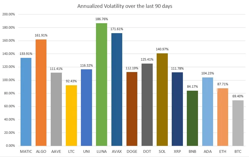
Below I'm pasting a chart I created that measures the volatility of daily returns for a hand full of large cap crypto assets over the last 90 days on an annualized basis. Why 90 days? Because it has been a relatively stable period for crypto currencies and I wanted to get a sense of what 'calm' looks like. Because of that, this is not exactly an apples to apples comparison but I think its still interesting. You can see that Bitcoin, coming in with a vol of nearly 70% was actually among the most stable of the selected crypto large caps over this period of time.
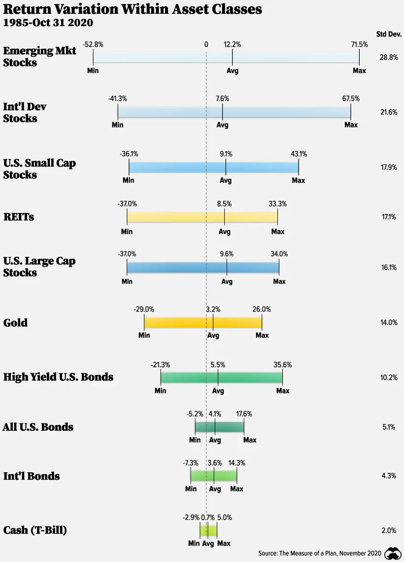
Below that I'm pasting a chart that shows the annualized volatilities of more traditional liquid asset classes over a much longer time horizon. Those figures can be seen on the far right hand side of the chart. You'll see that what is traditionally thought of as one of the more risky asset classes, emerging market equities, punches in at a meager 28.8% annualized vol.
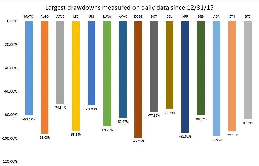
An alternative way of looking at risk is to measure the maximum drawdown of an asset from its prior high water mark. The third chart pasted below looks at the same crypto assets through that lens looking back to 12/31/2015, before many of these coins even existed. Several of these assets have had drawdowns of over 90%. In almost any other investing world, they would have been left for dead. Yet here they are at the top of the market cap charts.
No matter how you measure it, the risk profile of crypto assets dwarfs that of traditional asset classes.
Hope you find these charts interesting and as always, this is not investment advice.
Cheers,
NZFX