
How To Choose The Most Price-Correlated Candlestick Indicator
3 Steps:
- Multi-chain check for your target token.
- Select DEX Trades, CEX, or Liquidity metric groups based on The Balances on Exchanges chart.
- “Favorite” metrics to create your own dashboard
👉Price Forecast Via The Most Correlated Metrics
Step 1 - Check Token Signals On Multi-Chain
Candlestick supports multichain - Ethereum, Polygon and BNBChain.
Some tokens deploy on multi-chain. You may capture a bullish signal on one chain but miss a bigger up on another if you don’t switch blockchains.
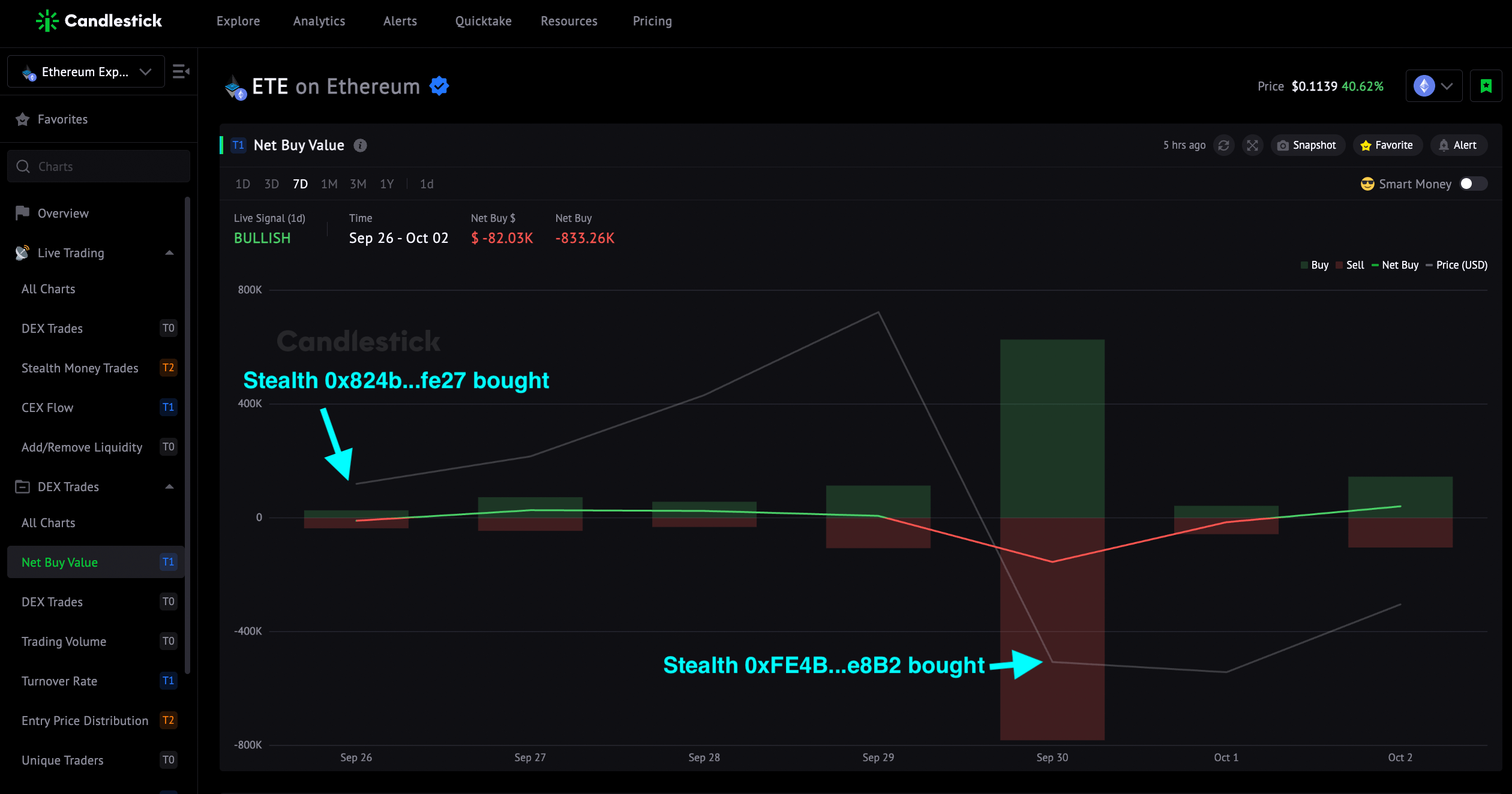
👉 TEL Skyrocketed Over 166% After The CEX Flow Bullish Signals on Ethereum and Polygon

Step 2 - Select Relevant Metric Groups
A token’s Balances on Exchanges refer to the token amount circulating on CEXs and DEXs. These tokens are available to the public for trading on exchanges and thus could affect the price.
- Supply is mainly on CEXs: Check the CEX Metric Group.
- Supply is primarily on DEXs: Check the DEX Trades & Liquidity Groups
- Almost 50/50 Supply: Check CEX, DEX Trades & Liquidity Groups
Two examples show you tricks.
Example 1: $TORN
$TORN CEX supply is significantly higher than the supply on DEX. Inflows and outflows are more sensitive to price than trades on DEX.
$TRON Balances on CEXs peaked on Aug 9. The FUD sentiment drove traders to transfer tokens to centralized exchanges. As a result, increased selling pressure sent prices lower.

Although a green candle was seen on Aug 10, the heavy inflows crashed the token price.
Step 3 - Customize Metric Dashboard
As Promised, We Ship More For You

- 8 leaderboards & 3 large transaction trackers

2. 6 new metrics for BNBchain token analytics
- 3 NETs: Net Buy Value on DEX, Net CEX Flow, Net Add Liquidity)

3. BSC payment, less gas!


