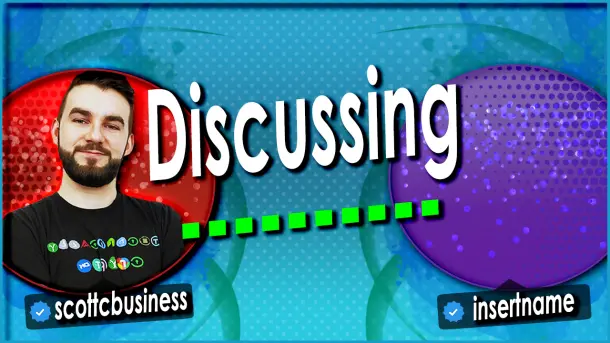
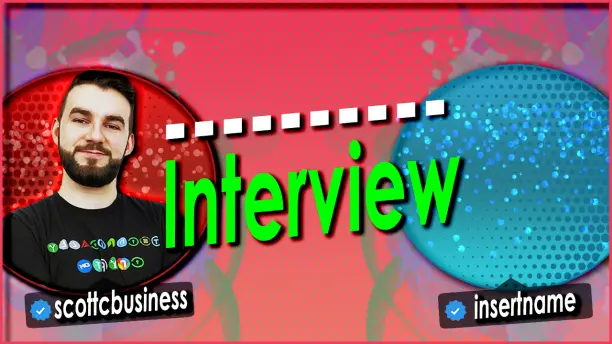
What do you think of some of the new interview and creator corner thumbnail templates I've designed? I think it's a lot cleaner. I usually get people telling me they like it, but I don't get a lot of useful critical feedback for color schemes or anything I could improve. Always happy to get that and am putting this out to get some feedback from my audience because you're the ones who have to see this stuff.
1.
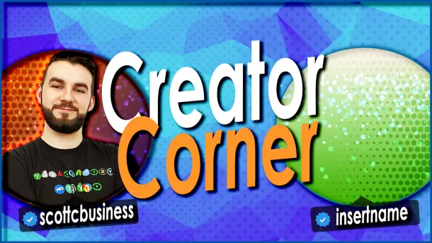
2.
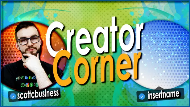
3.
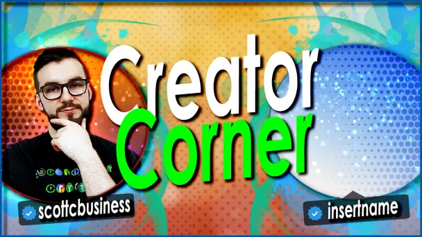
4.
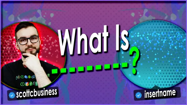
5.
6.
Thanks for checking it out. I want to always be constantly improving and would love to hear your thoughts on them below!