
In primary school, I didn’t have to buy books. I got them from the school. They were passed on from year to year.
I remember my teacher distributing books in the class and urging us not to write in them. We were only allowed to sign our names in the back for accountability purposes.
It was always exciting to receive a book that looked fairly new. Of course, that makes sense! Nobody wants to get a stack of pages that don’t adhere to the cover.
Sometimes we found additional notes or answers from the previous year's student. It only got us into trouble with the teacher as it was tempting to use the forbidden wisdom instead of your own effort.
I was trained to treat books well early on. Then I got my first Bible.
I took good care of my Bible for years. I washed my hands before reading it. Not because there was any religious duty. I simply didn’t want to touch it with greasy fingers and leave all kinds of marks!
Soon my patience started to wear off and my approach changed. I realized that if I wanted to study and get to know the Word of God well, I needed to interact with it.
The Bible is the book that has to be studied the most. It’s the book that shows the ways of life. It’s not a romance to read once and to put it away.
The Bible contains principles that can’t be grasped by reading it a single time. We need to ponder, meditate and apply in order to grasp the meaning of Scripture.
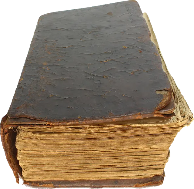
Books contain information. When the book is studied much, things become clear to the one who looks at it. Only the books that give us a lot of important insight show great wear and tear.
And by no means it shows a lack of respect!
I wrote a testimony book and it actually pleases my heart to see that the booklet is worn out like an old shoe. It shows the value of reading it more than one time.
Being “worn out” is the best compliment a book can receive.
God speaks in colors
Therefore, I don’t see marking the Bible as a vice anymore. Highlighting, underlining, and making notes in the Bible speaks to me more than just having plain text in front of me.
Different colors please the eyes and look more inviting. For some, it may look like a children’s coloring book. But the person that makes that comment usually is confused and gets lost in the Scriptures.
I don’t bother opening Google to find a verse if it’s somewhere in the New Testament. Google might give me results in less than a second, but let’s not forget opening the app, typing the words, and then scanning for the right reference in the list.
I’m not even adding the factor of distractions that the phone or laptop throws at us with notifications!
I’m quick to find verses because I spend time reading and marking the text. It helps to see the structure of the text. The things that stand out are no longer lost among all the similar-looking ants on the page.
How do I do it?
Over a couple of years, I developed a system that works well. There is a fixed number of ways the Bible relates to us. When we separate them in different colors, it helps not to get lost.
Highlighters I use:
- Green — a principle or a truth. I always use this color for text that reminds me of the truth and reality I live in. I don’t get to make a compromise or water down what God has set in place as a principle.
- Pink— a promise or a prophecy. When I feel a lack of hope, my eyes are always drawn to this color. It paints a hopeful future and helps me to step another step when times are difficult.
- Orange — an instruction, command or direction. This is like a road sign that alerts me and keeps my feet on the right path. Directions and commands are a reminder of who I’m created to be. However, it’s not a rule I have to follow to please God.
- Yellow — a description of the character of God. When I have a desire to remind myself of God’s goodness, I turn pages reading only the yellow parts. It grows my love for and trust in God.
- Blue — a prayer, blessing, or praise. This color reminds me of heaven. When we praise or pray we lift our eyes to see the blue sky above us. Communication with God always has to end up bringing a piece of heaven into our hearts.
One of my most recent additions is a purple underline to show who I am in God’s eyes or my identity as a believer. We are declared to be priests and kings unto our God. In the Bible, purple represents high value. Jesus paid a high price to redeem us. The purple underline reminds me of my great value and points me to Jesus.
Lastly, the red underline is used to draw attention. It’s the most flexible and can include anything that doesn’t fit into other categories.
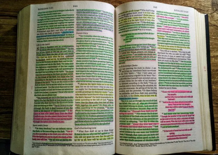
That’s how I get familiar with the Scriptures. It’s a very rewarding process that doesn’t get old.
If you struggle to fall in love with the written word of God, my suggestion would be to consider highlighting it or drawing in it. There is nothing bad about personalizing what you value.
Among all the colors and lines is the place where the wisdom of God meets the creativity of man and expresses itself in a visible manner.
For more useful insights and tips subscribe to my monthly newsletter.






