
Introduction
It's been more than a year ago (thanks to Igor Tomićt for correction) that Publish0x has added the dark theme support to the platform. As someone who is in the software industry and also spends a lot of time in front of the computer, I really appreciate that effort. However, at the same time, I have some feedback that hopefully helps in the future iterations to have a solid theming.
Disclaimer: By no means I'm a designer or have aesthetics taste in theming. Additionally, this article is not aiming to downplay the massive effort of Publish0x on bringing dark themes to the platform. As all of us are aware, the theming feature is still in the experimental stage and some hiccups are normal and totally expected. That's why providing feedback helps to the platform improvement which essentially all of us will be benefited from. Hence, I've decided to write this article to provide some feedback and share my experience.
I have been using the dark theme (dark gray specifically) for sometimes now. All and all it's good but as it's in the experimental stage, still there are some inconsistencies here and there. I figure out I can write this article to summarize my experience of using the dark mode and point out some of the flaws.
How to activate the dark themes
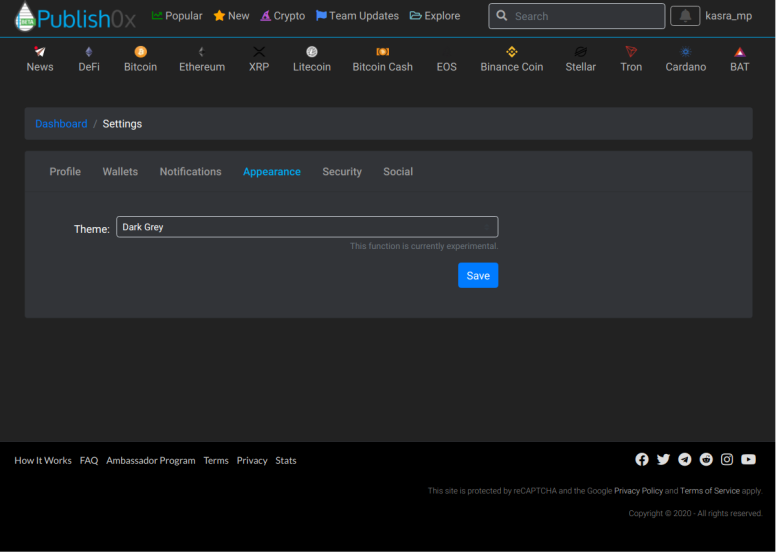
There are two themes, Dark Grey and Black (Optimal for AMOLED displays). You can activate them by going to your profile setting at this link.
This is how Dark Grey theme looks like,
Black (Optimal for AMOLED displays) also looks like this,
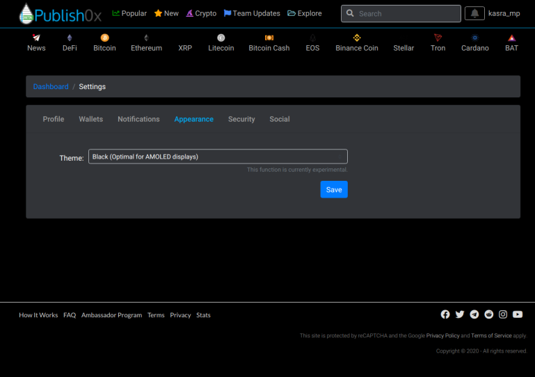
I personally prefer Dark Grey ddd as the contrast between colors is lower and fits me better.
Some feedback about dark theme feature
No announcement from Publish0x
I check Publish0x every day but I did not get a notice about this feature. Or maybe I missed it. I randomly found out through some community posts. My first suggestion is to have an official announcement. This is a great improvement and more awareness means, more people using it, the feature gets tested more, more feedback provided, and generally improves the platform.
Note: if there was and I missed, please write down in the comment and I'll amend the post accordingly.
Some spotted inconsistencies
In this section, I talk about some of the inconsistencies I have spotted while using the Dark Grey theme.
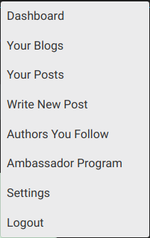
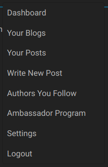
Drop down menu color doesn't change
No matter whether you use Dark Grey or Black (Optimal for AMOLED displays) theme, the drop-down menu color doesn't change.
Ideally, it should look like this.
Notification colors do not change
Similar to the drop-down menu, notification colors do not change. I attach two samples as follows.
One may argue, since they are notifications and important, perhaps the colors shouldn't be changed. I also agree to some extends but I believe the colors can be adjusted to such that they blend with dark themes better.
White text color makes the text more readable
I tried to change the text color on Dark Grey theme to white and I found that the text is more readable. You can compare it yourself.
Without change,
The result of switching the text to white using inspect element,
Correction one: Publish0x introduced the dark theme more than a year ago not a month ago (Thanks Igor Tomićt for the correction).


