
Trump overturned decades of US trade policy in 2025, and this time we actually have data that shows what happened after tariffs were imposed. The results are largely what the administration wanted, and on paper, they look strong.
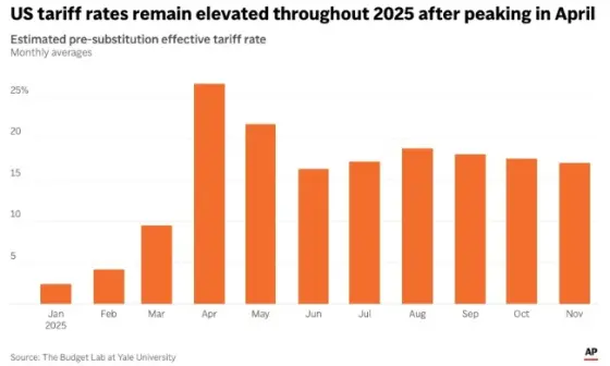
The charts I am sharing tell the story clearly. According to data from the Yale Budget Lab, the effective US tariff rate peaked in April 2025. Even after some adjustments in consumption, tariffs remained extremely elevated. By November, the effective tariff rate was close to 17 percent, nearly seven times higher than the average at the start of the year. This is the highest level seen since 1935, which alone shows how dramatic the shift has been.
Tariffs are also generating real money. Through November, more than 236 billion dollars has been collected, far higher than any recent year. This confirms that tariffs do work as a revenue tool. However, they still make up only a small portion of total federal revenue. Despite strong numbers, they are nowhere near enough to replace income taxes or fund large scale dividend checks, as some political claims suggest.
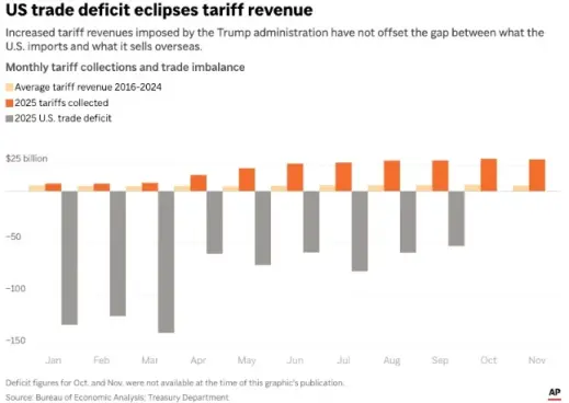
These numbers look good in isolation, but they also create a new incentive problem. Strong and steady tariff revenue, especially with relatively low media coverage, could encourage even higher tariffs in the future. That is where the long term risk begins. Over the coming years, the US will have to find a balance between using tariffs as leverage and maintaining workable trade relationships. Pushing too far could disrupt supply chains or trigger retaliation.
China remains the biggest hurdle in this equation. Any serious tariff strategy eventually runs into the reality of US dependence on Chinese manufacturing and global trade flows. Dominance by any single country is something the US wants to avoid, but doing so without harming its own economy will be the real test.
This is my first blog on the site, and I plan to write more posts like this if readers find value in breaking down economic data without political noise. The graphs used here were taken from Yahoo Finance, and I will continue using publicly available data to explain what the numbers actually mean.






