
Candle charts for Crypto Beginners:
Candle charts are one of the graphical methods to view the value of the market at periodic intervals. If you’re a beginner to crypto investments, you are highly likely to see this form of graph and wonder what are the rectangular boxes inside the graph charts. Well, Candle charts are introduced by Japanese people and these are to understand the opening and closing market price at a given time.
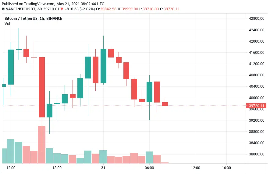
The figure shows us the candle chart representation of the BTC/USDT pair in the Binance exchange. The image is obtained from trading.com. The image displays a 1hr price chart for the BTC/USDT pair. The green color candle shows the value is increased during that hour and the red color shows the value is decreased in another hour. The rectangle bar is just a summary of the opening market price and closing market price.
For example, at 06.00 hrs, the chart displayed a candle of price ranging from 39,840 to 40,540 USD, this means at that hour the price initially started at around 39,840USD and end of the hour it becomes 40,540 USD and that shows price increased from low to high which is shown in color green. Then, the next hour chart representing the red color shows the values reversed from 40,540 to 39,840 USD. As the values reduced from high to low, it was represented in red color. This is an hourly candle chart representation, one can view the same for minutes, hours, weekly, monthly and yearly charts.
Candle charts are introduced to understand the market price and volatility. If the size of the candles is very long then it means the volatility is low and in case if the size of the candles didn’t change much and it stays in the same range then its volatility depends on day traders. Understanding candle charts help you to decide the price for your asset before you buy/sell.
Next time, before you purchase, understand the market volatility and buy the coins at the best price.






