
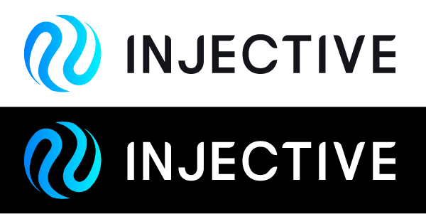
Injective announced an upgrade to their logo and brand identity! I was unfamiliar with Injective before this announcement and at first glance this new logo is undeniably an upgrade. But even with this enhancement to the brand, there are some details that could be cleaned up. Let's roll up our sleeves for an Injective brand inspection.
Color
Injective makes use of a very soothing blue gradient. This monochrome palette feels like a clear, serene ocean. Where serenity exists there will also be meditation and the idea of meditation brings to mind intelligence. In fact studies on color psychology have shown blue to improve performance when completing detail-oriented tasks and creative tasks, no matter the difficulty.
When tied together with a gradient transition, the concept of a smooth, perpetually changing, infinite ocean-like network of financial markets is easily extrapolated.
Type
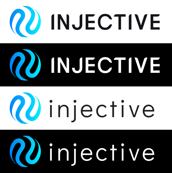
Injective's sans serif typeface strikes me as a bland attempt to convey uniqueness. The rounded corners of the letter strokes feel very arbitrary, as though they were an after thought or a last minute addition. They don't appear to have any pattern or uniformity aside from the round corner, which also creates some strange illusions. For example, the I and N each have a rounded corner on opposite sides making them look like they were clipped to fit a circular frame; the E bars are equal length, but the top bar looks shorter; the C just plain looks weird. Neither the wordmark nor the letterforms adopt the symmetry of the icon next to it. Also, consider what the brand immediately tells us with just their color and name. "INJECTIVE" in all caps is like an adrenaline rush - it actually feels like an injection - and it directly opposes the tranquility of the blue. In my opinion the current typeface is inconsistent with the overall message. Take a look at a lower case version and decide for yourself which one fits. There isn't a wrong answer, but observe the difference in the message each one communicates.
Web/UI/UX
Injective's UX adheres to the industry standard of dark mode interfaces. The design uses plenty of outer glow effects and high contrast elements, all of which mimic the same visual stimulation given to us by our video games. But where others in the industry utilize saturated colors to infatuate us, Injective's glowing blue adds a general intelligence. This radiance, simply put, feels smart and that means successful design.
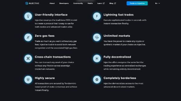
Injective's web site responds to mobile devices as expected. They have an awesome solution for their calls-to-action. Where most web designs force boxes to stack, Injective's intuitive design uses a sliding carousel. This isn't an uncommon feature, but this is exactly the type of design that reinforces the idea of intelligence.
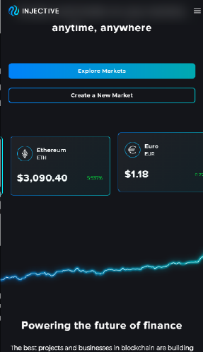
Injective's web design is smart and highly inviting and it successfully communicates their brand identity.
Concept
Injective's icon is an abstraction of the yinyang, a symmetrical symbol from Chinese philosophy. It represents duality, two halves of a whole that move in perpetual balance. One side can never fully overtake the other, yet each side contains something of the other within itself. We can observe the same infinite act of balance in the Injective icon, too. This new icon feels like a trail of dye swirling in a glass of water, and this feeling reiterates the perpetuity communicated by Injective's brand.
The word “injective” is a mathematical term used to describe the property of a function. Math isn't my strength but my understanding is that an injective function is a one-to-one function, and for me 1:1 is enough to fortify the idea of balance.
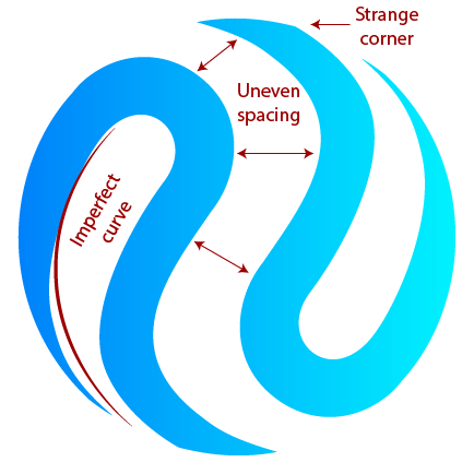
Injective's new logo is a giant step in the right direction for their brand. Adjusting the wordmark and smoothing out the curves of their "yinyang" just might add the weight needed for Injective to catapult itself over other defi brands.
-fizzlstout


