
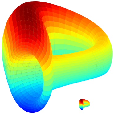
When I first saw the logo for the Curve DAO token I struggled to realize what it was. I saw an amorphous, multi-colored blob, that maybe, kind of resembled a weird “C”? It was neat, but I moved on.
When I started to research DeFi yield farming, Curve.fi showed up again and that's when things became “curious-er and curious-er”. Upon closer inspection, this blob revealed some interesting concepts, so lets crawl down this rabbit hole.
Color
Curve.fi is using all of the colors on the visible light spectrum; a rainbow. The rainbow has an interesting psychology on us. It is directly symbolic of the human-divine relationship; white light being the “source” from whence all other colors emerge. Each color summons forth certain emotions or specific memories on both the cultural and personal levels, thereby making the rainbow “human”. So, the rainbow represents unity, blending, and diversity.
Take a moment and try to recall a rainbow logo. Most people will think of a child care business, perhaps a charity, or maybe a major television corporation, but in each one there is a sense of happiness and welcome. That “happiness” is lost in this icon. The unusual distribution of this multi-colored gradient looks more like a FLIR heat map than a rainbow, and the surface of this shape is faceted with a grid. This is where color meets concept.
Concept
The mimicry of an infrared device and a topographical overlay forces our brains into an “information” mode, of sorts. The grid allows us to observe the wormhole-like “shape”, so we are inclined to look at this as an astrological anomaly. It then becomes an easy task to imagine complex algorithms and cryptic mathematical symbols associated with this shape, thus Curve.fi successfully communicates an expertise in the collection and management of all data, metadata, or even meta-metadata that orbits their gravitational pull.

But Curve.fi uses a neat little infinity knot to tie the concepts together; a Klein bottle. The Klein bottle, like the Möbius strip, is a non-orientable shape. That is to say, it has only one side and no discernible edge. If one were to travel along the plane, one would eventually find oneself “upside down” or “within” the Klein bottle without ever having transferred from an edge. Yes those are confusing words, but trace a line with your imagination and you can observe this effect for yourself.
This is Curve's delightful, playful way of communicating the dizzying business of DeFi yield farms through their icon; an alternate plane of existence where things can become confusing if one doesn't pay attention. When I first learned about LP tokens and how to utilize yield farms, there was a Wait! What?! moment of realization, and the use of this enigmatic shape precisely captures that feeling of epiphany.
So, when all of these ideas come together as a whole, it becomes evident that Curve very intentionally chose design elements to communicate its identity. It is supported by the rainbow of humanity providing liquidity, infinitely curving in on itself with the copious amounts of market data coming in and pouring out.
Well, there you have it friends. What was once a confusing blob to most of us has been explained. Once you've seen it, you can't un-see it. I think it is a wonderfully congruent design, especially for the early days of crypto/blockchain, but it doesn't feel "timeless". With an "in-the-moment" logo design begs the question How long are you in this for? Is Curve.fi here to stay, or have they distracted us like moths with a flame?
Of course, as is always the case with art and design, the ideas and concepts here are subjective yet absolutely food for thought! This isn't the only illusory logo in the DeFi design arena, but it is unique and I am very excited to see what new ideas the cryptoverse will produce, both technologically and artistically.
-fizzlstout


