
Good day everybody,
Welcome to CryptoGod-1's blog on all things crypto. Today I am going to focus on a chart a lot of us are familiar with, some of us adore it while others find it comical and ludicrous. The Bitcoin Rainbow Chart.
What is The Bitcoin Rainbow Chart?
The Bitcoin Rainbow Chart was created by Reddit user Azop back in 2014, using a valid and simple statistical technique called logarithmic growth curve to predict and forecast any potential growth and future price direction of Bitcoin. It was revised twice in 2014 after it was created but has not been amended or revised since. The Rainbow Chart has shown optimal moments for purchasing Bitcoin since its inception and its marked bottom curve has held during previous market bottom in 2015, 2016, 2019, 2020.
How Accurate Is The Bitcoin Rainbow Chart
As stated above the chart has held when showing the market bottoms in the past. The chart is made up of multiple layers, each with a different colour and label behind the layer. The layers are similar to that of a rainbow curving across the chart, and which layer the line is in along with which particular colour is the key piece of information available from reading it.
They are as follows:
Maximum Bubble Territory - Basically if you are investing to make profit, you would want to consider selling ASAP!
Sell, Seriously, Sell! - Like above, this is a level below but still near the higher points that Bitcoin is expected to achieve.
FOMO Intensifies - The fear of missing out is kicking in. Will it be the investors who buy because they fear missing the ride, or the holders who hold instead of selling for fear of not getting higher profits?
Is this a Bubble? - The price has risen to an area where it is now considered a 50/50 option between holding or selling.
HODL! - This is where a trader should neither sell not buy, instead just hold onto their accumulated Bitcoin.
Still Cheap - Similar to below, the price has grown but is still considered in an area where it is worthwhile to buy it.
Accumulate - Not the best price to buy at but compared to the levels above still considered a good area to load up.
BUY! - This is a good area to start buying if the chart is rising out of the previous level.
Basically a Fire Sale - BTC is in a bearish run, buy at your own risk and be prepared to hold it indefinitely
The below image shows the Bitcoin Rainbow Chart from blockchaincenter.net
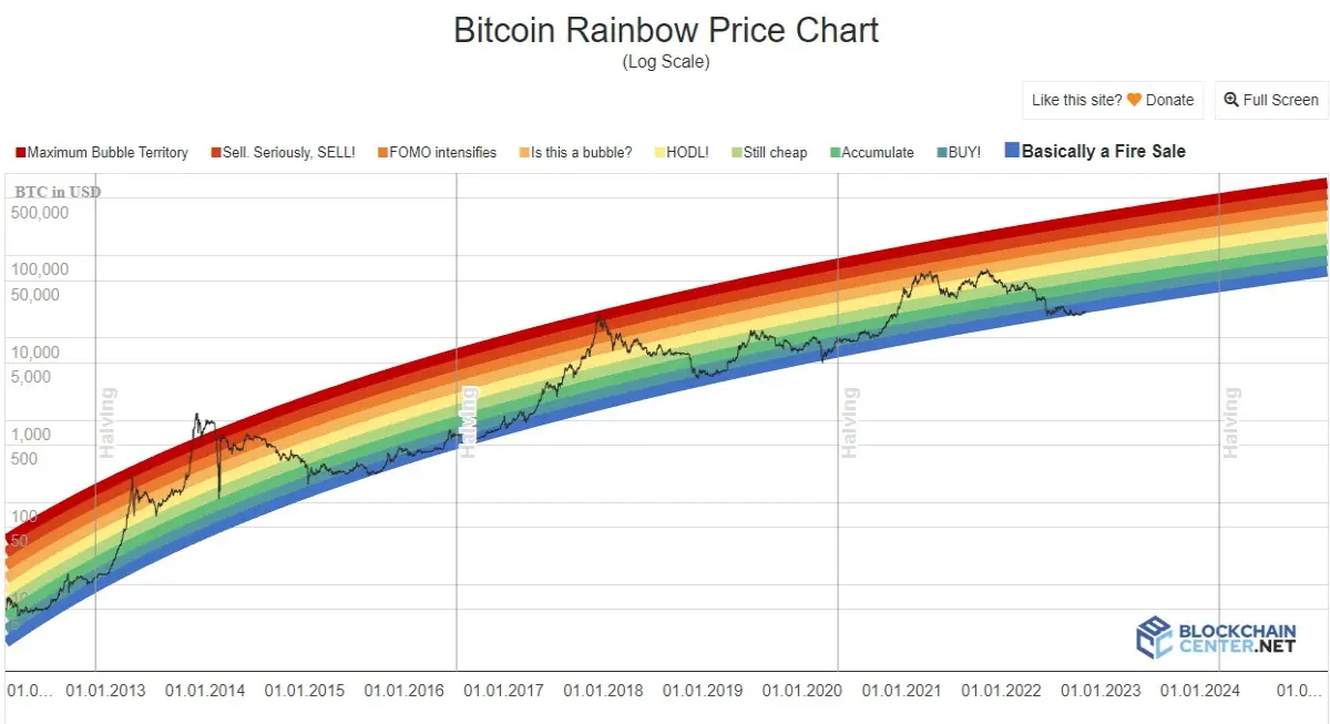
So why do people use the rainbow chart and is it actually accurate? Firstly, it is not going to be used for things like short term day trading or predicting the market trend. Instead it is meant to used as a guide over longer terms.
Advantages:
- Since it was launched in 2014 it has almost always been accurate
- Due to the volatility of crypto the Logarithmic regression model is useful
- Even a novice can understand and read the simplicity of the chart
Disadvantages:
- It is only useful in showing long term price trends.
- So far it has been mostly accurate, but there is no guarantee it will not be wrong in the future.
- The short life span of 2014-2022 is minimal in terms of proving the accuracy of something
The above chart shows a combined chart from the originals created by Reddit user Azop back in 2014 and the original logarithmic regression from Bitcoin Talk user Trolololo. Combined they give the commonly used and known Rainbow chart, but below is an example of the originals for reference.
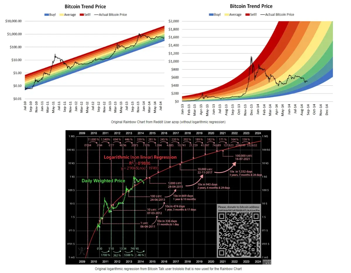
So far from viewing the simplicity of the rainbow chart it is clear to see that it is in fact quite accurate. It had never truly broken below the lowest level, bar briefly when Bitcoin sank to $18k and they added another level known as 1 BTC is 1 BTC for a day as a joke. All in all the bottom had held on the chart and the assumption was that this trend could and would continues into the foreseeable future. That was until FTX collapsed and the entire crypto market has crashed with it. At the other end, the price has actually jumped above the Maximum Bubble Territory level in the past, but generally remains within it. The fact the recent bull run saw the price only reach FOMO Intensifies level was an interesting change compared to the previous cycles. Also of note to users is how the halving generally takes place within a bear market and after that the price tends to rise, sometimes rapidly, soon after.
Where is The Bitcoin Rainbow Chart Leading to Next?
It is a very interesting time for both Bitcoin, Crypto, and the Rainbow Chart itself. After weeks of sideways movement and then the recent upwards spike, there was a renewed optimism creeping into the crypto space once again. The bulls were back claim some. Its only a false dawn claim others. Then the FTX crash emerged and suddenly within a manner of hours and days Bitcoin is trading at roughly $16,000. That's almost a 25% drop in less than two days. The bottom of the chart has been broken and from here all bets are off.
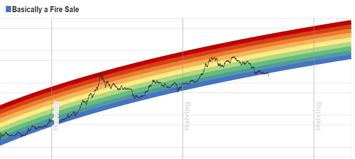
However, looking at the Rainbow Chart helps to calm any hysteria purely because that is short term thinking and mindset. The long-term view is positive. Yes the bottom of the chart has broken, but the top of the chart also broke back in 2013. From there, just like a chart and a moving average, the price gradually moved back into the levels of the chart, but it took time. From November 2013 when the price broke above the chart, it took until February 2014 to return. What does this imply for the short term? Will it take until February 2023 for Bitcoin to return into the levels of the rainbow chart, or will the time frame differ from the past? It is a fascinating thing to watch, but one should remember it did it before, albeit the opposite side of the chart, and it can do it again.
On a positive and optimistic note, judging from the model, Bitcoin could reach more than $106,000 around January 2025 if the price enters the model’s “accumulate” level. If the opposite happens and Bitcoin skyrockets towards the ‘Maximum Bubble Zone’ then it could could reach a value of $626,383 by 2024. This is all speculative of course and in reality we have no idea what will actually happen to Bitcoin, but it is possible. Some people are getting frustrated by Bitcoin again, while many others are seeing this as a chance to load their bags. Of course those holding bags are the unlucky ones, but this is just a mere moment in time. The hype will slowly return as will the investors. How high will the price fly? Nobody knows. How low could it crash? Nobody wants to know. There is a bright future with Bitcoin, and keeping an eye on the long term trends as shown by the Bitcoin Rainbow chart could help convince keep even the biggest doubters in the game.
I hope you enjoyed my view on the Bitcoin Rainbow Chart, and if the chart is something new to you then enjoy scrutinising it and dreaming of Bitcoin hitting the $500k levels in the coming years ;)
Have a great day.
Peace. CryptoGod-1.
Referral links:
Publish0x - https://www.publish0x.com/?a=olejZqrzej
Splinterlands - https://splinterlands.com?ref=rnabc1
Upland - r.upland.me/NQAH
Binance - https://accounts.binance.com/en/register?ref=143611368
NFT Market Sales
Opensea - https://opensea.io/RNabc
Follow Me :)
Twitter - @RNabc123






