
Good day everybody,
Welcome to CryptoGod-1's blog on all things crypto. Today I will be beginning the first part of my new series focusing on different "Chart Patterns" which all traders should ensure to familiarise themselves with. While I intend to focus in on different patterns traders should look out for, in the opening of the series I will cover the basics of how to understand and read a candlestick chart.
What Is a Candlestick Chart?
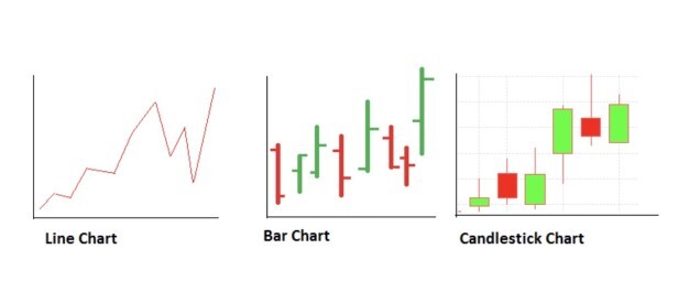
Candlestick charts originated in Japan well over 100 years before the West developed the bar and point-and-figure charts, dating back as far as the 1700's when a Japanese man named Homma discovered the link between price and the supply and demand of rice, meaning that the market was strongly influenced by the emotions of traders. The candlesticks were developed to be a means of representing that emotion visually, with price movements shown in different colours. Patterns were noticed and emerged, allowing traders to make trading decisions based on regularly occurring patterns that help forecast the direction of the price in the short and long term. The candlesticks are useful because they help to identify four points in the price; the open, close, high, and low. Over the year a number of variations have been developed from the original ideas of the candlestick chart, including the line chart, bar chart, and a variety of candlestick charts, as shown in the image below from bybit.com, they all represent the same information but show it in different ways.
How to Read a Candlestick Pattern
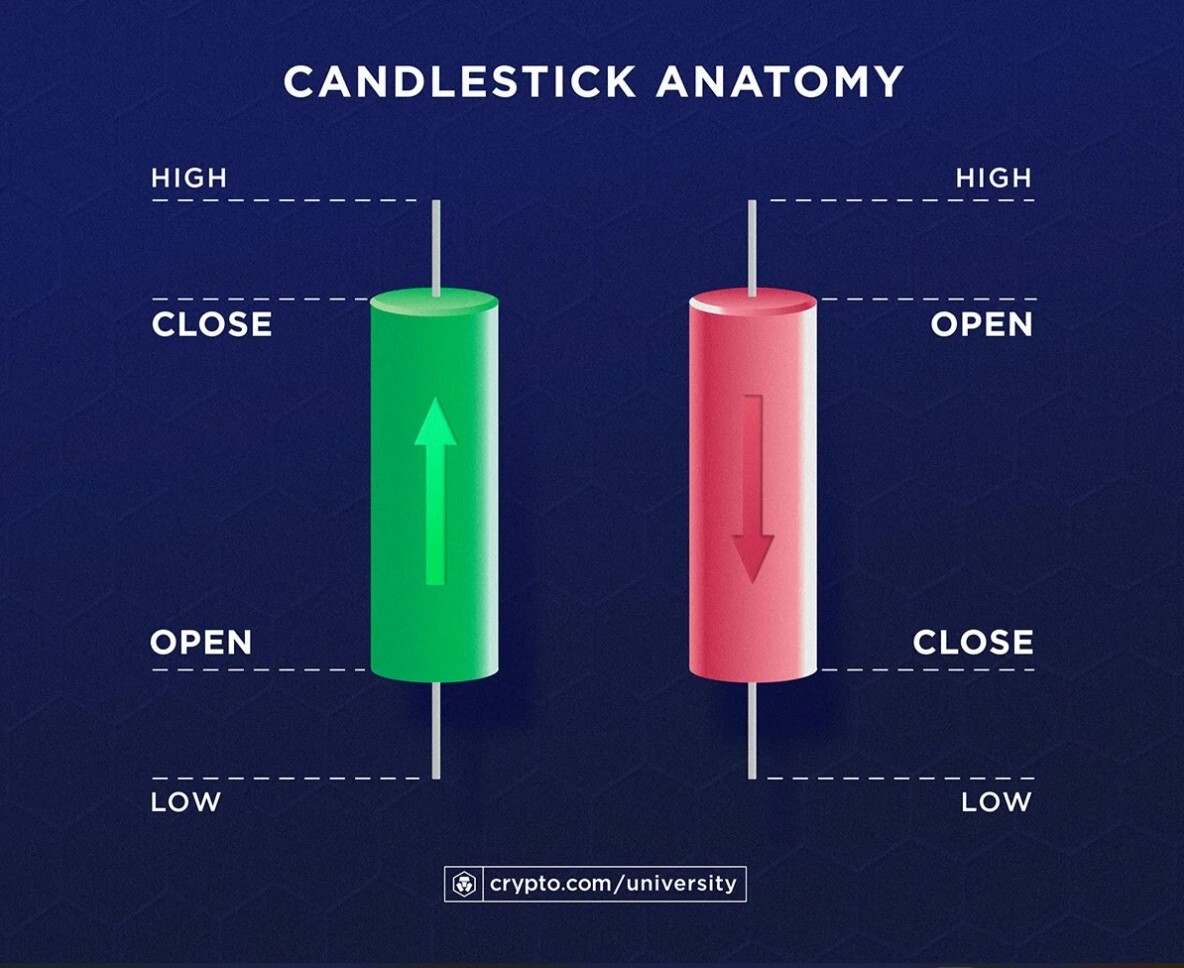
There are a multitude of different time frames in which a candlestick chart can be read, from short time frames of 1 minutes, 15 minutes, and hour hour, up to one day, and one month charts for longer term timeframes. As mentioned above, the candlestick shows four distinctive positions; the opening price, the high price, the low price, and the closing price for that specific time period. Similar to the bar chart, there is a wide part of the candlestick, which is known as the "real body." The real body represents the price range between the opening and closing price of the trading period. Different colours can be applied to the candlestick, with some using the traditional black and white, while others prefer the visually aesthetic green and red.
When the real body is filled in, or in black / red, then it means the closing price was lower than the opening price.
When the real body is empty, or shown in white / green, then it means the closing price was higher than the opening price.
These become known as up candles and down candles, as they represent the direction in which the price is moving. Traders can apply whichever colours they wish on their trading platform, once they are comfortable and familiar with the underlying meaning of their chosen colour to represent the up and down candles.
The area above and below the "real body" is known as the wick. These are shown as narrow thin lines, and are used to show the areas where the price moved before reversing direction. For example if the price drops at the opening of the candlestick period, but then reverses and rises above the opening price before closing above it, the area below the opening price will be shown as the wick. The same is applied if the price rises above the opening price and drops from its high price, but closes above the opening price. Inversely, it applies the same theory for a price which rises above its opening price but closes below it.
Bar charts and line charts work on similar principles, with the bar chart showing an indent for the opening and closing price, and the line chart working as the average price in that period of time. They all work off the same information, but represent it in different ways.
Below is a basic example from crypto.com of how to read a candlestick chart, with the key areas identified
Identifying Candlestick Patterns
Now that we understand how the candlesticks (and bar / line charts) work based off the up and down movements in price, it is important to understand the patterns which evolve and emerge within them. Sometimes these price movements can appear random, but often they form a part of a pattern which traders can rely on for analysis and trading purposes. There are many candlestick patterns, but it is important to learn about the fundamental terms and ideas behind them before diving into the patterns themselves.
Bullish or Bearish
The basics behind this theory is that Bullish patterns indicate that the price is likely to rise, while bearish patterns indicate that the price is likely to fall. These are some of the most important and interesting bits of information for a trader, as it is when the price is going up or down that the money is made.
Generally a bullish candlestick pattern appears after a series of downward price movements which leads to the succession of price increases.
At the same time, a bearish candlestick pattern generally shows up at the peak of a rising price chart and leads to a price fall.
It is important to note that the bullishness or bearishness of a candlestick pattern is not based on the colour which the actual candlestick is showing. Each pattern has its own price contexts that can ‘lean’ bullish or bearish in a chart, which is key to understanding the patterns.
Single or Multiple
A single candlestick is when, as the name suggests, an individual candlestick is seen as a strong enough signal to mark the possibility of a change in the price direction.
Usually, it is a continuation of multiple candlesticks which confirm a pattern, and these are known as multiple candlestick patterns. They require two or more consecutive candles to confirm the pattern and potential price trends.
Reversal or Continuation
An important factor when determining a patten is whether it is a reversal or a continuation of price. Many patterns focus of changes in the direction of price, identifying whether an upwards momentum is about to fall soon, or if a falling asset is about to see an uptrend. These are considered reversal patterns as they predict a reversal in the price direction.
However, other candlestick patterns can be used to confirm if the current direction of an assets price movement will continue. These are known as continuation candlestick patterns and they can help a trader decide whether to continue with a trade or close their position.
*Not all patterns work all the time, and as candlestick patterns represent tendencies in price movement they are not guarantees.
When Does a Candlestick Pattern Start to Show?
Basically we now know that the candlestick patterns are a combination of candles showing a story of the buyers and sellers during a particular timeframe. As noted at the beginning, the price movement in financial markets is based off of the supply and demand of traders emotions. When the price reaches specific Support and Resistance levels, that is the key area to start finding a candlestick pattern. To understand more about how Support and Resistance levels work you should check out my post on it from my Technical Analysis series, which can be found here: Technical Analysis Support and Resistance.
These levels are the key for spotting patterns around, as candlestick patterns at a random position on the price chart do not provide the same level of accuracy as patterns identified at the Support and Resistance levels, combined with being within the trend. It is also important to consider the overall market sentiment and trend, along with the overall environment to help increase the odds of success.
What should you do once you discover an appropriate candlestick pattern at a critical support or resistance level?
You should closely track the buyers’ and sellers’ activity and enter a trade only once the direction is clear and set, with the best solution being the waiting game of an appropriate candlestick pattern at support or resistance levels and only enter the trade after a rejection is confirmed.
Trading Time Frames & Price Action
Another essential tool for helping traders to make the most of their trades and patterns are time frames. All the candlestick patterns in all the timeframes come from the price movement which means there is no difference between higher and lower timeframes. However, higher timeframes are known to produce more accurate price directions than lower ones. Therefore it is always recommended to consult with the 4 hour or 1 day price chart even if you are trading on the 15 minute chart. When the lower timeframe and higher time frames match the direction, you can find profitable trades. A candlestick pattern within the trend and at a perfect location, taking note of Support and Resistance levels, can provide high probability trades.
There are four key items to remember when trading and taking time frames and price action into consideration:
Impulsive Price Movement: This is when the price moves with a solid and defined bullish or bearish pressure, often creating new highs or lower lows aggressively.
Correction Movement: This happens after an impulse, when the price needs to adjust and correct itself, often making the correction slowly.
Volatility: When the market is volatile, the price can break beyond recent highs and lows without setting any definitive price direction.
Non-volatility: When the market is not volatile, the price can aggressively move higher or lower, which indicates solid price dominance.
As a trader, if you can match the context of the market with the candlestick formation, you can easily define the possible price movement of any asset. Remember, to read the candlestick chart accurately, you should:
1. Use higher time frames
2. Focus on price action located at key support and resistance level
That is basically the main things to consider and focus on when trader and making use of candlestick patterns. It is a lot to take in for novice traders but experience and time spent in the market can help make you confident at identifying these things in the market. In the next part of the series I will be taking an in-depth look at individual patterns which a trader should be familiar with to help them when trading.
If you would like to check out the previous series I did, which focused on Technical Analysis, you can find it here: Recap of the Technical Analysis Series - Parts I - XXV
Have a great day.
Peace. CryptoGod-1.
Referral links:
Publish0x - https://www.publish0x.com/?a=olejZqrzej
Splinterlands - https://splinterlands.com?ref=rnabc1
Upland - r.upland.me/NQAH
Binance - https://accounts.binance.com/en/register?ref=143611368
NFT Market Sales
Opensea - https://opensea.io/RNabc
Follow Me :)
Twitter - @RNabc123


