
If you look at the USDT dominance chart right now, you will see a sharp spike in volume and be tempted to conclude: "That’s it, the panic is over, money is flowing out of stablecoins and back into Bitcoin, the rocket is about to take off."
Sounds beautiful. It’s just not true. Let’s break down how this actually works.
What Does Volume on USDT.D Even Show?
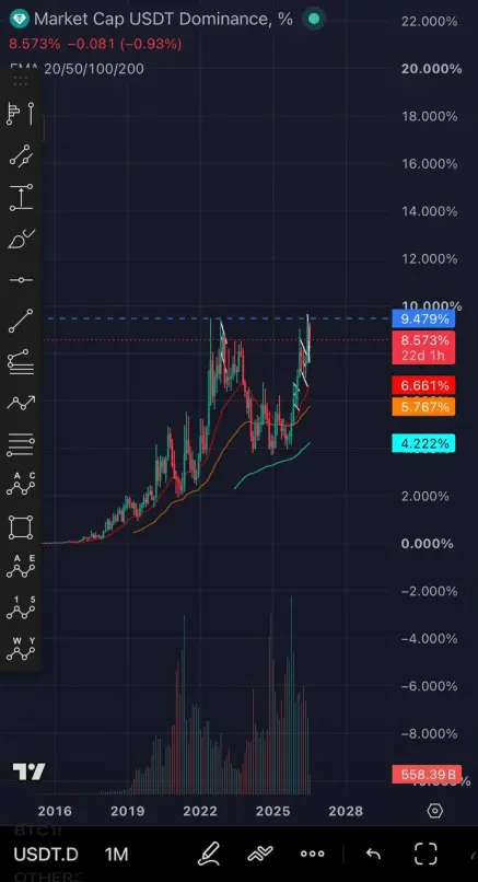
USDT dominance is the share of the USDT stablecoin in the total cryptocurrency market capitalization. In plain English: how many people are currently sitting in cash instead of Bitcoin and altcoins.
The volume under this chart represents activity around USDT—how much is being minted, burned, or transferred between exchanges. Simply put: how much movement is happening around the "crypto-dollar."
High volume does NOT indicate direction. It indicates that a large flow of capital is taking place right now. WHERE that capital is moving is a separate question.
What Happened in May 2021
Look at the chart. In May 2021, there was a volume peak almost identical to the one we see today. Back then, everyone rushed INTO USDT—China banned mining, Musk reversed Bitcoin payments, and overnight, $10 billion worth of positions were liquidated.
And what happened next? USDT dominance continued to rise for another year and a half—until mid-2022, after the Terra/Luna collapse. The reversal downward only happened in early 2023—quietly, on minimal volume, when the bear market was already dead and nobody believed in a recovery.
The Main Takeaway
A volume peak on stablecoins is NOT a reversal signal. It is a signal that "a major redistribution is happening right now." The reversal comes later, in silence, not in thunder.
What We See Right Now
The monthly chart volume is the largest in history. Dominance has approached resistance at 9.5% and has slightly bounced down.
And here, there are exactly two scenarios, and at this moment, you cannot choose between them:
-
Scenario A. We are like in May 2021. This is a panic-driven capitulation rush into stablecoins. Ahead lie many more months of high dominance and a bear market. Real risk-on only in 2027.
-
Scenario B. We are already like in early 2023. This is the final burst of fear. From here, volumes fade, dominance slowly drifts downward, and a new growth cycle begins.
What to Watch Over the Next 2–3 Months:
-
Is BTC holding levels above the 200-week moving average?
-
Are inflows into spot ETFs continuing, or are outflows persisting?
-
What are long-term holders doing—continuing to distribute, or have they shifted to accumulation?
-
Is M2 money supply expanding in the US?
One month confirms nothing. You need a sequence.
How to Apply This in Practice
You don’t need to guess the reversal. You need a plan for both phases.
The accumulation zone for Bitcoin at $48,000–$53,000 works in both scenarios. Munger’s rule—buying in pieces near the 200-week MA—works too. The only difference is how long it takes for the cycle to reach its peak.
The peak is only visible in the rearview mirror. The same goes for the bottom. Both become obvious six months later, not at the moment they are forming.
Therefore, the decision is not made based on a single picture, but on a system.






