
I often have to deal with some charts for a better expressing of a project's evolution. You know - sales, prices, number of employees vs sales volume vs costs, etc
What was the most difficult to design was to put in the same chart, having the X (Horizontal) axis occupied by the Timeline data, two kinds of data, (very) different in terms of scale - like number of sales representatives (which could be in terms of tens to hundreds) and sales volume (from 100 k to millions).
In a normal chart, the lines will look like this:
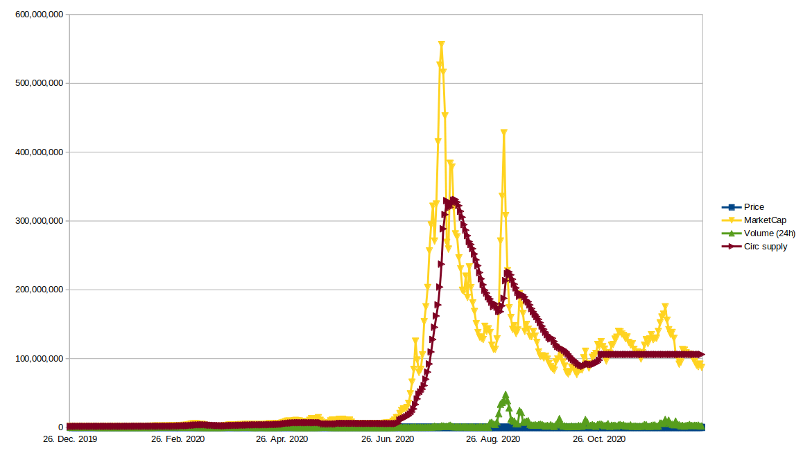
What we have here: - the Price (by the way, where is it? oh, I see something on the 26 of August) and the Volumes are also very small represented vs Market Cap and Circulating Supply.
And it's annoying! I want to see very clear how is the price on this chart when I had those big spikes on it!
I can see multiple measures on a chart on coinpaprika's website. It is like this:
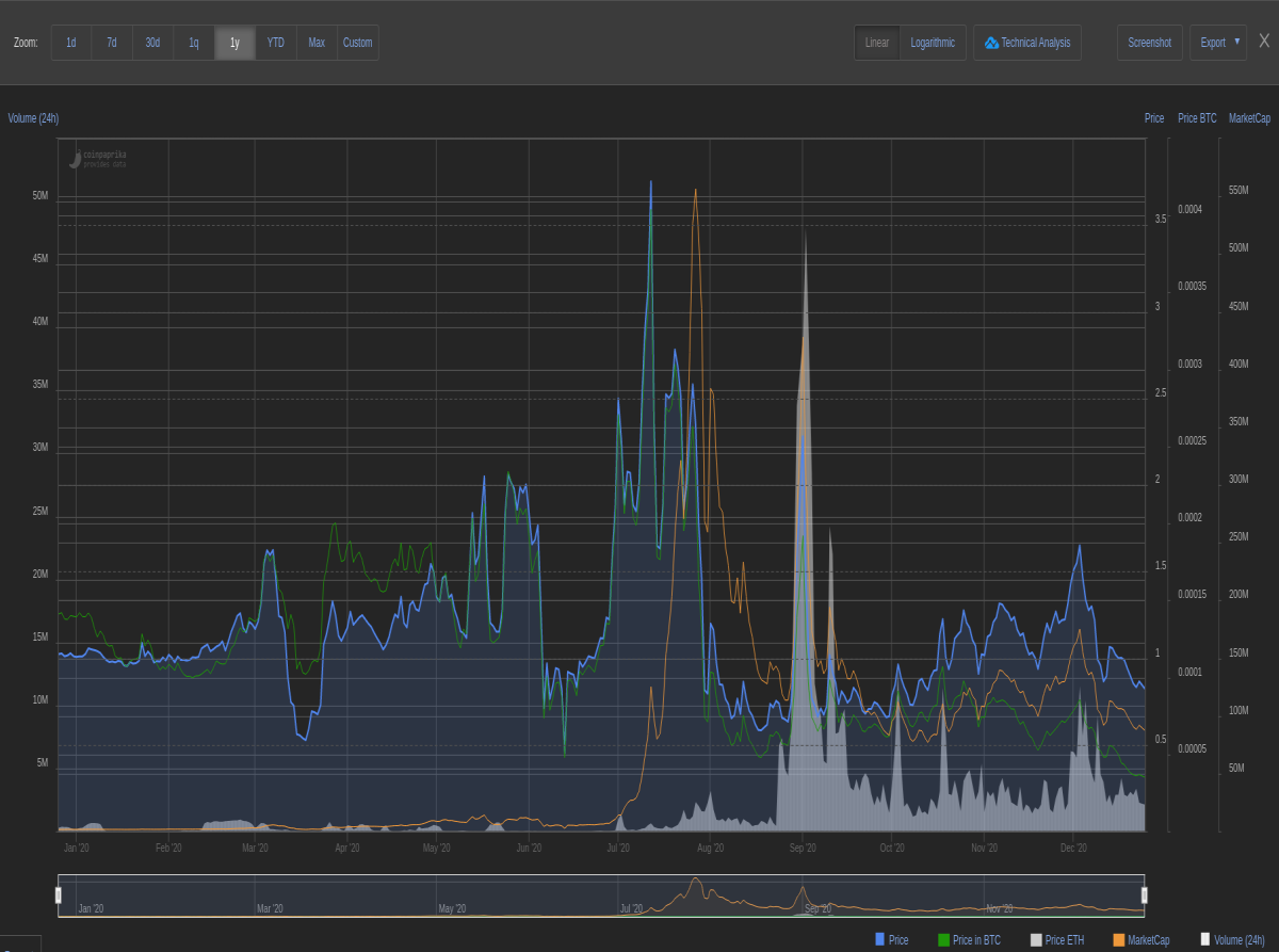
And now it's easier to understand how the price and volumes were in the moment of the spikes and not only then, but for the whole period of the chart.
This is what I'm trying to show you how to do it, because it is very useful and I don't want you to lost time anymore struggling to solve this issue.
I was spending some time searching on the internet and choosing the right words in finding the solution and after several searches, I got it!
Of course, the first one was sending me to a Software App that should be paid and I am sure it was good with all it's features, but I was only looking for a simple solution. I changed a little my searching terms and I found even a short video with explanations.
My first thought was to show you step by step how to do it, but, in the end, what is important for you is to understand it, so I will leave the video here because it is easier to follow.
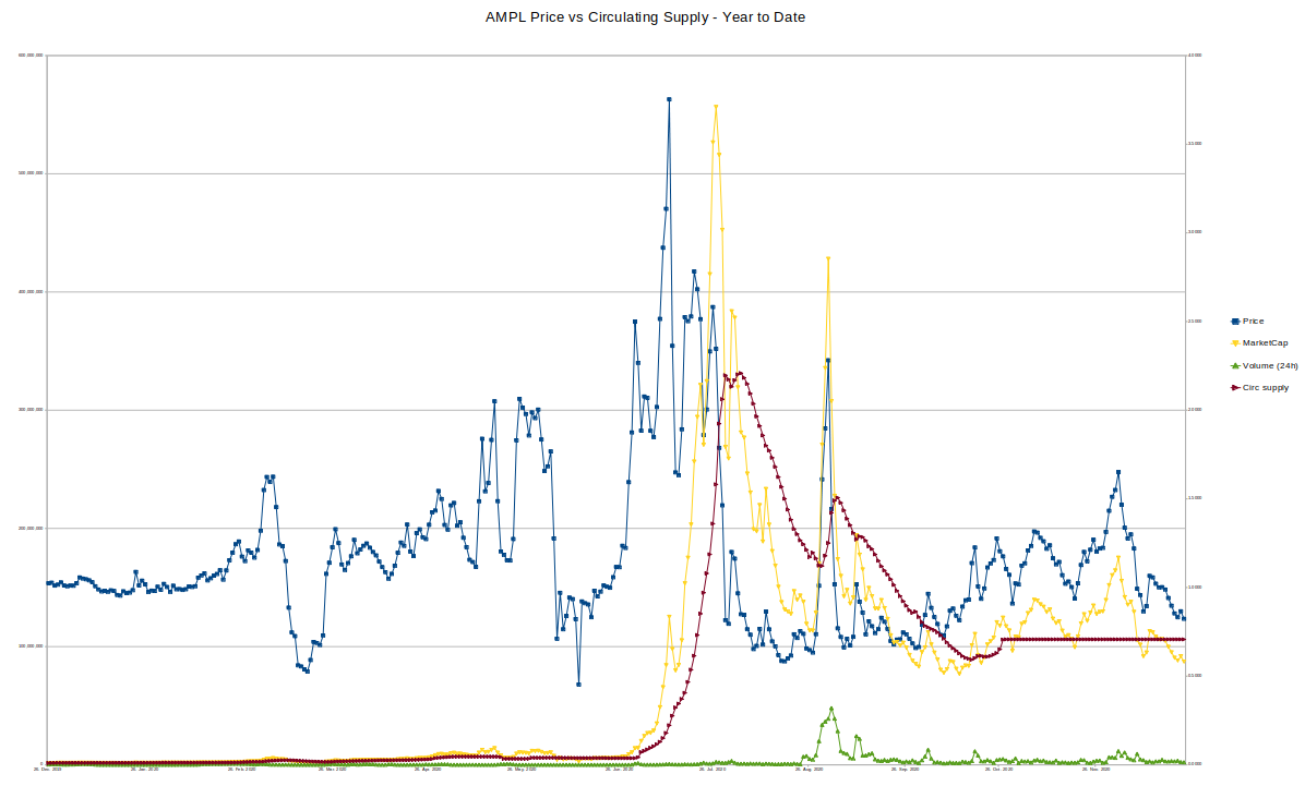
Below, I will show you the result of what I succeeded to do after watching the video and you can compare it with the first picture and than with the second one (taken directly from Coinpaprika). Of course, mine is also made with Coinpaprika's data where I added the circulating supply extracted from CSV file (in fact, I divided the market cap to USD price for every day).
How can we apply this?
If I could have this chart 3 months ago I could avoid my worst bad investment of this year - SUSHISWAP :). I admit, I saw the Binance listing announcement and I wanted to make a short profit, so I bought at 10.5 $ and even if it dropped until 9.8 $ and than raised until 10.8 $. I still believed it had the power for more increasings. I was wrong.
But, like I said, if I had this chart, I could skip this trade. Let;s see what Coinpaprika is charting for SUSHI:
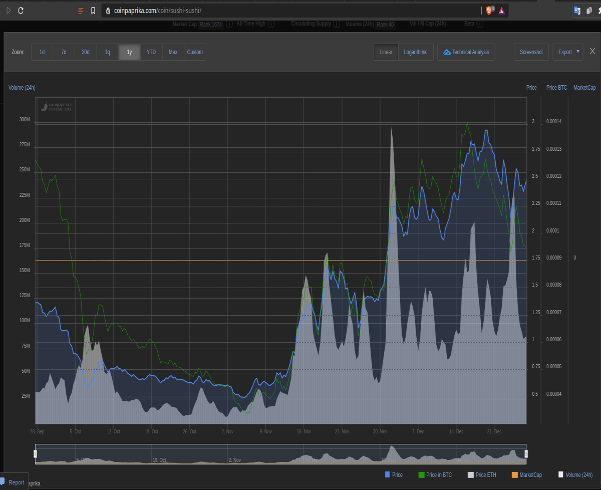
Not so much info: no MarketCap, incomplete data and only since 28 of September.
I tried then on Coinmarketcap:
Unfortunatelly, there is no possibility (or it's me I couldn't find it, yet) to have an CSV export file, so I selected the whole data with mouse and I copied it into a spreadsheet.
Because I have 4 types of quotations: open, high, low, close - I needed to made some test to see which is closer to reality vs market cap. So, if I observed that in one day I had 2.120 million coins and in the next one - 1.729 million, it is obvious that the Low and High quotations aren't what I was looking for. After several tests, the Close was the winner, with slight discrepancies.
This is the result:
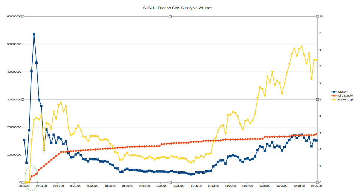
Yes, at the very start of the chart you could see the very spectacular increase in circulating supply. Like I said before, we get this by dividing the MarketCap to Token Price. In that moment, I should run. But if I didn't see it, I made the buy. No problem, it was a learning. Expensive, but not crucial.
So, please study carefully an investment from this perspective, too. It might be very important, especially at some moments in the project's life (exchange listing, new release of tokens, burning, etc)
If there is anything I can help regarding Spreadsheets, shout it!
Cheers!


