
Welcome to this week's post by #TheBlockchainBrainiacs where we closely follow real-time and historic data in order to appreciate the longer patterns and trends based on fundamental developments. This week we feature two graphs in the cross-hairs of every analyst: The Realised HODL Ratio and the Exchange Net Position Change. Without further ado, grab a cup of tea, and enjoy your weekly debrief. Make sure to find us on TG: https://t.me/BlockchainBrainiacs
A Brainiac does not miss.
Realised HODL Ratio
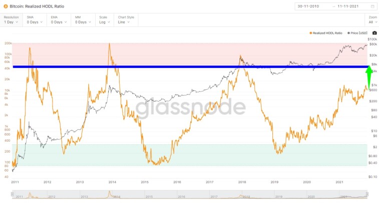
In layman's terms, this is a graph to represent the over-extendedness of a bull run for BTC. It tracks the number of capital positions which are yet to be realised, as in the process of realising profit, whales drive the price into stagnation or retracement.
The RHODL Ratio, measured on the right axis, is a good way to measure when too many new BTCs are running in unrealised profit: a good way to tell when the market is over-inflated. It accounts for annual supply growth by weighting the ratio to market age.
Over Bitcoin's history this ratio has succeeded in maintaining the values between the bands (red and green areas) with the blue line set to represent a safe estimate for the RHODL peak.
The key to this cyclical trend is the repetition of previous peaks, with the ratio sitting at around $600 after a brief retracement from $1000. Such a pattern has occurred in almost a symmetrical place in the previous cycles. The most notable factors are that there is still much room to run to the peak where whales realise profits, and usually it is this last leg which contributes to the parabolic runs that Bitcoin is known for.
This is in-line with market-analyst commentary, with surprisingly accurate prediction model's such as 'Plan B' calling for near $100k BTC by the end of the year.
Exchange Net Position Change
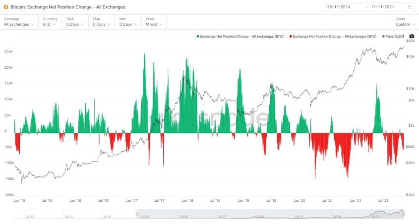
Similar to the position analysis on the RHODL ratio, the Exchange Net Position Change graph tracks the supply available on exchanges. Typically, and historically, whales move their holdings to exchanges in order to sell their coins and realise profit and thus is directly correlated with the RHODL ratio.
When supply is being moved off of exchanges, it is being done for the purposes of HODLing which reduces overall supply available to sell. The rest of the work is simply a supply-demand economic mechanism where the low supply, coupled with high demand drives the Bitcoin price up.
Working with the first graph, this is great auxiliary evidence of upside potential, expected very soon.
Conclusion
Though whilst Bitcoin continues a notoriously volatile path, with peaks and troughs inspired by over-leveraged margin traders, the fundamentals for long-term value remain a great buy opportunity.
In Q4 2021, heading into Q1 2022, One may find lucrative risk to reward in the presently under-leveraged, poised to parabolically grow, Bitcoin market.
Remember to always DYOR and remain patient.
Remember, a Brainiac doesn't miss.
Join us here.


