
I don't know about you guys but when taking into consideration Crypto that I might invest into the first thing I see and essentially judge is the logo/design. You might ask... "Why in hells name would you look at that, just look at the project and the idea behind it" but the thing is, why waste a ton of time researching that when a design can tell you half the story. A badly made or thought out design can give anyone a sour first impression.
Look at these for example.


Which one would you more likely invest into just based on design? Both of these are fictional and they might be a bit of an exaggeration but I think you get the point. A well designed coin can boost it's likeability, marketing and general likelihood of success. So let's get onto the juicy part of this article. The 5 designs I really liked.
Keep in mind, these are in no particular order and just because it's not on the list doesn't mean it's bad and if it is on the list, this is personal preference somewhat as well. Now let's go!
1. Cardano

To anyone familiar with crypto this is also a very familiar platform. Cardano isn't a coin in itself, ADA is but in this case, since the Cardano logo is what most people are familiar with we'll be talking about that... So what is so appealing about it? First of all, my bias towards the color blue is always something to consider when I'm judging stuff but looking at it purely design vise it peaks the persons interest. It doesn't look like most other crypto logos (besides IOTA), it is symmetrical on all sides and evokes a feeling of slow fading cause of it's smaller and smaller circles. The dots/circles are also aranged in a sort of star like manner while also looking like something a person might make, or an atom... It just peaks the interest so well that I just can't not like it.
2. BAT (Basic Attention Token)

Ah the BAT, oh how I've followed your existence and seen you grow. This token is pretty simple in it's looks. Where it shines though is when it is in front of dark backgrounds or has a shadow. In those situations, and sometimes outside them, it plays with your head, making you perceive it as 3D and actually having a gradient/slope sort of effect rather than 3 colors that stay the same at all times. The simple design paired with it's perception make it one of my personal favorite designs.
3. Ethereum
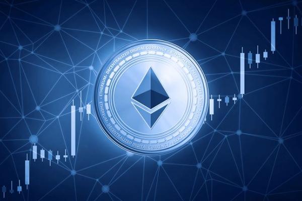
Now... you can't really had a good logo list without the king of elegance, Ethereum. As one of the first ever things I saw when I entered the crypto world, the look and simplistic design of this really took me by surprise especially when I compared it to the likes of BTC and LTC, it was sleek, elegant, fashionable, it was that one friend that dresses great all the time. It's not even my bias towards blue things, cause Ethereum Classic is just as good of a logo as this one. The logo speaks for itself honestly.

4. Sia

Sia differs from most of my other entries in the fact that it's not symmetrical at least not when you look at it directly, since the symbol itself is symmetrical so... What I like most about their logo is the simple gradient or just the single beautiful jade green and the sleek design that reminds me of Asian feathered fans. Another thing it makes you feel is movement, like it's falling toward the earth, like a comet of sorts and it's not really simple? The shape connects two larger parts of which one should seem like a beginning while the other is larger, abstract, looks like the google maps logo xD and it should represent the end result and growth. Not much more to say, just cool and leafy.
5. Bytom

This is a very recent discovery for me and I've only actually seen its logo but it's a prime example of good design getting me interested. I see stuff like Stellar, Monacoin and Factom and they just make me feel like I'm looking at something primitive... old. And than you have this gem, a black spyral built out of very interestingly shaped lines. They somewhat make me think of ice picks or pickaxes, simultaneously holding onto each other and keeping themselves locked into an endless beautiful swirl. Not only that but despite being a spiral it's edges actually confine it into what is essentially more a square than a circle making a very neat connection between two very simple shapes that are the cornerstone of most logos. It's just good, really good.
That is all folks, I hope you enjoyed the read, I thought this was an interesting thing to talk about and it ended up taking longer than expected but it was fun. What are your favorite coins design vise?






