
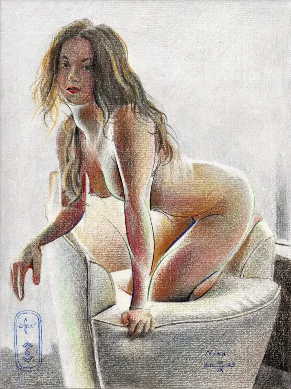
Website link: https://corneakkers.com/2023/09/06/nina-05-09-23/
Printable: https://corneakkers.com/product/printable-nina-05-09-23/
Back on Track
This graphite pencil drawing ‘Nina – 05-09-23’ puts me back on track of studying this beautiful and intriguing model. For those who don’t want to miss out, you can visit her profile on deviantart under the name ‘Ninaerotique’. Last August 23rd I made one of her reclining on a bed. However, my last drawing ‘Neo Deco – 29-08-23’ kicked up a lot of dust, I must say. 90% of the criticism was positive but there were others who found the female form almost out of balance. They found her pose, sitting on a very thin chair, too exciting. There were also people who found the left arm particularly missing but I do not concur. I blame those people for a lack of analytical and optical skills. Perhaps to be confused with sheer laziness to look any further than a nose length. Makes it all the more fun for me.
Color by Accident?
Arguably is the claim there are way too many consecutive graphite pencil executions now. It was about time to pull my colored pencils out of the drawer for a change, wouldn’t you say? The universe seemed to agree for it pushed me into the direction of color. The thing is, beginning in graphite and setting out proportions, suddenly this tiny little stain appeared on my paper. As a draftsman you can burst into tears. There’s no way you can remove it, even by means of an electric erazer. Hence, colour came to my aid. I guess, there are no random accidents occuring. I felt the whole thing was staged. So I tried to listen what the artistic bird had to whisper in my ears.
Jan Veth
I already had the cubist power lines so adjacent to them I started filling in planes. First in pinks and apricots. In a later stage I added blues and greens in order to counterbalance all things warm. Next to that, I also replaced most of the black linear structures by colored ones. As time progressed I started to associated my search for subtle color transitions with the work of Jan Veth. Last Sunday was the last day his works were on display in the Dordrechts Museum. Not a avangardist but a true craftsman, friends with Breitner, Kloos, van Eeden and Israëls. So there it was, a bit of influence that may show. Perhaps in the use of muted colors. Closing the gap between realism and cubism even more. What do you think?
Graphite and colored pencils (Faber Castell Pitt Graphite Matt pencil 14B) drawing on Fabriano Ingres paper (21 x 29.7 x 0.1 cm)
Artist: Corné Akkers
Sales info: [email protected]
Dailymotion (the making of): https://www.dailymotion.com/video/x8nt4q4
Bitchute: https://www.bitchute.com/video/TJYOnfqRIDh7/
Bitchute (the making of): https://www.bitchute.com/video/vBA8wSWIqI6N/






