
Website link: https://corneakkers.com/2022/12/11/neo-deco-10-12-22/
Printable: https://corneakkers.com/product/printable-neo-deco-10-12-22/
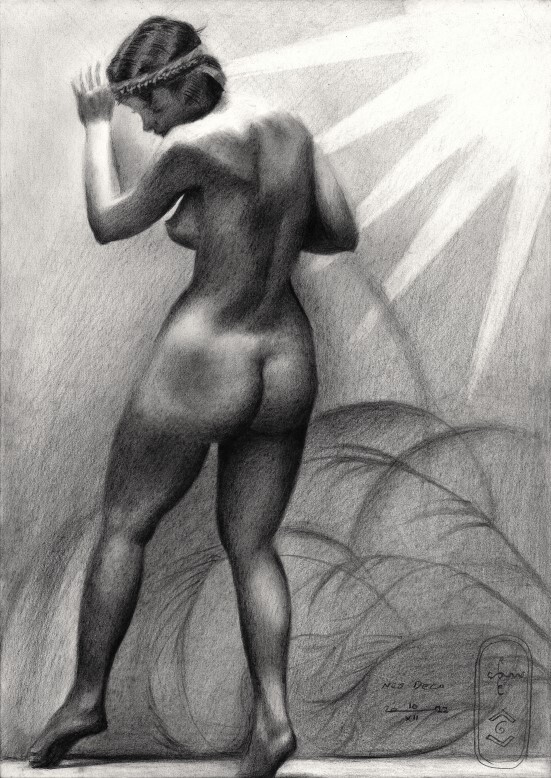
New One
This graphite pencil drawing ‘Neo Deco – 10-12-22’ follows after two consecutive cubist drawings. Golden Orange – 29-11-22 was the last so-called ‘realist’ one. I just wonder why. Not coincidentally I happen to have a stash of old photographs with the female form as the main theme. They vary from the Victorian age up to the art deco epoque, my favorite of them all. The motif for this drawing at hand I don’t know the origin of, unfortunately. So there is no one yet to give credit to. I would have like to because of the perfect lighting and natural grace that oozes out from it. I had it stored for quite some time but didn’t what to do with it. That was until three days ago, after the completion of ‘Louise Brooks – 07-12-22’.
No Roundism
As usual I set out to get the proportions right to begin with and then go from there. See whatever artistic whim would dwell over me. First I had some premature roundistic extrapolations of bodily forms as a kind of ‘pencil note’. For artistic reason I decided not to pursue this roundism style further in an early stage. The woman in the picture is standing upright, leaving only a few possibilities to extrapolate forms towards the negative space. No cubist move this time.
Surreal Then?
What then? I already was started to block in the light and toned all things up. Then I saw these birds stemming from her calves and lower back. I decided to go surrealistic and for 90% of the time spent on this drawing that was my very aim. I got a bit weary towards the end. I planned to do a giant peacock in the back behind the roundish plant shapes. As such I could refer to the birds already tucked inside the body. However, carrying through on this scheme would take me to depict that peacock a bit too obvious. Otherwise people wouldn’t recognize it as such. There you have it, left to no other device than to turn it into a simple and plain tonal study. You could call it deco, realistic or impressionistic.
The Solution
Sometimes you have to let go nifty ambitions and keep it simple. It feels a bit as if I cheated myself out of it though. I hate sheer copying and that’s where the final idea came popping up. I drew a sun with styled solar beams in the upper right corner. Occasionally the solution presents itself at the very end. It all made sense to me. The theme became ‘nothing looks as it seems’. The sun is only part of the wallpaper and the true light is coming from above. The sun was a great replacement of the flowery patterns in the reference picture anyway. They felt a bit abundant. Problem solved. They next thing I did is to keep a rough edge. I didn’t want the drawing to become overproduced. In fact I like the grainy structure it got because I didn’t smooth all things out too perfectly.
Graphite pencil (Faber Castell Pitt Graphite Matt pencil 14B) drawing Talens Bristol paper (21 x 29.7 x 0.1 cm)
Artist: Corné Akkers


