
Website link: https://corneakkers.com/2021/02/21/golden-cubism-21-02-21/
Printable: https://corneakkers.com/product/printable-golden-cubism-21-02-21/
Real Cubism
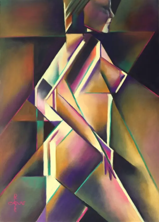
This pastel Golden Cubism – 21-02-21 is the first real cubist drawing in my Golden series. After my last pastel drawing Lakshmi – 16-02-21 I realized I only made pastels in my Roundism style. The last one in that style was ‘Golden Lilac – 07-02-21’. What if I would return to the initial form of cubism I employed back in 2014. Besides that, once in a while my preference is to put the stress on angular forms rather than round ones. Variety is the spice of life.
Shy for Color
My graphite pencil drawing ‘Nude – 01-11-19’ served as the motif for this pastel. The objective was the same as its predecessors: to introduce and study the realm of colors. Forms and tonality I already got in so many a drawing. Color relations are hard to get your head around but that does not keep me from trying. In the past I solved many color related problems by seeking balance in hefty colors. As long as I counterbalanced one with its complementary counterpart the image would become attractive. At least that has been my main attitude towards the matter. Lately I came to realize I had to overcome my aversion to brown and gray colors. There is so much subtlety to be found in them.
Golden Middle Way
Perhaps my reluctance was prompted by so many brownish paintings from the 17th, 18th and 19th century. Since modernists took over color has been reassessed anyway. But brown? Brrr, or not? In many of my pastels in the hatched strokes style I placed complementary and half-complementary colors next to eachother. Such solved all too hefty color saturation because these strokes tend to cancel themselves out that way. In this pastel I sought for a balance between patches of color of high saturation and lower saturated ones. It goes beyond saying that the first ones are to be found in the dominant theme: the model herself. In order to start a meaningful dialogue I let these colors reappear in the negative space around it.
The Result
This way harmony as well as contrast is preserved. My favorite complementary duo yellow-purple still is the dominant factor, whereas browish yellow and other grays form the bulk of the drawing.
Pastel drawing on Clairfontaine Pastel Mat paper (69.4 x 49.8 x 0.1 cm)
Artist: Corné Akkers






