I'll tell you what settings I used to make this photo (taken with iPhone):
By the way, the settings are also well suited as a preset.
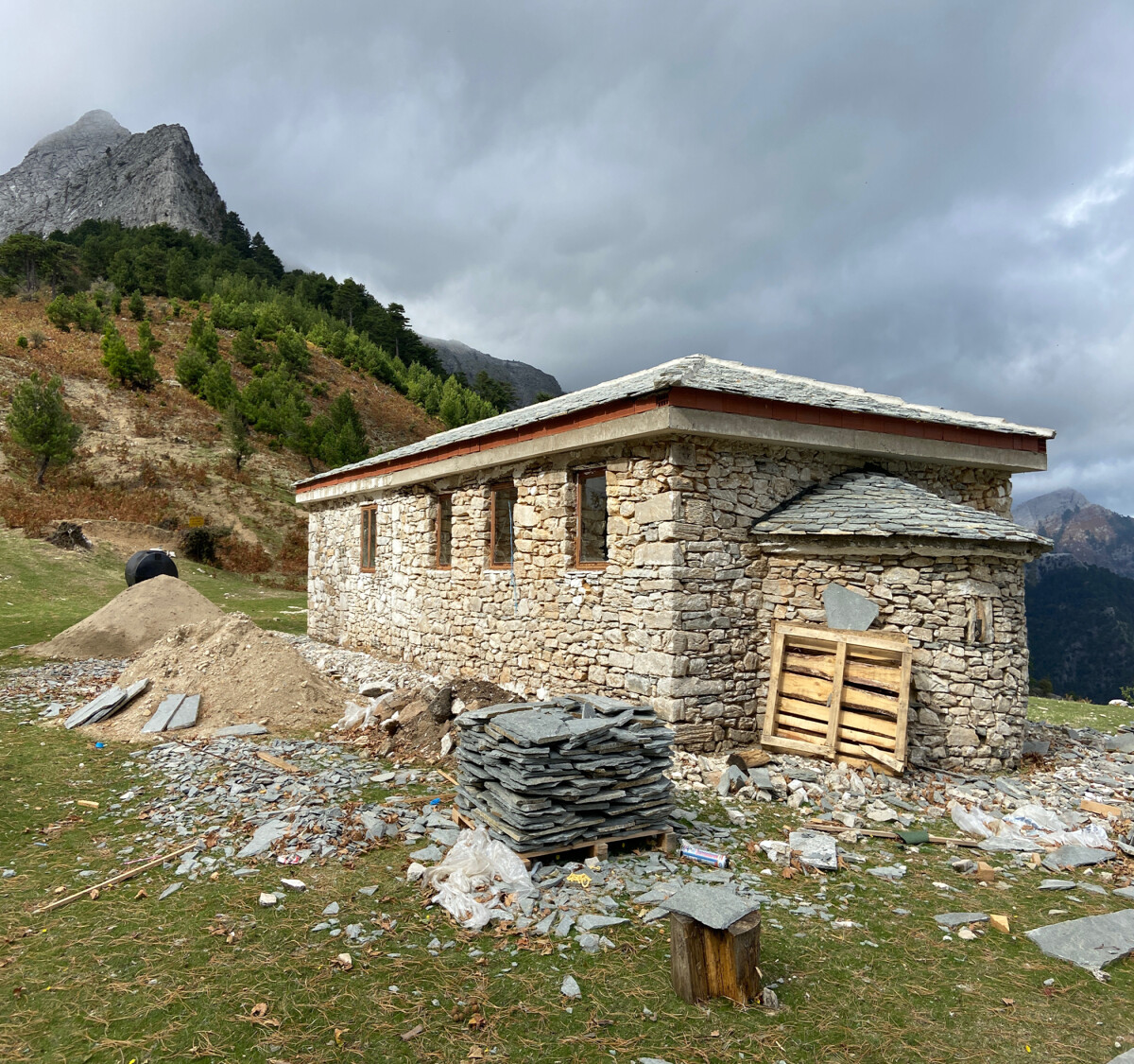
starting from here:
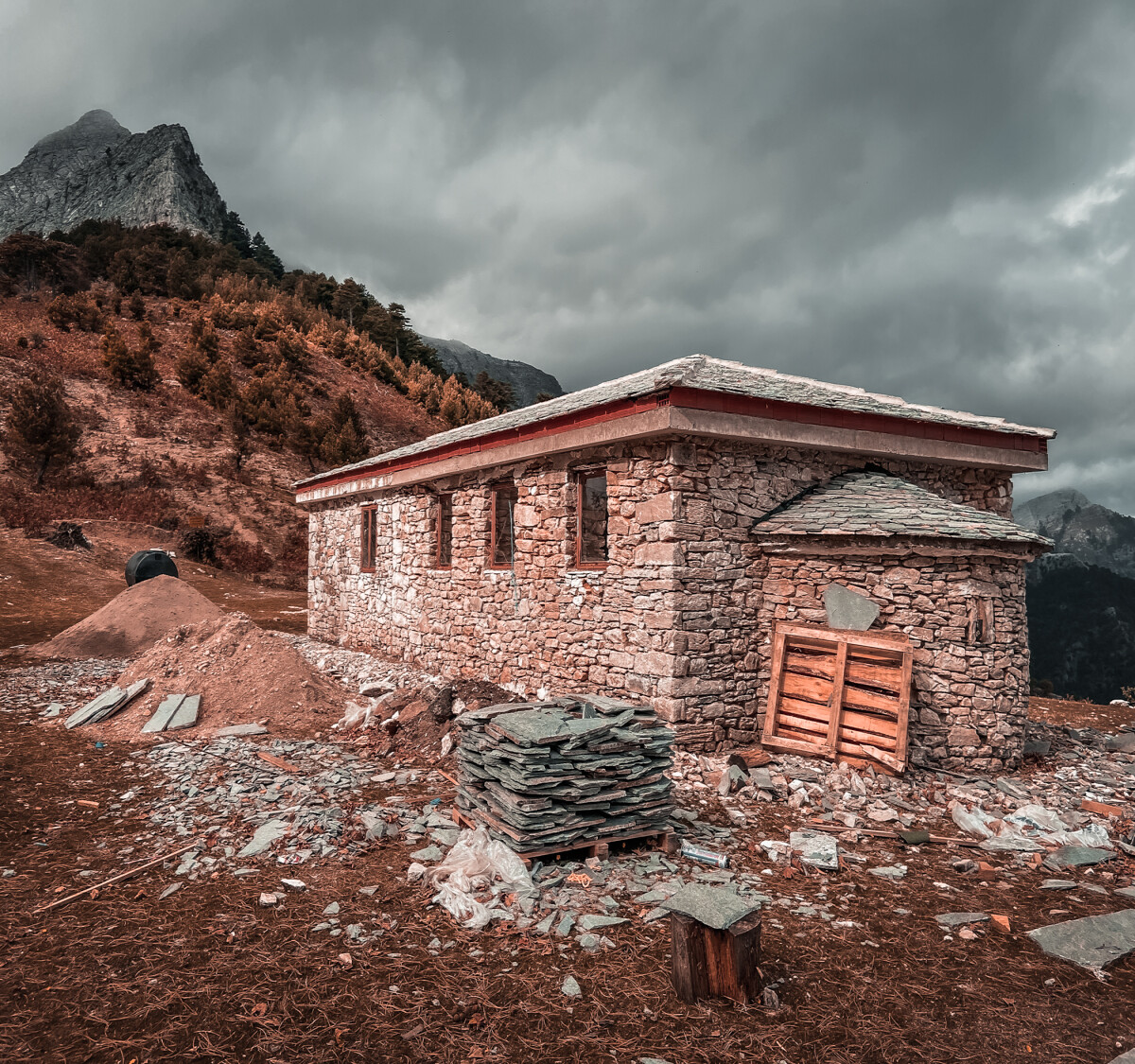
Since we have a relatively dense cloud cover on the image but the sun is shining on the building, we pull the contrast a bit higher and reduce the brightness. This adds a bit of drama. Furthermore, we can see that the shadows have been post-exposed by the iPhone. (You can see this in the bushes in the background).
On the building we can see that the shadow is still minimally present. Unfortunately, this makes the image look very flat. So we strengthen the shadows.
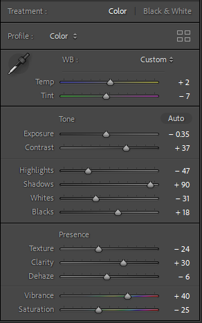
In some places, the white seems a bit too bright and the general color intensity suffers a bit. That's why we turn down the highlights and turn up the vibrance a bit.
Vibrance ensures that only certain colors are highlighted. Saturation would enhance all colors. Since some are already very intense and some are almost faded. So we decrease saturation and increase vibrance.
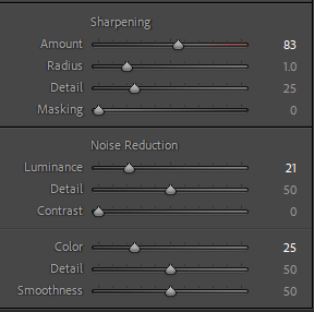
Additionally, we are working against the noise in the sky, increasing the contrast has allowed us to make the sky look more dramatic. Unfortunately, this also creates noise, which we correct here with Noise Reduction. So that the clouds and any other objects do not look too flat, we sharpened the image in general.
I am a fan of warm brown tones to achieve this we need to adjust the color scheme.
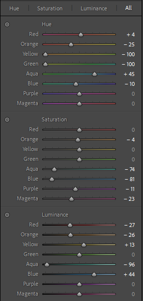
Since each image has different color values, this area is very individual. In short, I have ensured that green colors now transition to an autumnal brown and appear darker.
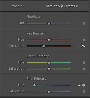
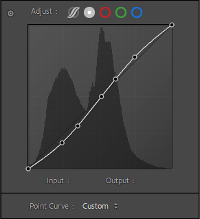
The last two graphics show the fine-tuning in the area of the coloring and the curves, which I did not rework, but which is the result of the previous processing. For the sake of completeness, I have listed them again.


