
Are you tired of making boring plots that are dull and uninspiring? If you are looking to take your data visualization abilities to the next level, then this is the post for you. In this series of lessons, we will be exploring ggplot2: The premier data visualization package for the free and open source R programming language. This is the first post in the series, and my goal is to provide a nice, gentle introduction for beginners. By the end of this post, you will be able to:
- Create a basic scatter plot
If this is already a review for you, don't worry. The tutorials will become more advanced as we go along. That being said, we've got to start somewhere, so let's jump in and start build a solid foundation with ggplot2.
Getting Started
R is completely open-source software, which can be used on almost any operating system. In addition to downloading the basic version of R, you will also need to install the graphical user environment called RStudio. You can download both of them using the following link.
Once you download and launch the program, you'll be looking at a pretty basic screen that looks a little bit like this. Note that your version of R might have a different color scheme, and that's ok.
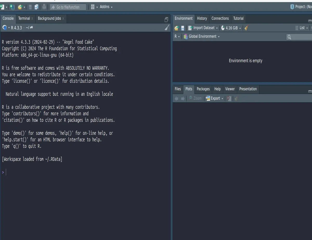
Now that we have RStudio opened up, we want to install two different packages. The Tidyverse is a collection of packages that contains the ggplot graphing function that we will be using, and the palmerpenguins package contains a sample data set. Keep in mind that it's totally fine to use your own data, but for the purposes of this tutorial, I think it's helpful if we're all on the same page and using the same data.
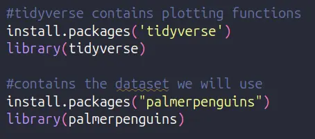
Installing these packages is a two-part process. In the first command, we install the package to our system, and then we use the library command to pull the package into the workspace. You won't have to reinstall the package every time, but you will need to pull the package into your workspace using the library command every time that you close and reopen RStudio.
Let's Plot!
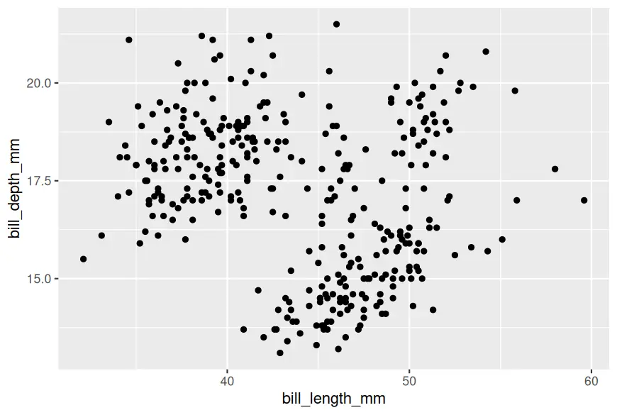
Now that we have all the basics covered, let's go ahead and start making our first plot. The way that we do this is by using the ggplot command. At the most basic level, ggplot takes two arguments: data and aesthetics. Data tells ggplot what dataframe to work with, and the aesthetics tells ggplot what columns in the data frame we want to use. In this example, I am telling R to use the bill_length_mm and bill_depth_mm columns from the penguins data frame to create the plot. In and of itself, the first ggplot command will just draw a blank canvas. I recommend watching the video for this, as it's a lot easier to demonstrate than it is to explain.

To actually create a scatterplot, we have to tell the R programming language the type of geometry we want to create from the x and y-axis. In this example, I'm using the geom_point command, but I could just as easily use a different command such as geom_line. Don't worry....we will talk about all the different types of plots you can create in future tutorials. At least for now, your plot should look something like this.
Summary
Obviously,, this isn't the most beautiful plot in the world, and it's not going to win any awards for stunning graphic design. However, it is a start, and this plot is the foundation from which we will build in subsequent posts. In the coming lessons, we will learn how to change add titles, change colors, and more!
Follow My Work!
As always, I'd like to finish by thanking you for taking the time to read my article. If you would like to support my work, consider following me on my other platforms below. Note: As a US resident, I am required to disclose that I might receive a benefit, such as reward or incentive, if you join using my affiliate link.






