
Enter Sentinomics (Name Pending)
The sentiment is defined as “a view or opinion that is held or expressed.”. I am currently scraping Twitter, every 6 hours for the Top 500 CoinMarketCap Coins. I use sPacy as my NLP python library to do sentiment analysis.
The idea was if the sentiment of a coin is over the 2 week mean, we can assume some hype is being generated and we can do some research before it could possibly go up 🚀 or go down 👇
Brief Overview of the System
The system is made using AWS, it’s entirely serverless to save on cost (All free tier 💸).
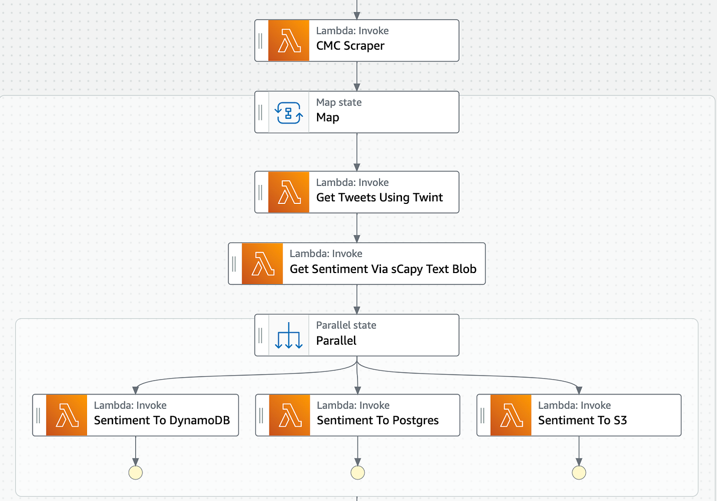
I’ve experimented Read and Write speeds for both Postgres via Aurora and DynamoDB. Aurora has proved to be better suited for this sort of data (This could be because I don’t know much about Dynamo optimisation). I removed the Dynamo step and just send the data to a Postgres table, and backup the sentiment onto S3 if anything ever happens.
The Results
I’ll be the first to say, this is a flawed system. I got this running in a short amount of time and a lot of the creases haven’t been ironed, but more about that below. For now, the results.
Sentiment and Price
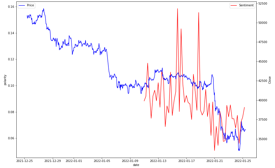
My initial coin to look at was Bitcoin, I’ve been running this system for around 3 weeks now to get some data filling in, and I wanted to plot that compared to time. This was simple enough with the below code.
First I used yfinance to get the BTC price data, and because my script grabs the sentiment every 6 hours, I smoothed the price data to the same interval.
btc_data = yf.download(
            tickers = "BTC-USD",
            period = "1mo",
            interval = "1h"
        )

btc_data.last('21D')
btc_data = btc_data.resample("6H").mean()
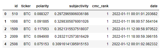
I had my own API for the sentiment data, it looked like this.
ax = sns.lineplot(data=sentiment_df, x="date", y="polarity", color="r", label="Sentiment")
ax2 = plt.twinx()
sns.lineplot(data=data['Close'], color="b", ax=ax2, label="Price")
plt.legend(loc='upper left')
The sentiment data is all over the place, and this is mainly because my sample size is quite small (1000 tweets). None the less this is what the graph looked like for BTC on 25/1/2022.
I wanted to hone in on this a little more, hopefully this graph is a little more readable.
ax1 = sns.lineplot(data=btc_sentiment, x="date", y="polarity", color="r", label="Sentiment")
ax2 = plt.twinx()
ax1.set_ylim(0.05, 0.2)
sns.lineplot(data=btc_data['Close'], color="b", ax=ax2, label="Price")
ax1.vlines(btc_sentiment.iloc[::4, :]['date'],0.05, 0.2, linestyles='dashed', colors='black')
plt.legend(loc='upper left')
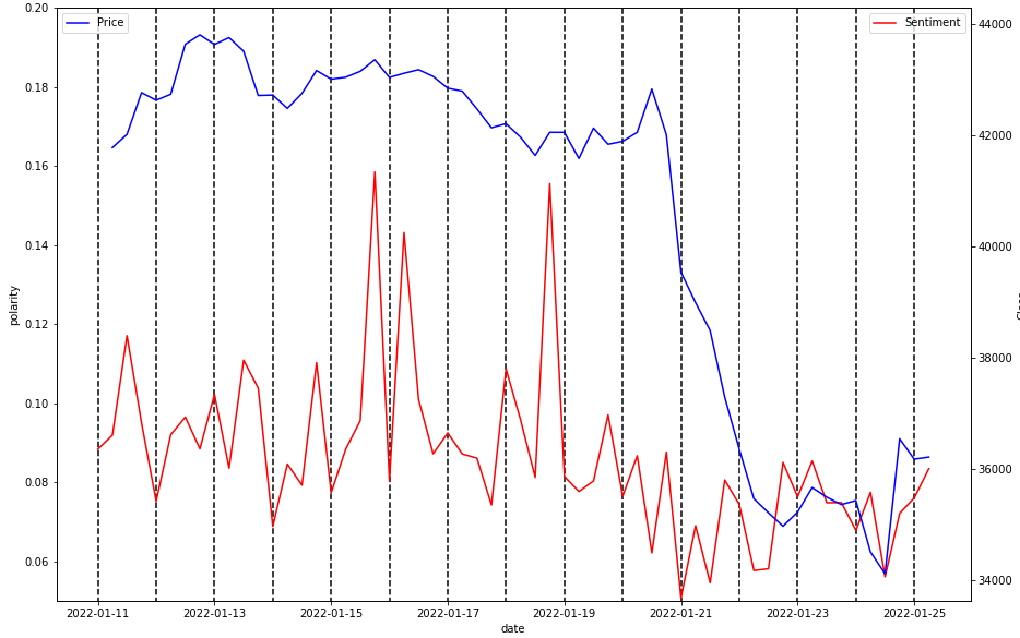
The vertical lines are every 4th data point to line them up a little nicer. We can clearly see that after the price drop off, sentiment has been generally lower than before.
There doesn’t seem to be much correlation, and sentiment seems to be a lagging indicator apart from some points. The 21st of Jan seems interesting where sentiment was an all time low, and the price continued to fall.
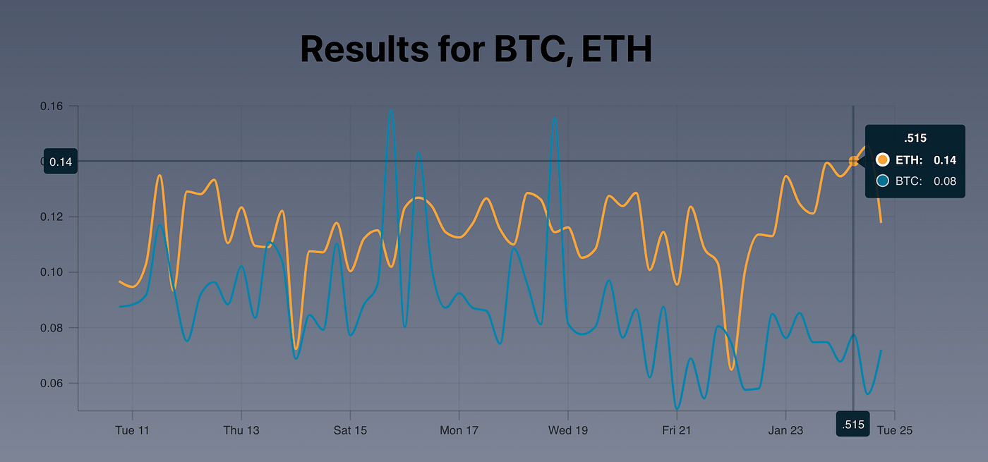
Eth
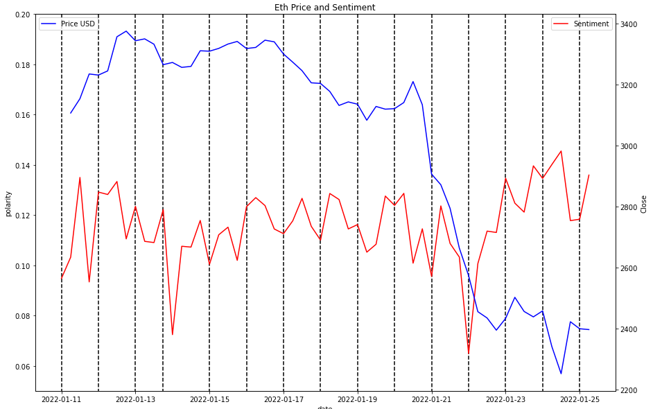
It doesn’t seem like there is much to go on with the ETH graph. Sentiment went down around the 22nd of Jan, which is lagging to the actual price drop. Now sentiment is up while price is in the pits. One thing to note is while Bitcoin sentiment is generally lower than before the crash, ETH is higher than before!
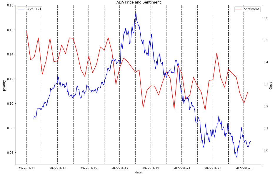
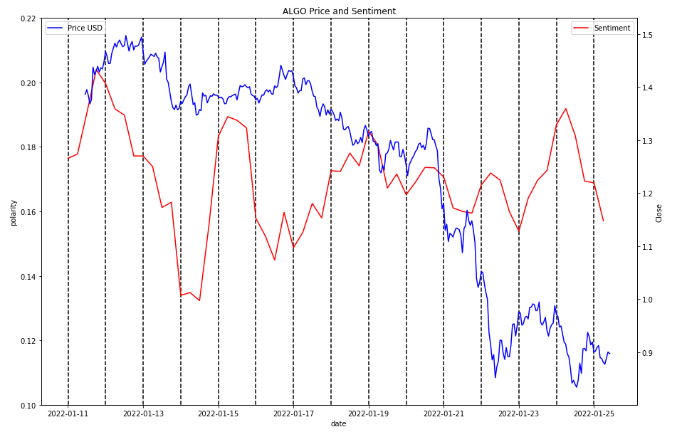
Alt Coins
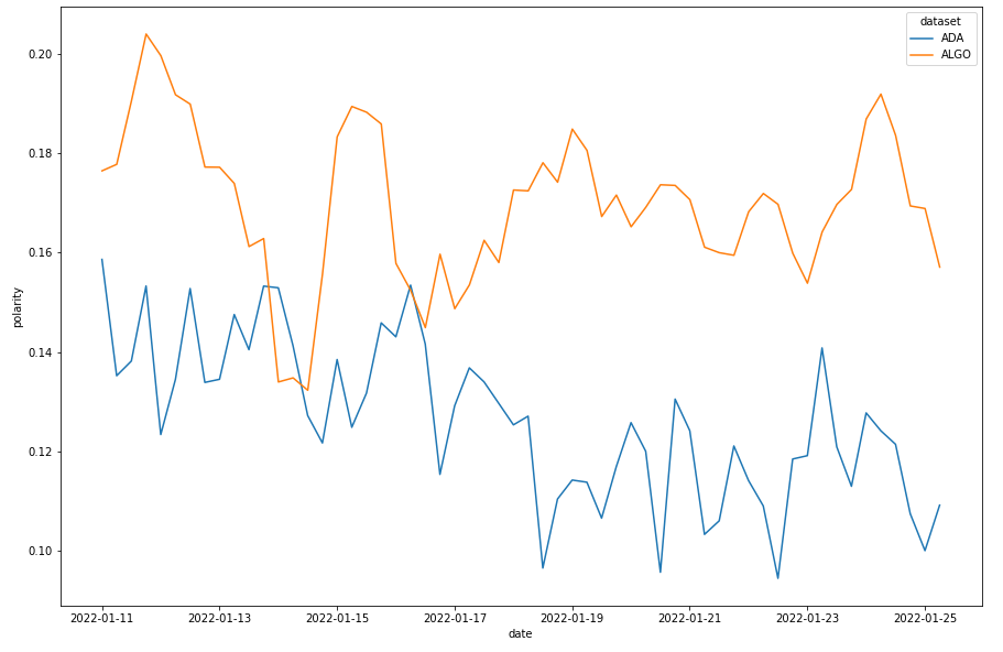
ADA
ALGO
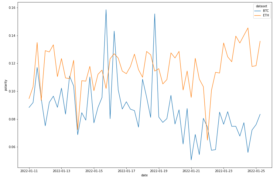
 Comparing Sentiment
So you might ask, what is the difference in sentiment between different coins?
BTC and ETH
ADA and Algo
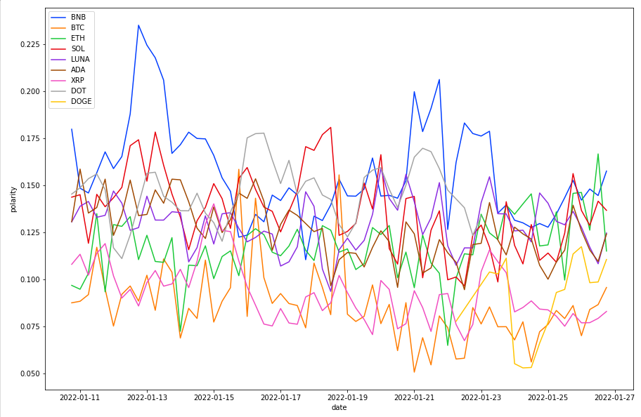
This is indicative of much other than people are probably more bullish on if the sentiment is higher. Here is the sentiment difference between the top 20 coins on CMC.
The Top 10 Coins
*excluding USDT and USDC
The Web App
The worst part of any project has to be the front end — but it is the most rewarding. So everyone can benefit from this system, I’ve created a web app hosted on Netlify. You can compare as many coins as you want (No complaining if it breaks!), it should show a nice graph, and the data below.
Web App here: https://silly-brattain-56ba53.netlify.app/
Head over to the Ticker page and hopefully it’s self explanatory.
Data Disclaimer — The Flaws!
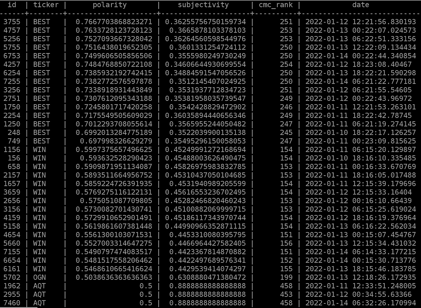
There is no data validation — A token named “Best” ranking very highly. After reviewing the tweets, $BEST is also a stock ticker with momentum behind it, and “best” shows positive sentiment in the sentence.
SELECT * FROM tickers ORDER BY polarity DESC LIMIT 50;
Amount of Tweets — I currently only scrape 1000 tweets per token per scrape. This is fine for a proof of concept, but I should bump them up. This also doesn’t take into account the amount of mentions it scrapes, it maxes at 1000, but what if there is only 3 tweets? The data could be skewed.
There are plenty more, but those are the big ones!
Cheers


