If you have ever provided liquidity on a DEX, you know the biggest headache: Where do I set my range? Until today, you had to look at a price chart on one screen and manually type in "Price Bins" on another, hoping the market didn't move before you hit "Confirm."
On March 26, 2026, Meteora changed the game by bringing the chart directly into the liquidity setup. This is the first time a major Solana protocol has allowed you to "Draw your Yield" exactly where the support and resistance levels are.
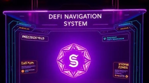
1. Visualizing the "Bins"
The Dynamic Liquidity Market Maker (DLMM) is famous for being 10x more efficient than traditional pools, but it was always a bit too "techy" for most people.
-
The New Chart: You can now see exactly where your liquidity "bins" sit on the actual price candle chart.
-
Support & Resistance: Instead of guessing numbers, you can drag your liquidity range to sit right on top of a known support level (like the current $69,000 floor) or just below a resistance level (like $73,000).
-
Real-Time Accuracy: You can see how much of the "Trading Volume" is hitting your specific bins in real-time. If the price moves out of your range, you see it instantly on the chart and can rebalance with one click.
2. Why This is a "Game-Changer" for Yield
In DeFi, the person who stays "In Range" the longest wins the most fees.
-
Zero-Slippage Bins: Because Meteora uses discrete price bins, there is zero slippage for traders inside those bins. This attracts more volume from aggregators like Jupiter.
-
Dynamic Fees: When the market gets volatile (like during this week’s Trump-Iran news), Meteora automatically raises the fees. With the new chart, you can see these "Fee Spikes" visually and move your capital to the most profitable "hot zones."
3. The "Anti-Impermanent Loss" Tool
For many of us who aren't "tech guys," the biggest fear is Impermanent Loss (IL)—where you lose money because the price moves too fast.
-
The new chart feature includes an IL Projection Overlay. As you move your range on the chart, it shows you a "Heat Map" of your potential risk. It’s like having a GPS for your capital, showing you exactly where the "dangerous" zones are.
My Perspective: Professional Tools for Everyone
In my opinion, this launch is a major part of the "Institutionalization of Solana." We are seeing tools that used to only be available to high-frequency trading firms being handed to the average "Digital Dividend" reader.
By making it easy to visualize and set ranges, Meteora is turning yield farming from a "guessing game" into a "precision strategy." As Solana’s TVL crosses $35 billion this month, these are the tools that will keep the liquidity deep and the yields high, regardless of what the global headlines say.