
The Rainbow Chart is a tool that allows you to track the price of Bitcoin using equations and statistics on its future possible buy and sell areas.
The Chart was first introduced back in 2014 and his creator is a Reddit user. Since Über Holger made some improvement and you can see the chart updated here, in USD or EURO.
The chart follows a logarithmic regression. The Red color means “time to sell” and Blue color means “time to buy”.
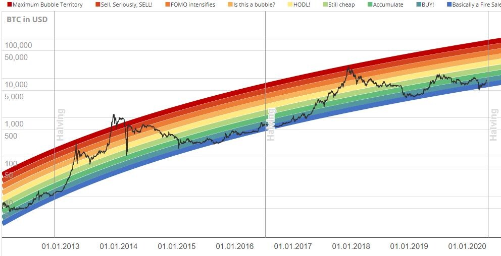
The Rainbow chart uses the simplest approach of seemingly following Bitcoin’s price trajectory over the course of its history.
Let us see how we can use.
As you see now, Bitcoin price has left Dark Blue ‘Basically a Fire Sale’ territory and entered ‘BUY!’ territory.
Is the Bitcoin Rainbow Chart can help us on our trading decisions with Bitcoin?
The chart allows you to observe long-term cost movements, ignoring the inevitable disruptions produced by daily volatility and giving you an idea of the best times to buy or sell BTC in the past.
However, the creator has noted that this chart is only a fun way of looking at a long-term price movement, but it cannot predict the future. As you know, past performance is not indicative of future developments.
Like he said: “it will only be correct until it isn’t.”
See my other post: Enjoy your free time during lockdown


