![Look into bitcoin [GUIDE] for On-Chain Analysis](https://www.publish0x.com/img/180925.jpeg?action=resize&ar=1&inv=0&ori=1&st=1&up=1&w=1140&signature=2ce7d7eaf71b441ee2bdce1d60bffc535bfddd35b404e383320fdfe9693985e3)
With 15 more days left for the Bitcoin halving I couldn't think of a better time to write an article about the on-chain metrics that are available at our disposal to help in predicting the Bitcoin price action.
About Look into Bitcoin
A website that offers various tools for investing in bitcoin through on chain data metrics and live information. Through charts and various market cycles, bitcoin can be visualized and analyzed in different ways.
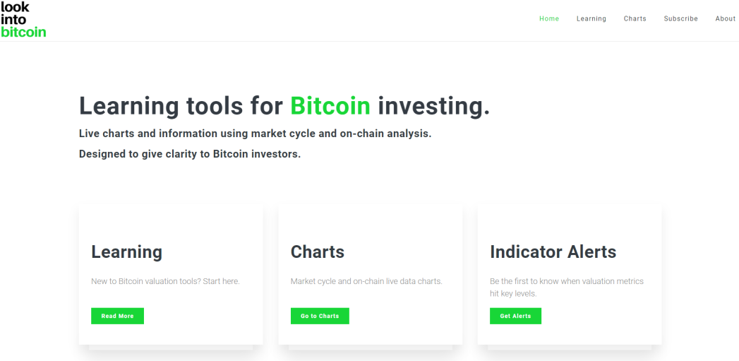
LEARNING
If you're completely new to bitcoin and have no idea about the various charts that are available they have a learning section where the basic topics are covered on how to look at the charts given in their site, how to get the information out of those charts and how to make use of that information for investing.

CHARTS
In the homepage if you click on the go to charts you'll come to the charts section. This page has a total of 13 charts It contains various charts that have been proposed by various analysts and is a hit in the bitcoin community. You must have all heard of the Stock-to-flow model which is one such chart.
1) Bitcoin Investor Tool: 2-Year MA Multiplier
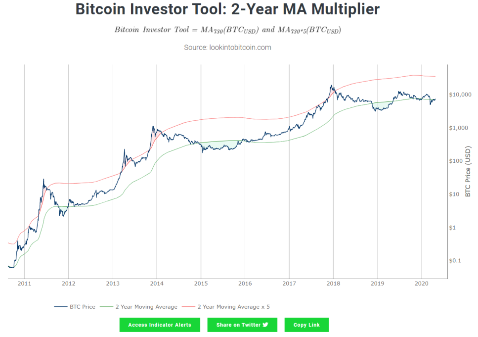
Created by Philip Swift
The x-axis indicates the year and y-axis indicates the price of bitcoin($). The green line indicates the 2 year moving average(MA), the red line indicates 5 times the 2 Year MA and the blue line is the price of BTC. So whenever the price of BTC falls below or is very close to the green line then it indicates a BUY SIGNAL and when the price of bitcoin is above or is in close contact with the red signal then it indicates that it is a SELL SIGNAL.The investor can time his buying and selling to get good returns from this chart. It is an investment for the long term as the x-axis is measured in years. Did you guys notice that the price of bitcoin is in contact with the green line now ;-) Still not too late to buy more bitcoin!
2) Relative Unrealized Profit/Loss
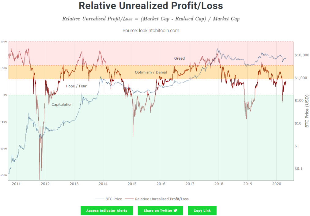
Created by Tuur Demeester and Michiel Lescrauwaet
The various stages are visible Greed, Optimisim/Denial, Hope/Fear and Capitulation can be seen in the chart. For a long term investor it can been used to see which stage we are in and decisions can be made easily. So when there's a lot of greed in the market it makes sense to cash out on your profits. The investor sentiment can be tracked with respect to time.
Market Cap = Price of bitcoin into the number of coins in circulation give the market cap
Realized Cap = The average price of all the bitcoins that were last moved into the coins in circulation gives the realized cap
The total profit/loss in bitcoin is the unrealized profit/loss which can be obtained by subtracting the above two caps and the relative unrealized profit/cap can be obtained by dividing the subtracted value by market cap.
3) 200 Week Moving Average Heatmap
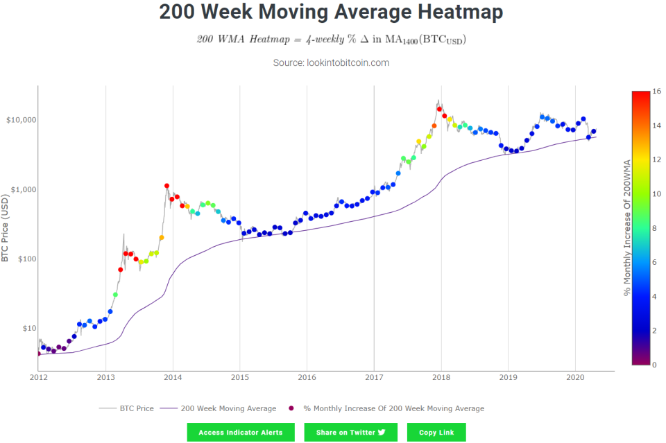
Created by PlanB
The 200 Weekly moving average is said to be an important factor for long term investors. When the price of bitcoin touches the 200 WMA it is said to have bottomed so accordingly one can decide when to buy and sell bitcoin.
4) MVRV Z-Score
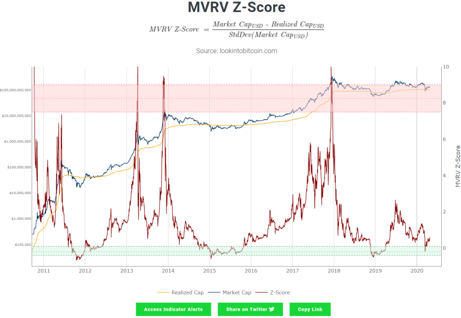
Created by Murad Mahmudov and David Puell
Z-score is the standard deviation between the extremes of the market cap and realized cap. When the Z score is high it indicates that bitcoin is trading at a period where the market cap is higher than the realized cap i.e the red zone and when bitcoin is trading at a period where the market cap is lower than the realized cap it is in the green zone.
5) The Puell Multiple

Created by David Puell
The Puell Multiple is calculated by dividing the daily issuance value of bitcoins (in USD) by the 365-day moving average of daily issuance value. When the Puell Multiplier (red line) is in the green zone the value of bitcoin is low and is a good time to buy bitcoin. When the Puell Multiplier is in the red zone it indicates a good time to sell your bitcoin and take some profits.
6) Stock-to-Flow Model
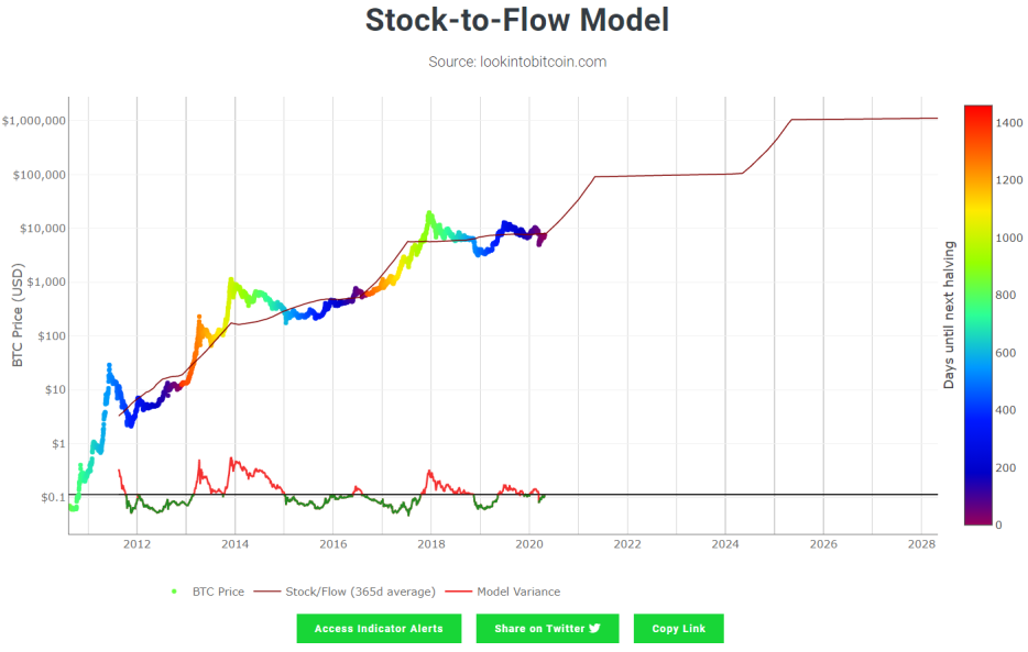
Created by PlanB
All of you might have got a lot of hopium looking at this chart and must have given you the confidence to hodl your bitcoin for the long run. Stock-to-flow is used to evaluate the total amount of bitcoin that is currently available against the bitcoin that will be minted in that specific year. The bitcoin price is highlighted on top of the stock to flow line and it can be seen that so far it has been following it properly and will give you an indication where it would be in the future provided it keeps following the stock to flow the same way. As the colour turns dark it indicates how close we are approaching the halving and when it turns bright it indicates how far we are until the next halving takes place. This chart tells us that bitcoin has a good store of value and like other precious commodities like gold and silver it has managed to increase in price and acts as a safe haven from the fiat currencies which has been plummeting since its creation.
7) 1Y+ HODL Wave
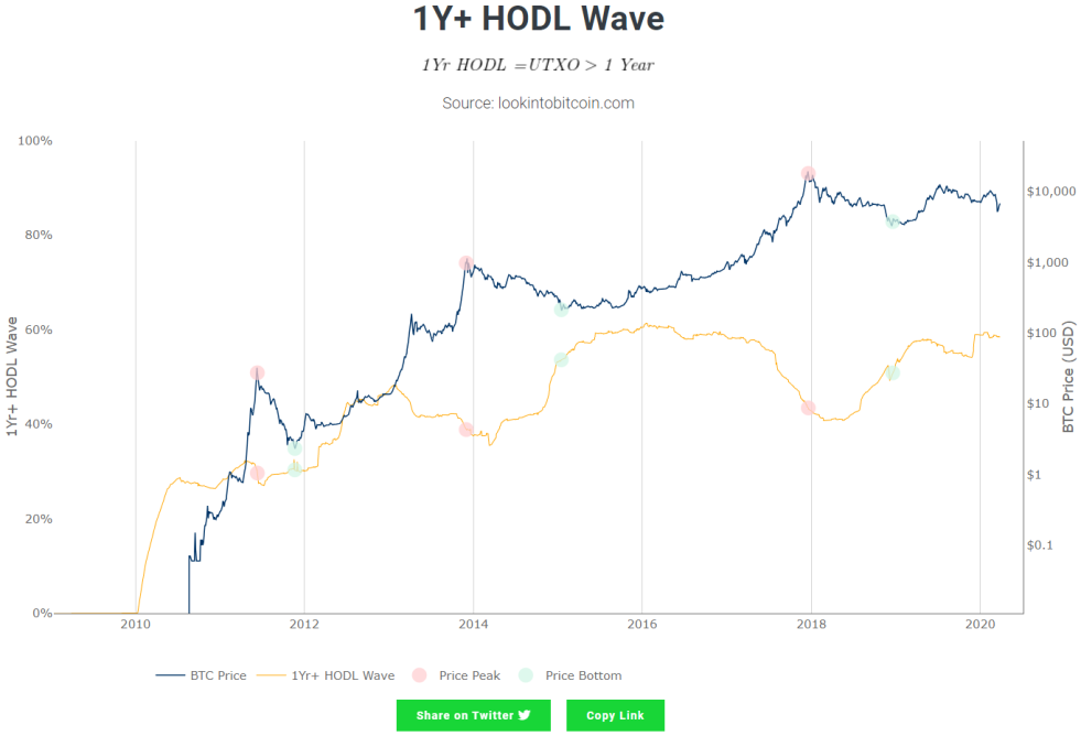
Created by Unchained Capital and modified by Philip Swift
This chart shows the emotional strength of the HODLERS. Coins that haven't been moved from a particular address for over a year have been considered in this category. The orange line indicates the number of hodlers increasing over the years. The price peak is indicated with the red circle and the price bottom is indicated with the green circle. The bitcoin price indicated by the blue line when it reaches at peaks a noticeable downtrend in the number of hodlers can be seen by the dip in the orange line. This indicates that the hodlers are cashing out and taking profits. Once they cash out these coins are no more part of the 1 year hodl category.
8) Bitcoin Network Momentum
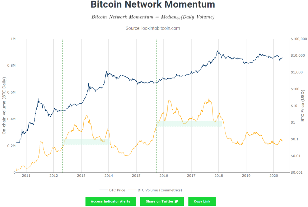
Created by Philip Swift
The chart tells us about the health of Bitcoin. If there is enough volume then there will be enough momentum for a bullish run. The yellow line indicates the bitcoin volume and blue line indicates the bitcoin price.
9) Pi Cycle Top Indicator
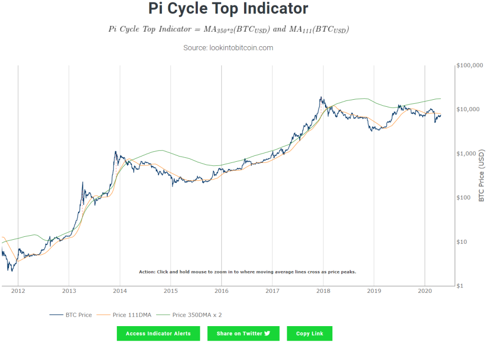
Created by Philip Swift
The orange line indicates the 111 Day Moving Average (111DMA) and green line indicates two times the 350 Day moving average (350DMA) . So whenever the orange line crosses the green line it indicates that a market top has been reached and it is a good time to sell.
10) The Golden Ratio Multiplier
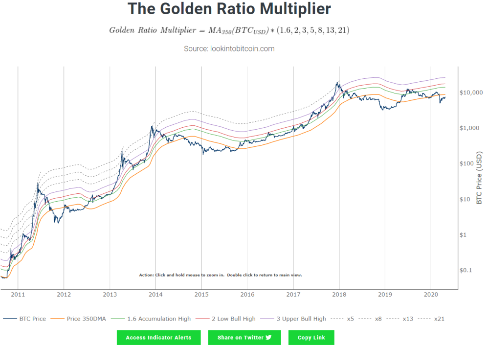
Created by Philip Swift
The blue line indicates the price of Bitcoin, the orange line indicates the 350 Day Moving Average (350DMA), the green line indicates the 350DMA into the first fibonacci number 1.6, the red line indicates the 350DMA into 2 and the other lines indicate the 350DMA multiplied by the next number in the fibonacci series. So each line acts as a support and resistance which can be used to judge the market top or trend reversals.
11) Bitcoin Profitable Days
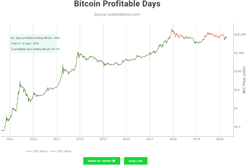
Created by Rythm
From the name of the chart it is understood that the number of days holding bitcoin would have been profitable for the investor with respect to the current price at which BTC is trading. It shows that if you play the long game there shouldn't be any problem in gaining profits. Never FOMO in at a higher price.
12) Reserve Risk
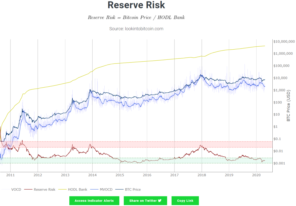
Created by Hans Hauge
This chart indicates the confidence of the long term bitcoin hodlers relative to the bitcoin price at any given moment of time. When the Reserve Risk line enters the green zone it indicates a buy signal as the price of bitcoin is low and the confidence is high. When the line is in the red zone it indicates a sell signal as the confidence is low and the price of bitcoin is high.
13) Bitcoin Logarithmic Growth Curves
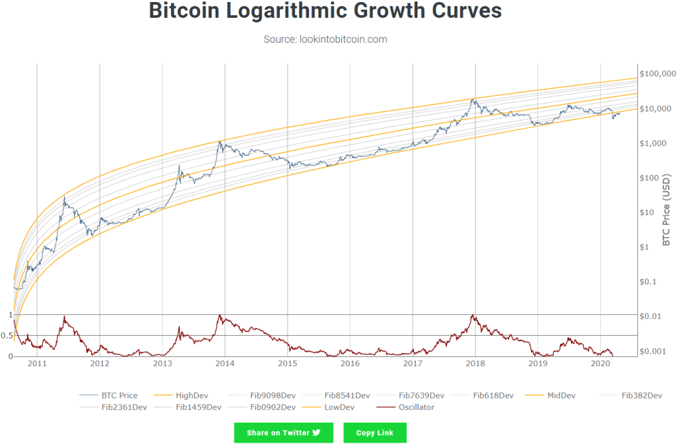
Created by Cole Garner
The bitcoin price has been within the logarithmic curves since its inception except for the flash crash that happened recently when it dumped till 3.8K. So when we're close to the lower most band it indicates that there is huge sell pressure and a good time to buy and at the top most there is massive fomo and is generally a good time to cash out on your profits.
SUBSCRIBE
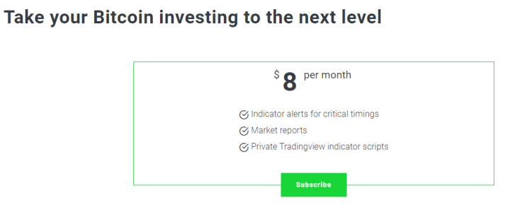
No sign-up is required to look at the charts given in their website. All the data available on the website and are free for all. If you'd like to go the extra mile and receive email notifications on price alerts and key information signals from the charts you can subscribe for 8$ a month.
You also get reports on the second month of each quarter so that's 4 reports in total. You'd get some key insights on how to invest the money on bitcoin. They are also providing scripts (Bitcoin Investor Tool, Golden Ratio Multiplier, Pi Cycle Top Indicator, Puell Multiple) that can be added on to your tradingview account.
Here are the samples on how an email notification and a report would look like.
The creator of this website Philip Swift is on twitter and you could give him a follow. He keeps posting a lot of insights about the current situation and market trend of Bitcoin.
DISCLAIMER: ALL INFORMATION PROVIDED HERE IS FOR EDUCATIONAL PURPOSE AND NOT TO BE CONSIDERED AS FINANCIAL ADVICE. DO YOUR OWN RESEARCH BEFORE INVESTING.


