
Website link: https://corneakkers.com/2023/11/09/the-magere-brug-in-amsterdam-09-11-23/
Printable: https://corneakkers.com/product/printable-the-magere-brug-in-amsterdam-09-11-23/
Clueless as to Female Forms
This graphite pencil drawing ‘The Magere Brug in Amsterdam – 09-11-23’ is rather realistic looking but let me explain why. Of late I started sketching urban sceneries and landscapes again. St.-Bavo in Haarlem – 03-10-23 was the first one in a while. In the meantime I am racking my brain on what to do with the female form next. Art Deco, neo deco, roundism and/or cubism paired to surrealism and impressionism, I don’t know. I have made so many of them. It’s only natural to shift from bodyscapes to landscapes and back once in a while. There’s also another reason. I started again with my In Hoc Signo painting. Lots of work to do. Creating these A5-size sketches is a break from the grand tale I try to play out on wood panel.
Amsterdam Trip
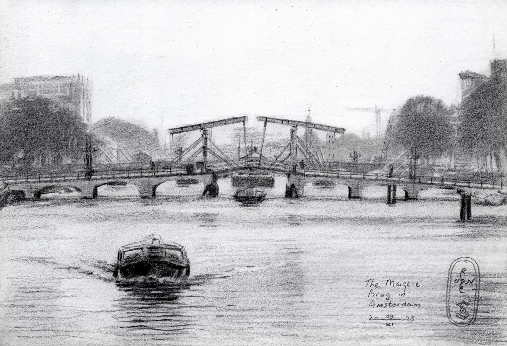
This having said, there are plenty of artistic motifs to work out. A graveyard of pictures in my archive I took throughout the years, doing citytrips and walking in nature. So it happened I walked out the Hermitage Amsterdam one time, now called H’Art. There I visited a Rembrandt and other old 17th century dutch old masters exhibition, coming from St. Petersburg. Going for a bite-to-eat in the centre I had a lovely view on the Magere Brug (Skinny Bridge) afterwards. In the back the Amstelsluizen were visible and behind them the Sarpathistraat. I liked the stacked outlook of all three structures and thought I’d turn it into a drawing one day. That was this day.
Impressionist Only
My last drawing ‘Berg en Dal – 02-11-23’ already was more impressionist than cubist. This one totally is devoid of any form of cubism. I intented a sort of cubist styling though but soon realized that was not in the books this time. Simply because the scenery looked rather flat. Also because I feared abstracting forms stacked behind eachother would deliver me only some kind of amorphous rubble pile. Instead I turned to regular impressionism or realism for that matter. I kept the bridge, buildings and trees in the back rather sketchy and vague. Therefor the Skinny Bridge stands out more, just like the canal boat in the front. Fun to do and this style reminds me of younger days when I sketched in the surroundings of Nijmegen.
Graphite pencil drawing (Sakura 0.5 mm, 4B) on Winsor & Newton paper (21 x 14.8 x 0.1 cm – A5 format)
Artist: Corné Akkers
Youtube (creating):


