
Website link: https://corneakkers.com/neo-deco-12-02-25/
Print: https://corneakkers.com/print-neo-deco-12-02-25/
Printable: https://corneakkers.com/product/printable-neo-deco-12-02-25/
Rumble (creating): https://rumble.com/v6k9xks-creating-neo-deco-12-02-25.html
A Sort of a Cross-over
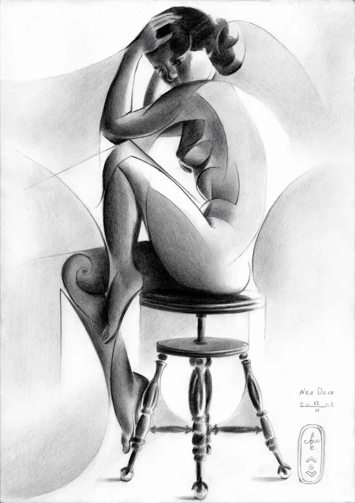
This graphite pencil drawing ‘Neo Deco – 12-02-25’ makes a sort of a cross-over. My older ‘Roundism’ style meeting my new ‘Neo Deco’ one. Demarcation lines are blurry. Sometimes I don’t think there’s even a clear difference, only a progression over time. What I can see is my drawings tend to become a bit more realistic again. Strange how I started off doing impressionism, realism and surrealism, sliding towards an abstracter sort of cubism. Only to find myself getting back to realism. In fact, writing this art statement and looking at the drawing I just made thumbnail-sized I see a realistic nude. When I zoom in I see abstracted linear structures and cubist styling appear. That was my very aim and in that respect I think I have succeeded.
On a Stool Again
Some time ago I came across a beautiful reference photo of a female nude on a stool. Not sure though who made it so I can’t give someone credit. It’s ancient anyway. Allegedly the model photographed would be Anita Ekberg, so the internet stated. Well, I don’t buy it. Her appearance looks different. However, that’s not every exciting to know. The posture is interesting enough, no matter who she is. Not the first time though I drew a female form on a stool, such as my latest pastel. I also could mention Roundism – 22-12-22. There are intriguing aspects of doing nudes on a stool. That is the potential of a model showing triangularly positioned limbs. So much better dan having a model stand straight up. Then he or she becomes to static-looking.
Both Abstraction and Meaning
The stool itself initially bothered me a bit. Balusters looked too heavily profiled to my taste, so I styled them a bit. On the other side they enforce the feel of the intended realism too. The cubist styling employed wasn’t to much of a challenge I must say. That’s a walk in the park. The real challenge was to have the viewer believe the scenery to be realistic whereas in fact it’s not. The goal is to have both abstraction and the meaning (a nice female nude) be pleasant to look at. If you like you can tell me whether I succeeded or not. I think I did.
Graphite pencil (Faber Castell, Pitt Graphite Matt, 14B) drawing Talens Bristol paper (21 x 29.7 x 0.1 cm)
Artist: Corné Akkers






