
Chartist figures
Today I want to show the chartist figures that are most often repeated in the charts and comment on how the price usually behaves once they are formed.
Chartism is part of what we know as technical analysis, it is in charge of analyzing figures, trends or patterns that the price has for a time.
The economist Charles Henry Dow, the one we know by the Dow Jones index, was the creator of this type of analysis. According to his theories, the market behaves cyclically.
I will summarize it for you in
TRENDS,
CHARTIST FIGURES, (simple)
The Dow Theory is based on these six main points, and lays the foundation for much of what we now know as technical analysis.
1.) Prices reflect and discount everything
2.) Markets move by trends
3.) The three main phases of any primary trend
4.) Confirmation principle
5.) Trading volume should confirm the trend
6.) The trend will be in effect until it is replaced by another opposite trend
Trends
Are movements (in any temporality) either upward or downward and can be joined by a line at least two points of movement.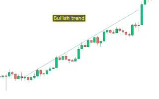
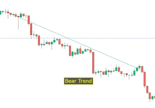
I summarize it in three sections, I try to simplify as much as possible to make learning easier. After many years, I usually see trends; bullish, bearish or consolidation, and two types of figures; continuity figures or patterns or trend change figures.
This is all very well, but I must say that sometimes ... fundamental analyzes render technical analyzes invalid.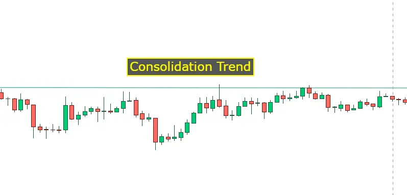
Change of trend formations
These patterns often cause the trend to be strongly modified. They are usually accompanied by volume.
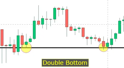
The double bottom is formed when there are two lows on a level close to each other, and we can also confirm the figure if we see that in the second low the volume decreases.
For the double top it happens exactly the opposite, it is formed when there are two close maximums and also in the second top it loses volume. After these movements the pull back usually occurs, which will confirm the movement. The longer it takes for these figures to be produced, the greater the impulse.

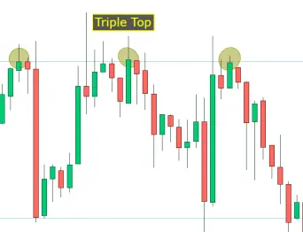
In the case of triples, they are two other figures, but they occur on much fewer occasions and are sometimes sometimes confused with HCH.
The volume usually decreases from the first peak to the last, and it is not necessary that the maximum or minimum be symmetrical.
Reversing wedges
The wedges can sometimes confuse us since it is not necessary to only look at their formation, if not as it is accompanied, if it comes from a downtrend or if on the contrary it comes from an uptrend, they act differently.

If the rising wedge forms while in an uptrend we will have a price reversal.
If the rising wedge forms during a downtrend we will have a continuation of the price.
Higher highs and higher lows.
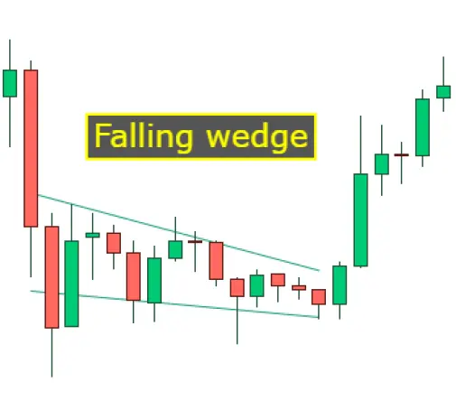
If the falling wedge comes from a downtrend, we will see how the price reverses, lower highs and lower lows. But if the price comes from an uptrend and a falling wedge occurs then we will be faced with a continuation of the price.
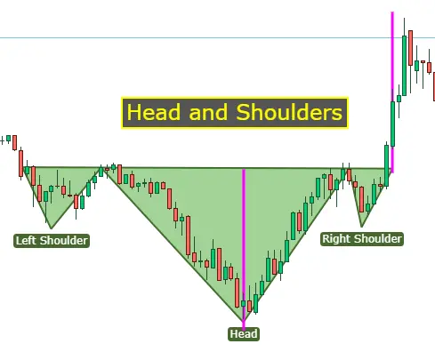
In this pattern we can see how a symmetrical head-shoulder shoulder has been formed and how the purple neck line is projected once the strong green sail confirms the movement. This would be a bullish HCH, but it could be reversed and then we would have a bearish HCH. It is an easily recognizable figure and it can be seen that usually when the second shoulder is finishing forming, the asset usually takes volume.
Trend continuation figures
Let's start with my favorite figures, these are undoubtedly the ascending and descending triangles, the ascending triangle occurs when the highs are stable and the lows each candle higher, it continues to narrow until finally over 75% or 80% of the length of the triangle breaks.
The descending triangle occurs in reverse, when the highs are lower each candle and the lows remain stable.
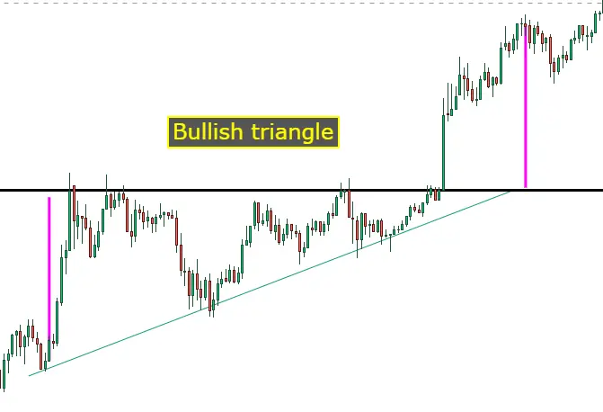
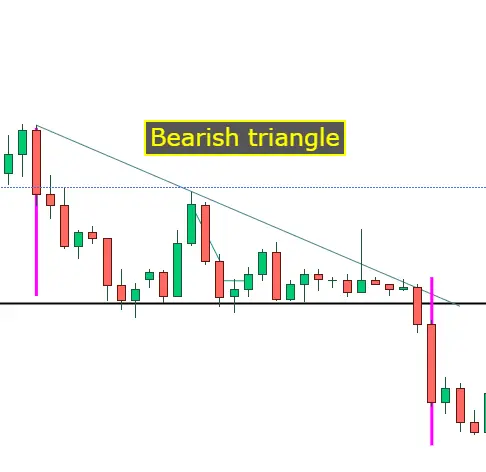
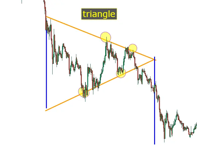
Symmetrical triangles are usually congestion and operate like any other laterality figure, they can be easily seen and usually break in favor of the trend it brought. A good time to enter the triangles is when a pull occurs and they are usually with less volume. Very attentive to the volume always.
One of the norms or rules that exist is that the volume falls within the triangle.
Flag
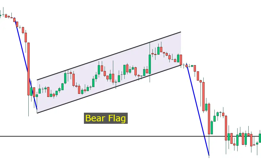
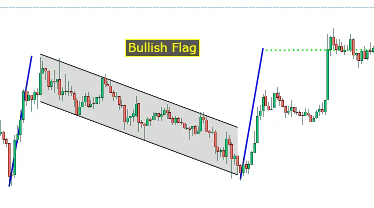
The flags form price continuation figures, and do not usually last long, it is difficult to see a flag for 3 weeks. They are usually seen in bull and bear markets preceded by a strong movement and an increase in volume.
They are identified because they always take an inclination contrary to the trend. After half the flag, the volume is usually lowered and a ZIGZAG begins. The target is usually marked by the height of the mast.
Pennant
The pennants are usually formed after strong movements, they are usually bullish or bearish "small wedges",
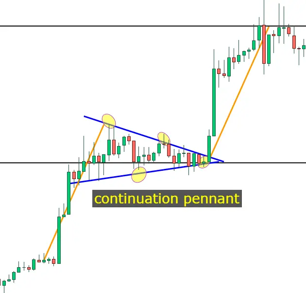
For a pennant to be validated it has to touch at least 4 points from the trend lines. Two above and two below. Although pennants are usually small in size, they can project large movements. That is why you must always be very aware of these formations. They can also be given in reverse, it would be the same inverted figure and would project the price in the same way.
I hope it helps you and that you learn something with this article. I encourage you to subscribe to the blog so that you do not miss any article related to the crypto world. I am a crypto enthusiast and want to show some of the knowledge that I have been acquiring over the years. It is thought and done quickly and easily so that you can have a very basic knowledge of chartist figures-






