
The Rainbow Chart for Ethereum is a technical analysis tool that provides a visual representation of long-term price movements, filtering out the daily volatility “noise.”
If you are interested in investing in crypto, you have probably heard about the Rainbow Chart, which is a visual tool for making informed investment decisions based on the asset’s behavior in the previous market cycles. Although the first crypto rainbow chart was created for Bitcoin, a replica of it was later applied to track the historical performance of Ethereum, the second-largest cryptocurrency by market capitalization after Bitcoin.
The following guide takes you on a quick tour of using the Ethereum Rainbow Chart to spot the right time for entry and exit, maximizing profits from your investment in ETH.
What is Ethereum Rainbow Chart?
The Ethereum Rainbow Chart is a visualization tool that plots the price history of Ethereum over time on a logarithmic scale and uses nine distinct color bands — hence the name rainbow — to indicate when it may be the best time to sell, buy, or HODL.
On Ethereum Rainbow Chart, red and orange hues typically signal an overbought zone, while greens and blues indicate that ETH is undervalued. However, it's worth mentioning that its accuracy and usefulness as a predictive tool for future price movements are a matter of debate among cryptocurrency analysts and traders. For instance, Bitcoin Rainbow Chart from 2014-2022 is apparently dead now, as the 2022 bear market proved too strong, and the price slipped below the last blue band. However, the crypto community's love for rainbows is undefeatable, so BTC enthusiasts simply adjusted the logarithmic growth curve to fit the new data and called it Bitcoin Rainbow Chart V2.
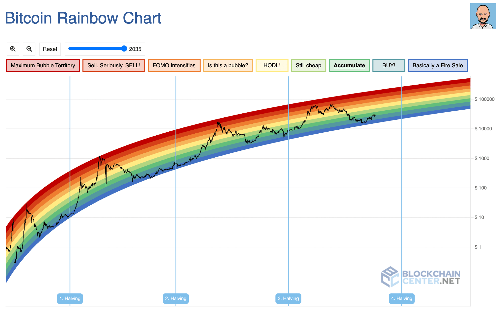 Bitcoin Rainbow Chart V2 by Uber Holger
Who created the ETH Rainbow Chart?
In 2014, an anonymous Reddit user azop was the first to use colorful bands to show the Bitcoin historical price patterns, and later that year, a BitcoinTalk user named trolololo came up with an idea to use logarithmic regression to forecast future BTC price. The final touch to the model was added by a Bitcoin enthusiast Uber Holger, who added captions and interpretations to each band. Holger was also the one to apply it to the ETH price, thus giving birth to the Ethereum Rainbow Chart.
What is the difference between the Bitcoin and Ethereum Rainbow Charts?
The Ethereum Rainbow Chart and the Bitcoin Rainbow Chart are different in terms of the price ranges they represent, which makes sense, as Ethereum has historically been less valuable than Bitcoin. However, the most significant difference between the Bitcoin and Ethereum Rainbow Charts is the time frame. While the Bitcoin price history used in the chart dates back to 2010, Ethereum's historical price performance only goes back to 2015, which makes it much less reliable.
Additionally, Bitcoin Rainbow Chart suggests possible price levels up to 2023, while that of Ethereum trends only for a couple of months in the future — until October 2023 at the time of writing.
Read also: Fundamental analysis in crypto: should it be in your toolbox?
Both charts may be useful for visualizing the historical price trends of their respective cryptocurrencies, and can help investors identify potential support and resistance levels based on past price movements. However, it's important to note that these charts should not be the sole basis for making investment decisions.





